Posts Tagged ‘Oklahoma’

As Seen in TulsaPeople: The Flower Farm at The Studio at K|D in Tulsa

Vibrant zinnias growing at The Flower Farm at The Studio at K|D in Tulsa, OK;A black cottage and refurbished silo sit in the background

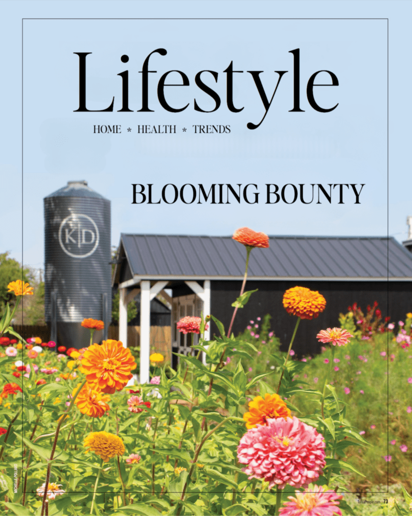
We’re honored to share that our flower farm was recently featured in TulsaPeople! So we thought it was the perfect time to share more about how it came to be and what you can expect this season.

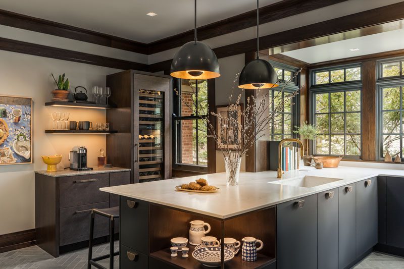
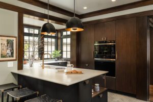
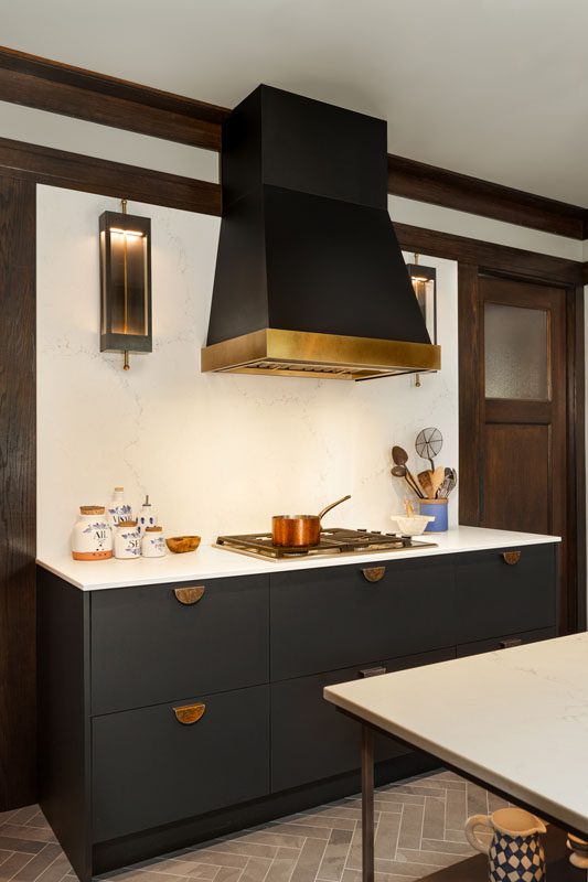
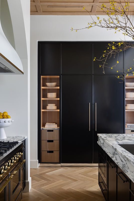
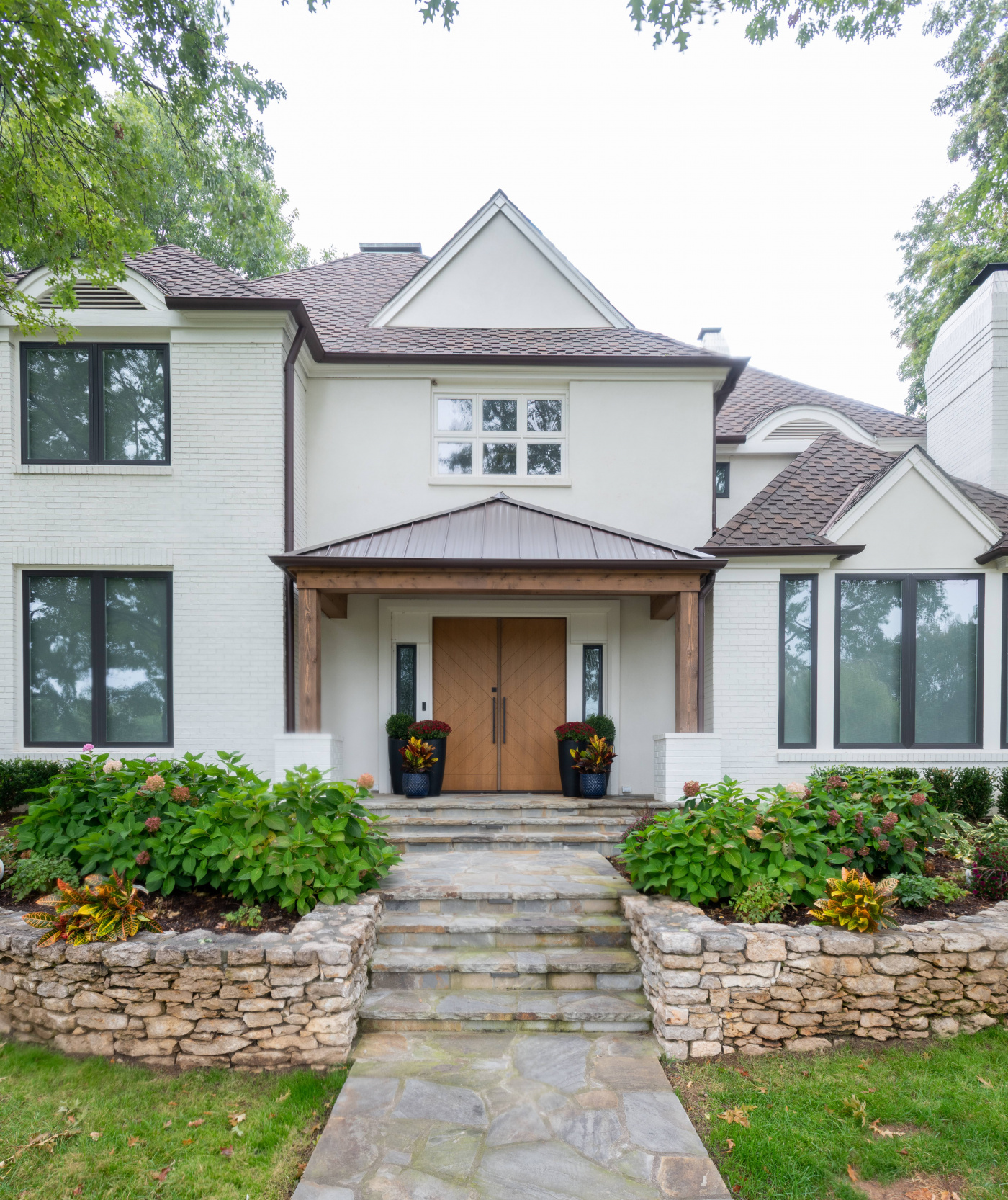
The Flower Farm is a key part of The Studio at K|D—a dream that began when we purchased five acres in Tulsa to serve as the new headquarters for Kirkendall Design. From the beginning, Julia imagined an interactive, event-driven space that would merge design, nature, and community—complete with blooming flower fields.

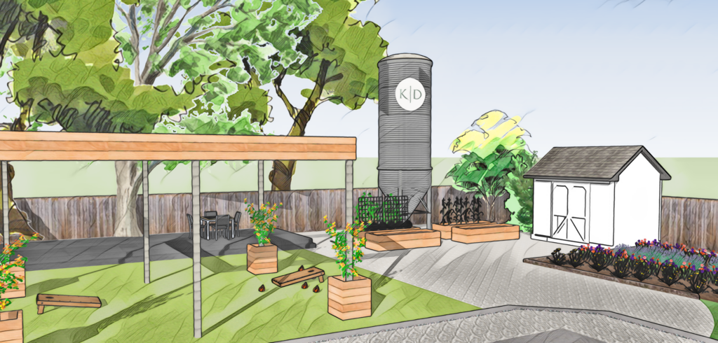
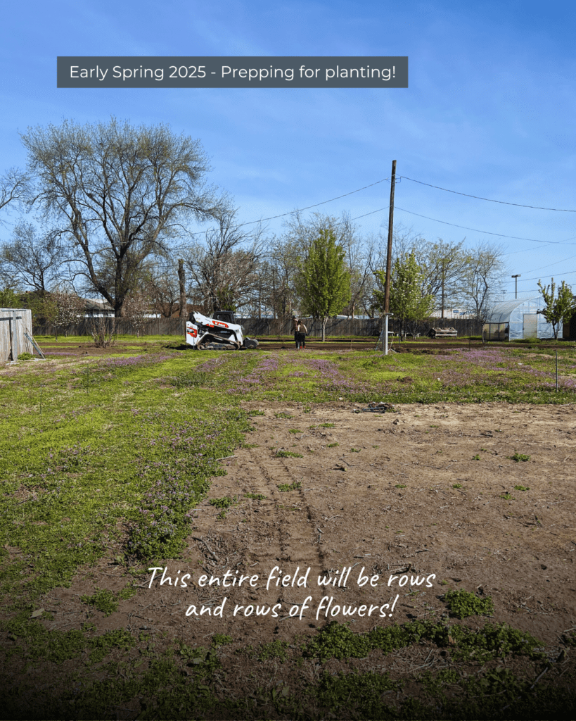
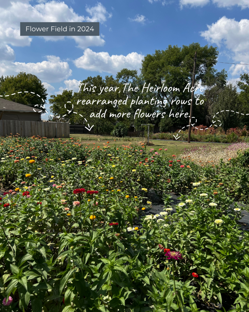
From the beginning, we partnered with The Heirloom Acre Farm to bring that vision to life. Together, we prepped the land and laid the groundwork. From there, The Heirloom Acre took the lead—leasing the land, cultivating the flower fields, and managing all U-Pick experiences.

Once flowers are ready for the season, we will be open every Saturday, along with a handful of special events—including a monthly Sunset U-Pick on Friday evenings and private weeknight U-Pick experiences.

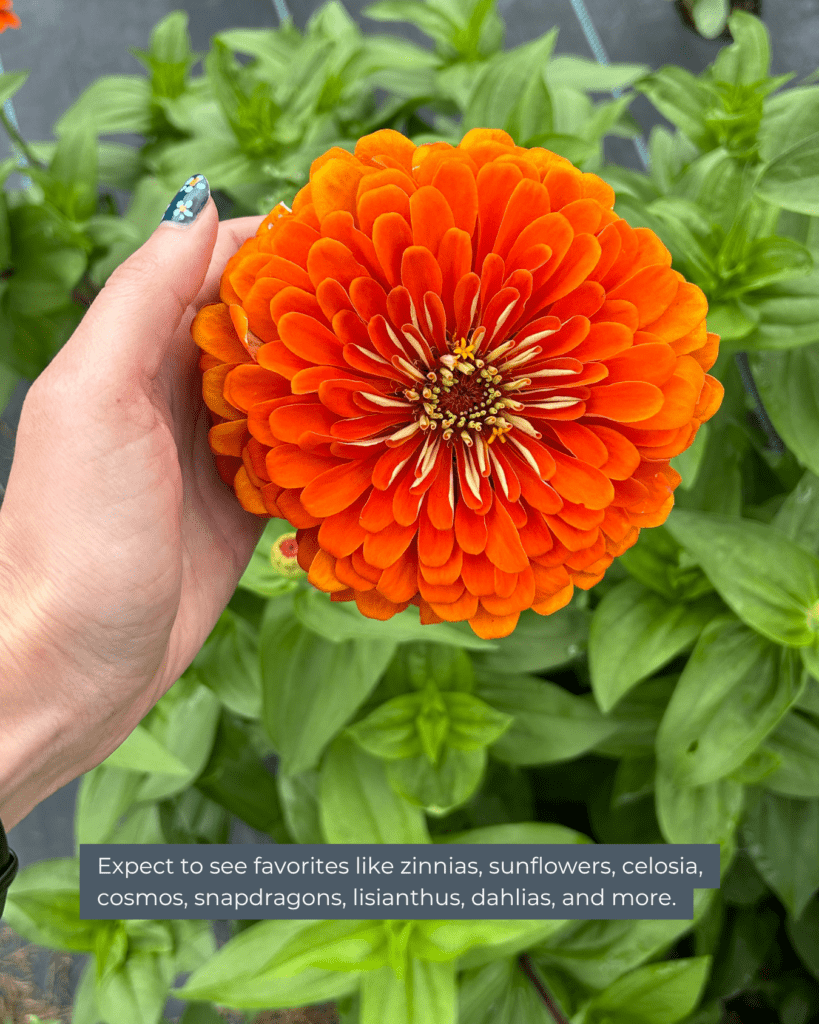
Expect to see favorites like zinnias, sunflowers, celosia, cosmos, snapdragons, lisianthus, dahlias, and more. Each U-Pick is $20 and includes a large mason jar you can fill with your choice of fresh blooms.

Event schedules will be posted at TheHeirloomAcre.com, TheStudioatKD.com, and on Instagram at @theheirloomacrefarm and @thestudio_at_kd.

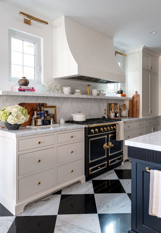
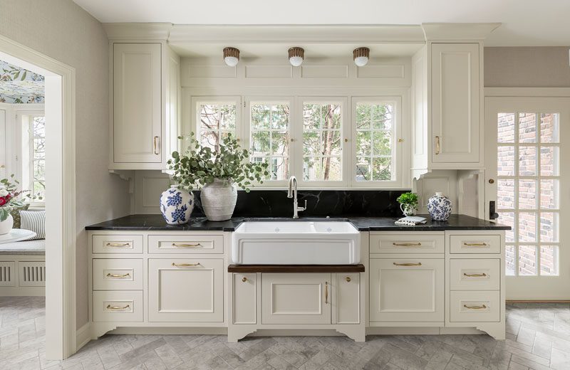
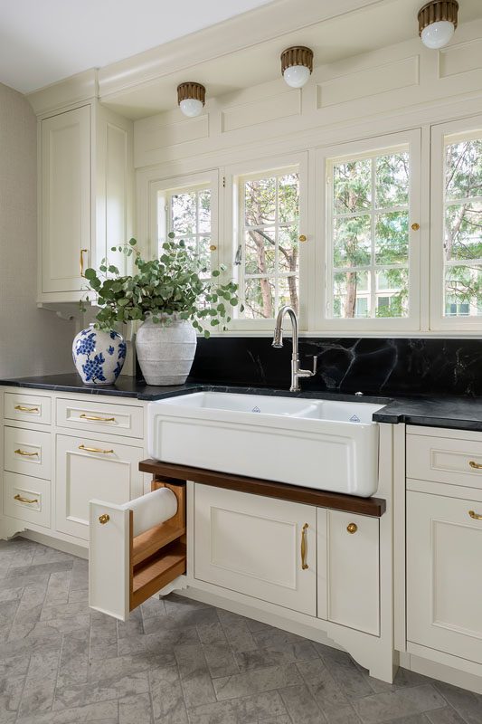
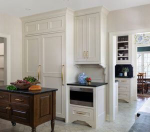
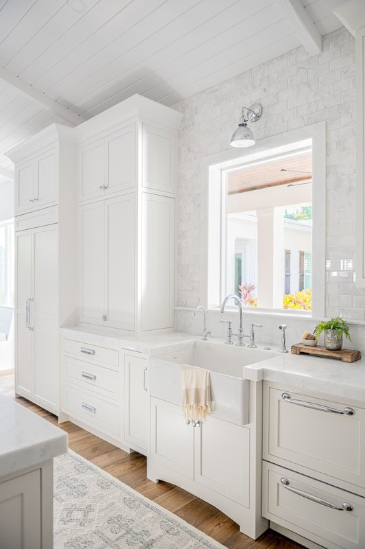
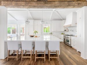
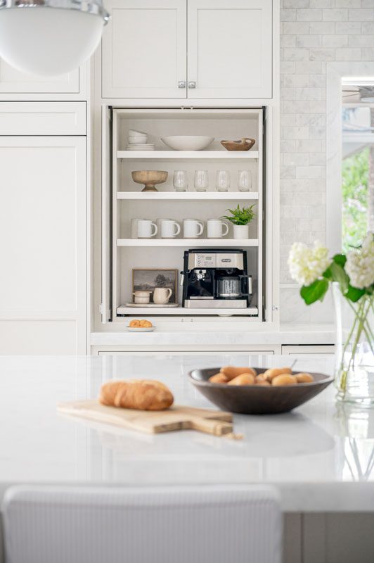
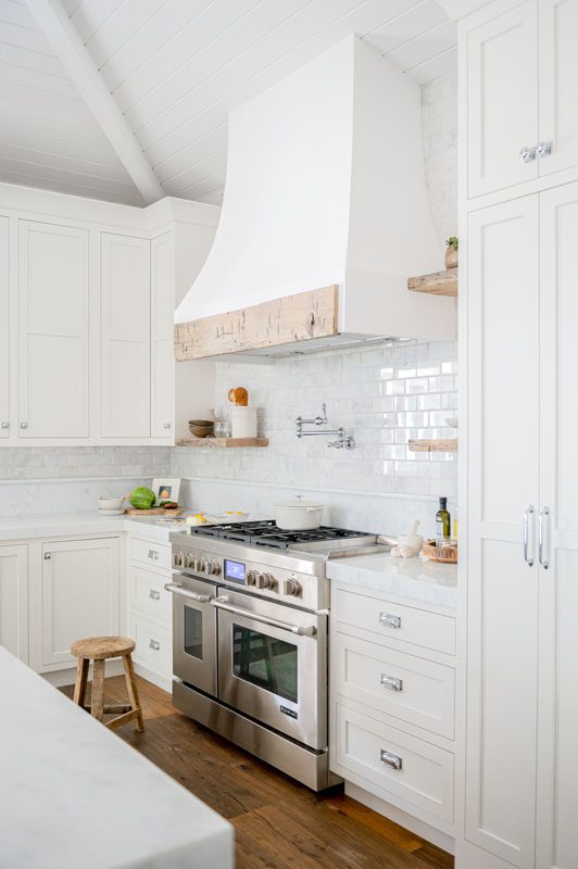
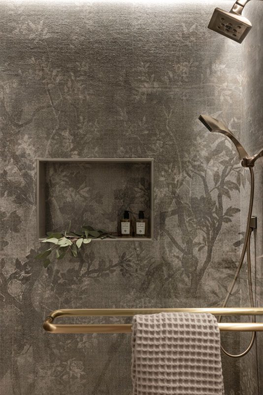
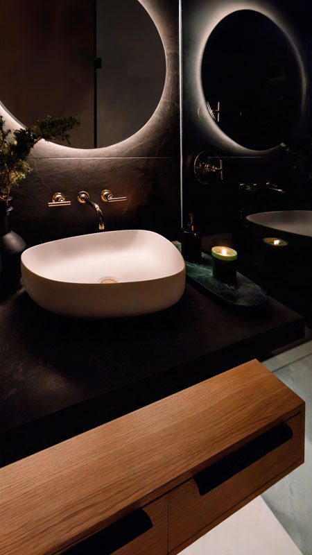
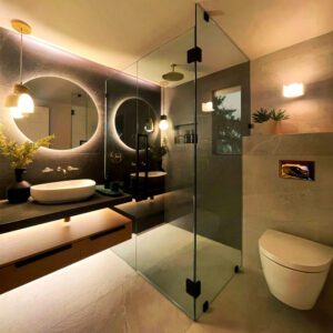
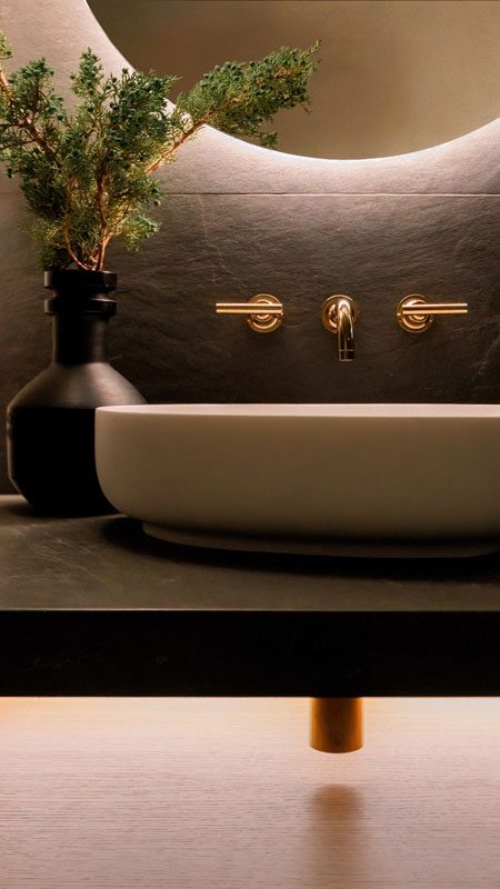
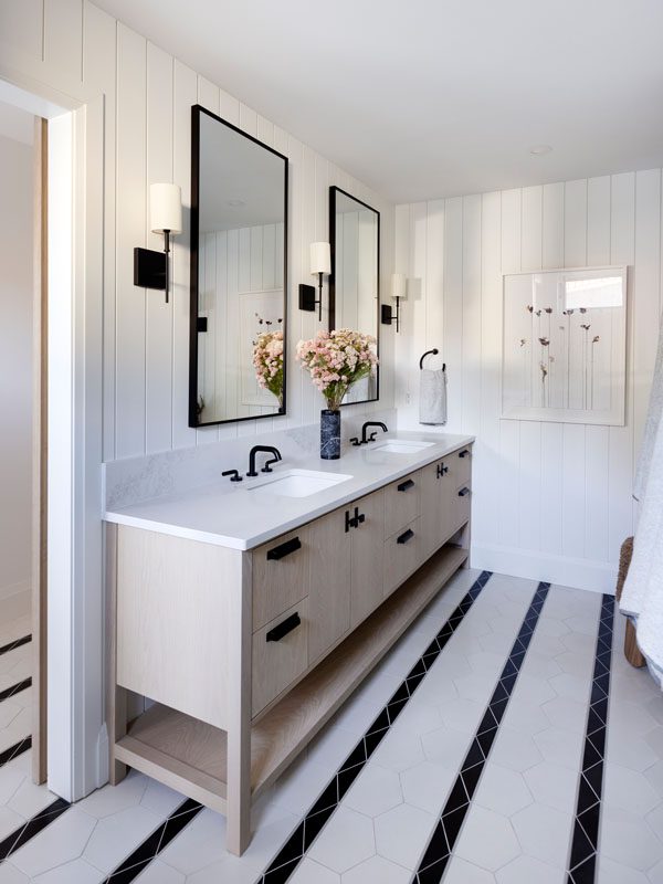
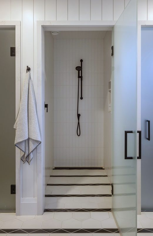
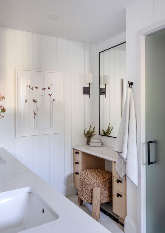
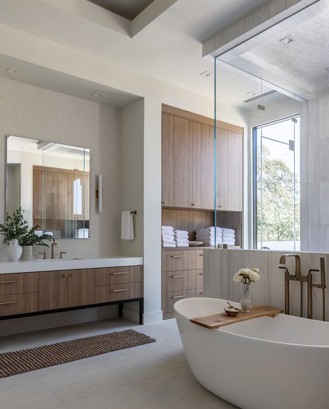
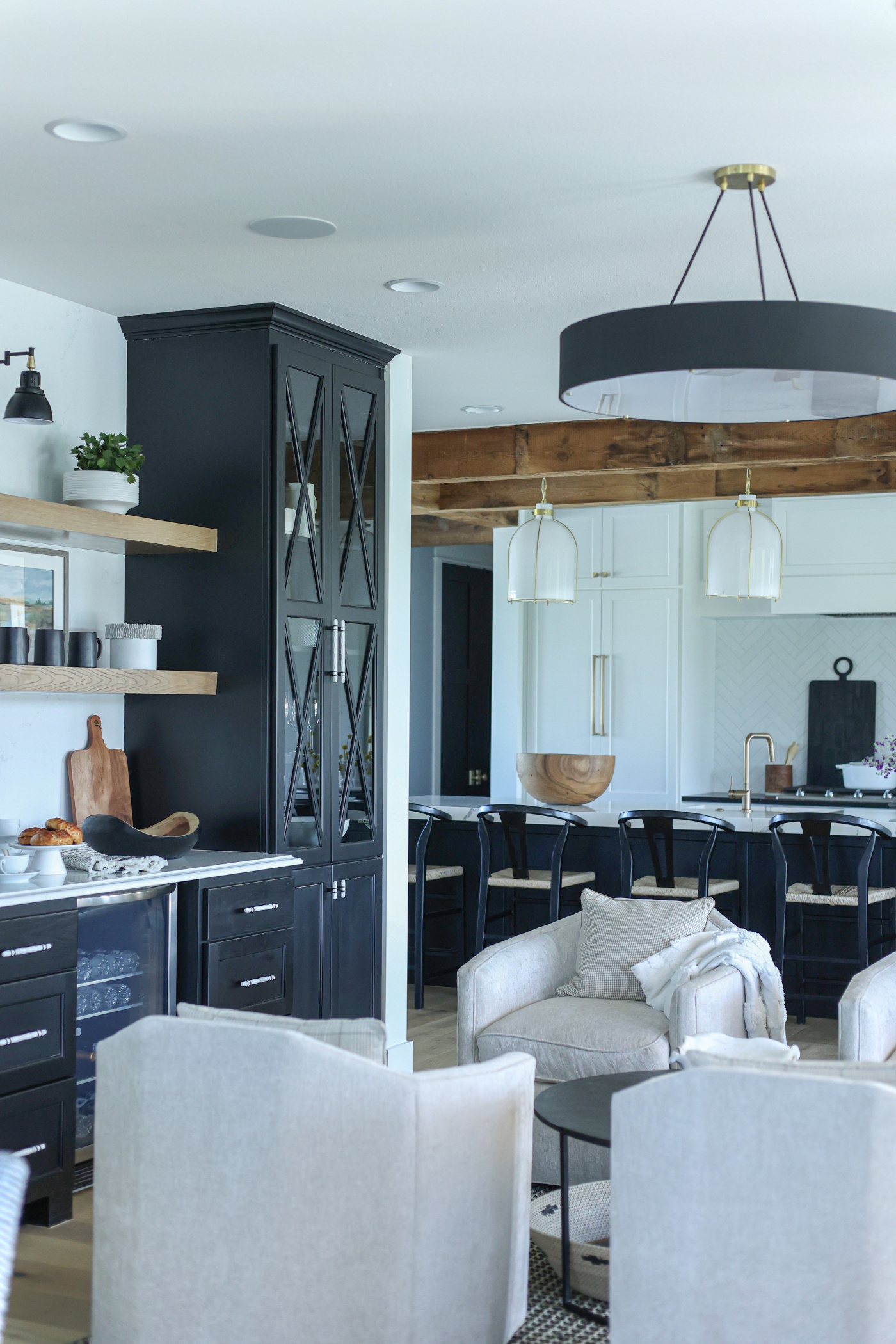
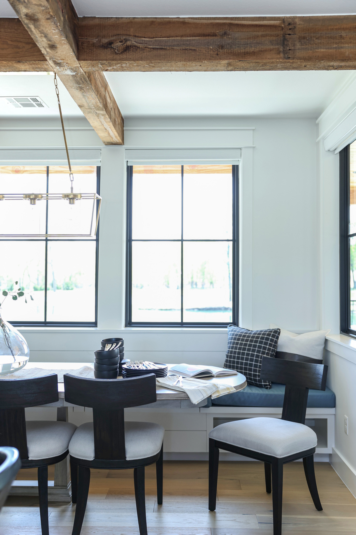
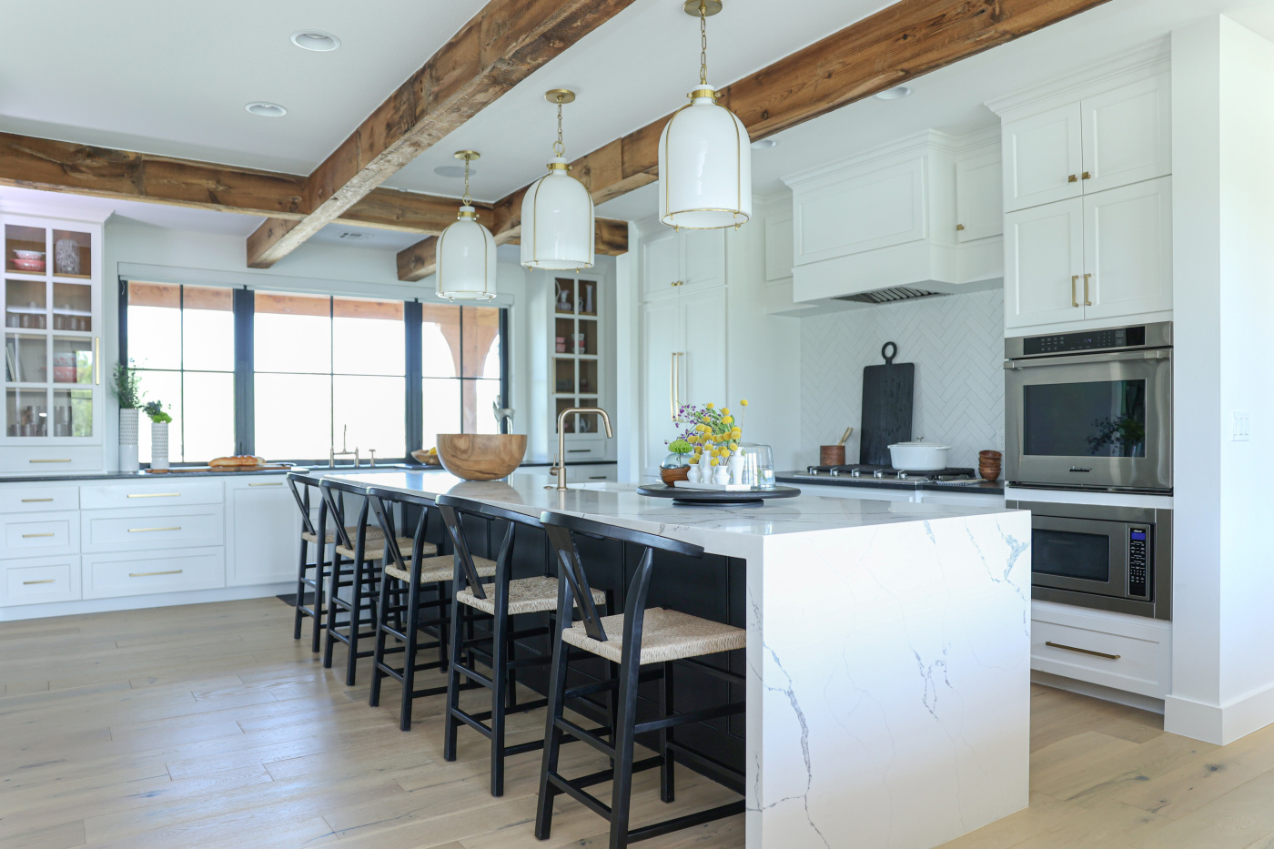
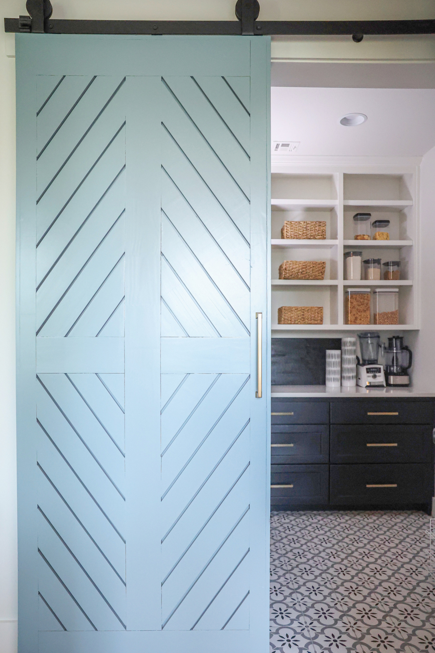
The Studio at K|D Offerings

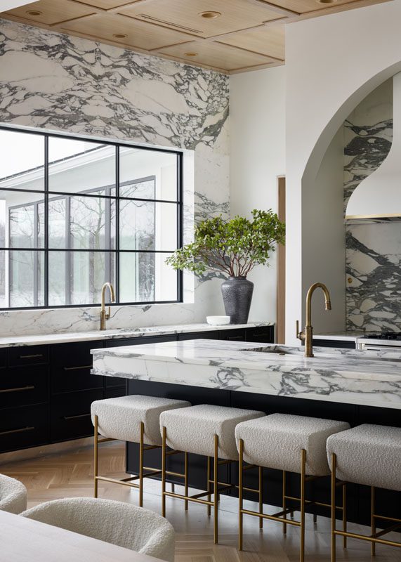
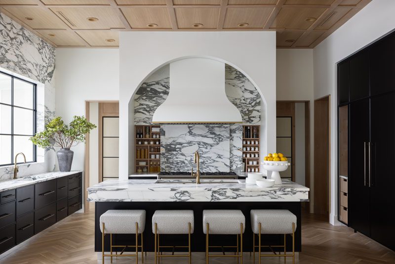
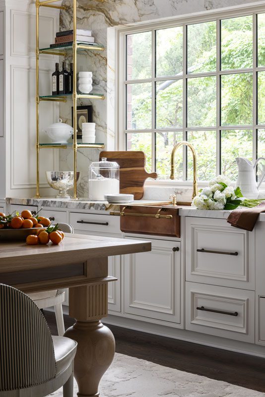
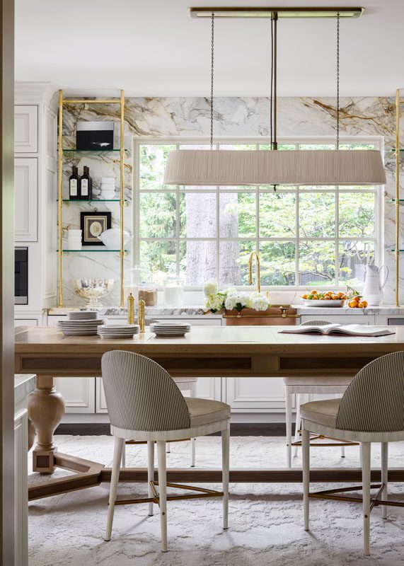
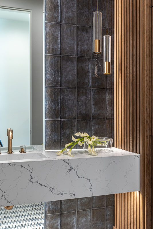
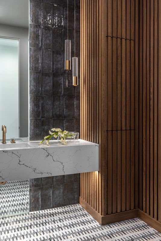
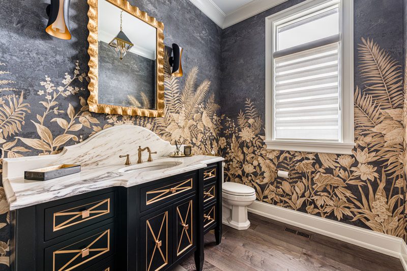
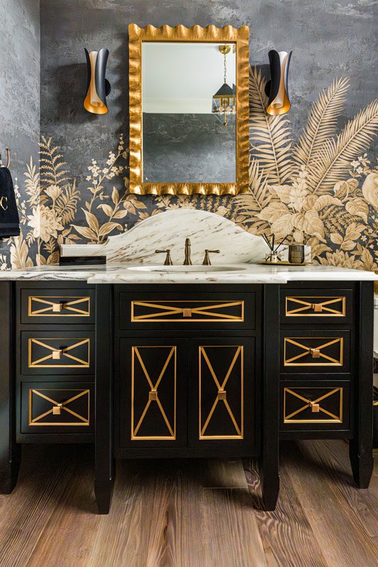
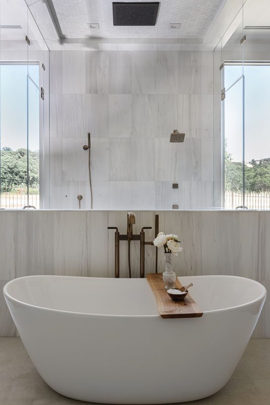
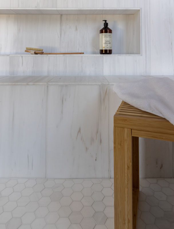
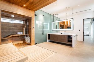
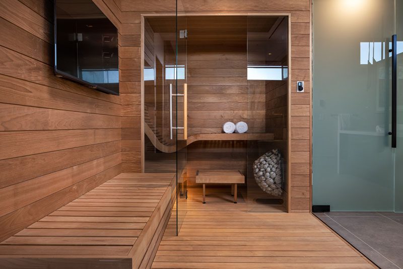
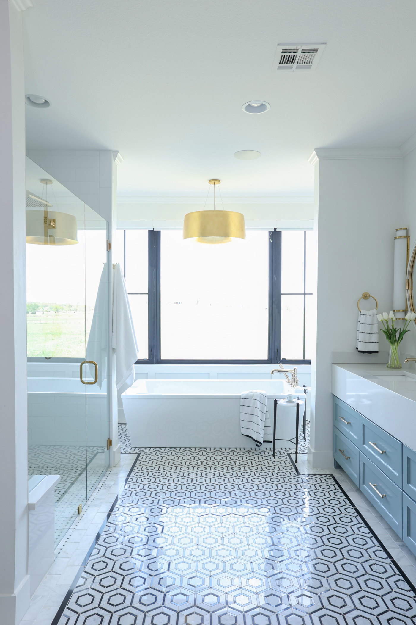
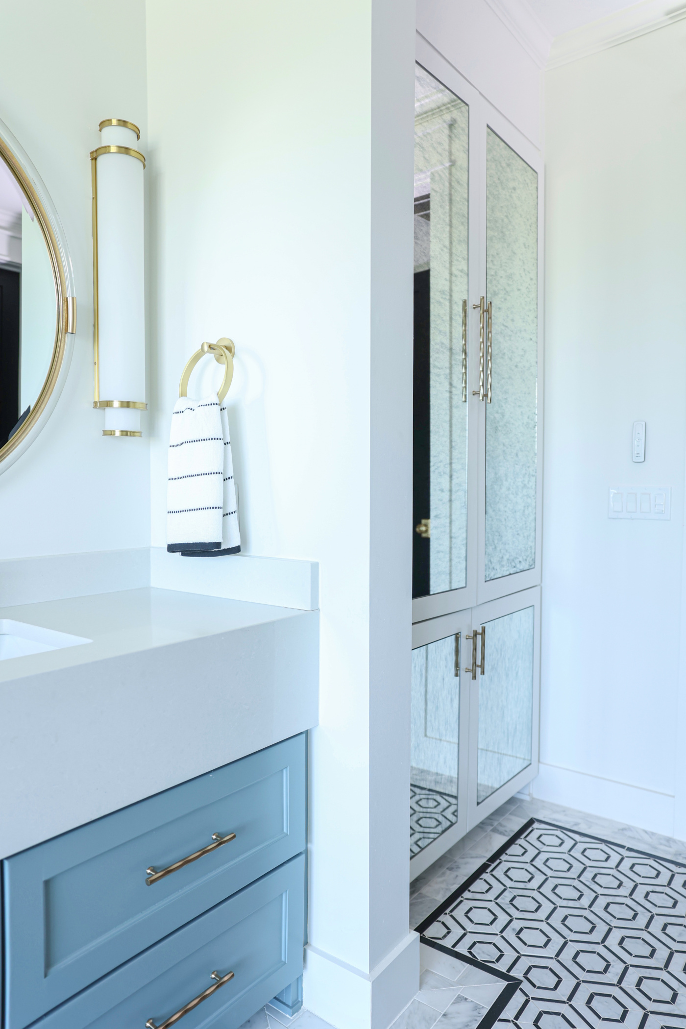
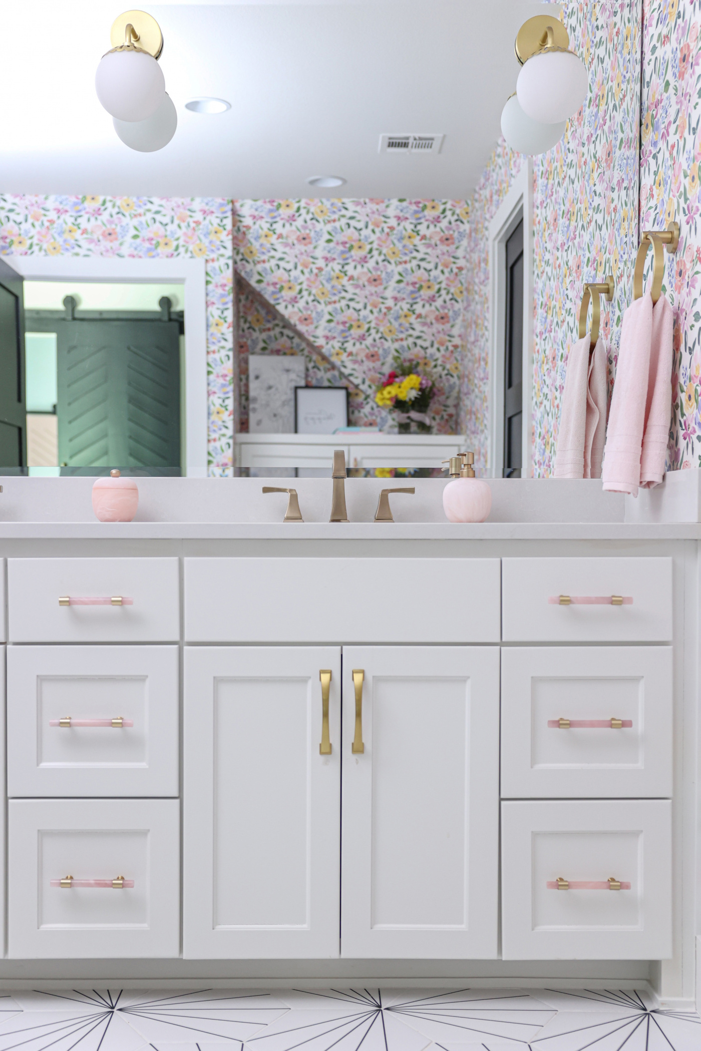
The Flower Farm is just one part of what makes The Studio at K|D so special. In addition to the seasonal U-Pick experiences, The Studio is available to rent for private events—with priority given to Kirkendall Design clients and their affiliates. It also serves as a beautiful backdrop for photographers, available to book by the hour for branding, corporate, and lifestyle sessions. To learn more about our space, visit thestudioatkd.com.

As Seen in TulsaPeople: Grand Lake Home Remodel for a Growing Family

We’re thrilled to share that our Grand Lake Getaway home renovation has been featured in TulsaPeople! What started as a water leak repair quickly evolved into a full-scale remodel. We reimagined this weekend retreat to give our clients a space where they can relax, host their kids and grandkids, and enjoy modern lake living—perfect for making lifelong memories.

Get all the design details and explore more photos in our Grand Lake Lakehouse Remodel Pt. 1 blog post.

Top Kitchen Trends From the 2025 NKBA Design Awards

Posted on No Comments

The National Kitchen + Bath Association (NKBA) is the world’s leading authority in kitchen and bath design, always at the cutting edge of industry trends. Last month, we shared the top bathroom trends that inspired us. Now, let’s take a look at the winners of their 2025 Kitchen Design Competition—and the design elements that caught our eye.

Here’s the top kitchen trends that stood out to us.

Best overall Kitchen & First Place Small Kitchen: “Breckinridge Kitchen”

  • Marble backsplash with a built-in shelf ledge
  • Classic checkered floors
  • Undermount sink with apron front—you’ll see this sink style in several of the winning designs.

Small Kitchen, Second Place: “Parkway Kitchen”

Wall of kitchen cabinet with large farmhouse sink and windows

Kitchen with Rohl Shaws farmhouse sink and custom pull-out paper towel holder

Refrigerator area in French country kitchen with small custom island and pantry in background

A Wolf range surrounded by cabinets in a traditional kitchen

  • Wood feature at the range hood—it’s becoming more common to see statement range hoods like this in kitchens
  • Integrated lighting within trim work above the sink
  • Custom trim details on cabinetry

Small Kitchen, Third Place: “Evanston”

  • Invisible appliances and fridge hidden in cabinetry
  • Mix of wood stain and painted finishes
  • Under-shelf lighting on corner display
  • Built-in wine captain (O Captain, My Captain!)

Large Kitchen Winners

Large Kitchen, First Place: “West”

  • Paneled ceiling to add warmth and texture
  • Built-in spice racks flanking the range
  • Marble everywhere—counters, backsplash, and walls!
  • Unique stain/paint combo with lit display storage

Large Kitchen, Second Place: “Bailey”

  • Dramatic full marble wall
  • Table-style island blends function and casual dining

Large Kitchen, Third Place: “Sea Glass”

  • Apron front sink
  • Appliance garage and hidden appliances
  • Hood feature made from 100-year-old barn wood

Which of these kitchen trends—from the 2025 NKBA design competition—are you loving?

All photos courtesy of NKBA. Submit a design request to start creating your dream kitchen with Kirkendall Design today.

Top Bath Trends From the 2025 NKBA Design Awards

The National Kitchen + Bath Association (NKBA) is the world’s leading authority in kitchen and bath design, always at the cutting edge of industry trends. Here’s a look at the winners from their 2025 Design Competition—and the design elements that caught our attention.

Here’s the top bath trends from the NKBA Design Awards that stood out to us.

Best Overall Bath & First Place Powder Room: “Knotty Potty”

NKBA 2025 award-winning powder bath with custom quartz onyx sink and unconventional design elements inspired by the client's love for burled wood and gemstones

Source: National Kitchen + Bath Association

NKBA 2025 award-winning powder bath with custom quartz onyx sink and unconventional design elements inspired by the client's love for burled wood and gemstones

A bold and unconventional design, but we can still appreciate the custom details inspired by the client’s love for burled wood and gemstones!

Bath features/trends that stood out to us:

  • Custom quartz onyx sink
  • Full-length mirror layered behind slabs 
  • Backlighting behind the vanity and mirror–this was a feature in almost every winning design! 

Powder Room, Second Place: “Tranquillo Santuario”

NKBA 2025 award-winning powder bath featuring a teak panel wall, full-height tiled backsplash, and a floating white quartz vanity with black veining.

Source: National Kitchen + Bath Association

NKBA 2025 award-winning powder bath featuring a teak panel wall, full-height tiled backsplash, and a floating white quartz vanity with black veining.

NKBA 2025 award-winning powder bath featuring a teak panel wall, full-height tiled backsplash, and a floating white quartz vanity with black veining.

  • Teak panel tambour walls with hidden storage—See the tambour wall in our Fieldstone Project.
  • Floor-to-ceiling tile and mirror
  • Indirect lighting behind the mirror and vanity
  • Floating vanity—you’ll see this feature in several of the winning designs. 

Powder Room, Third Place: “Paradise Found”

NKBA 2025 award-winning powder bath featuring a curved backsplash, large-scale gold-leaf wallcovering, a black vanity, and gold accents.

Source: National Kitchen + Bath Association

NKBA 2025 award-winning powder bath featuring a curved backsplash, large-scale gold-leaf wallcovering, a black vanity, and gold accents.

NKBA 2025 award-winning powder bath featuring a curved marble countertop.

NKBA 2025 award-winning powder bath with abstract floral line drawing in the sink basin.

  • Large-scale wallpaper mural
  • Scalloped backsplashes and curved cabinets—rounded edges are big this year.
  • Note the “abstract floral line drawing in the sink basin”

Secondary Bath Winners

Secondary Bath, First Place: “Midsummer Night”

NKBA 2025 award-winning bathroom featuring indirect cove lighting and botanical tree wallcovering that extends from the bathroom walls into the shower.

Source: National Kitchen + Bath Association

NKBA 2025 award-winning bathroom featuring a botanical wallcovering, ornate gold mirror, curved marble backsplash, and floating vanity.

NKBA 2025 award-winning bathroom featuring a botanical tree mural tile in the shower.

  • Maximalism design—bold textures and patterns throughout
  • Large-pattern wallcovering extends from the walls into the shower
  • Another curved backsplash
  • Indirect lighting in the shower—also known as cove lighting

Secondary Bath, Second Place: “Cenote Bathroom”

NKBA 2025 award-winning bathroom with a moody aesthetic featuring black tile backsplash, round backlit mirror and vessel sink.

Source: National Kitchen + Bath Association

NKBA 2025 award-winning bathroom featuring custom floating vanity, zero-entry glass-walled shower, and in-wall toilet.

NKBA 2025 award-winning bathroom featuring a black tile backsplash, backlit mirror, and vessel sink.

  • Floating vanity and vessel basin
  • Zero-entry or curbless shower
  • In-wall toilet for a clean, sleek design—one of our clients just selected a similar style for their bathroom renovation
  • (Another) backlit mirror

Secondary Bath, Third Place: “Sharing is Caring”

NKBA 2025 award-winning bathroom featuring a black and white motif with a distinct tile design.

Source: National Kitchen + Bath Association

NKBA 2025 award-winning bathroom featuring shiplap walls and striped tile pattern.

NKBA 2025 award-winning bathroom featuring a black and white motif with shiplap walls and striped tile.

  • All-black fixtures from lighting to plumbing
  • Distinct tile design—we love this tile!
  • Hidden linear drain in shower floor—do you see it?

Primary Bath Winners

Primary Bath, First Place: “Tranquillo Sanctuario”

NKBA 2025 award-winning primary bathroom with warm, spa-like design featuring pony wall shower and flat slab-front cabinets.

Source: National Kitchen + Bath Association

NKBA 2025 award-winning primary bathroom featuring a pony wall shower and a tiled ceiling with a rainhead shower system.  Close up of the shower in the NKBA 2025 award-winning primary bathroom, featuring a mix of honed marble and fabric-effect ceramic tiles.

  • Partial shower walls or pony walls—provides a functional divider while keeping the space feeling open
  • Flat slab-front cabinets (Compare to traditional cabinet doors, such as Shaker-style. This style gives a more modern look.)
  • Tiled ceiling with rain head shower system—we love the ceiling design!

Primary Bath, Second Place: “TNAH 23”

NKBA 2025 award-winning primary bathroom with glass-walled, cedar-clad sauna, and dual floating vanities.

Source: National Kitchen + Bath Association

Cedar sauna from the TNAH 23" primary bathroom

NKBA 2025 award-winning primary bathroom featuring marble-lined wet room with high narrow window.

NKBA 2025 award-winning primary bathroom featuring dual floating vanities.

  • Glass-walled, cedar-clad sauna—Home saunas are increasing in popularity because of their health benefits
  • Back-to-back dual floating vanities
  • High narrow window in shower—brings in natural light but maintains privacy
  • Additional luxury features: Heated floors and comfort-height smart toilets with music

Primary Bath, Third Place: “Scandi Retreat”

NKBA 2025 award-winning primary bathroom featuring a hidden closet door within a tambour wall made of white oak slats.

Source: National Kitchen + Bath Association

NKBA 2025 award-winning primary bathroom with spacious, spa-like layout featuring large-format concrete-look tile and minimalist design.

NKBA 2025 award-winning primary bathroom with floating white-oak vanity, floor-to-ceiling tile, and backlit mirrors.

NKBA 2025 award-winning primary bathroom with luxe shower featuring large-format concrete-look tile and minimalist design.

  • Hidden closet door within tambour wall, this one made from white-oak slats
  • More backlit mirrors—Five out of the eight winning designs feature backlit vanity mirrors!

The 2025 NKBA winners highlight the top bath trends like maximalist design, curved elements, and indirect lighting. Which of these trends are you loving?

All photos courtesy of NKBA. Submit a design request to start creating your dream bathroom with Kirkendall Design today.

As Seen in TulsaPeople: Florence Park Midtown Attic Bathroom Renovation

Posted on No Comments

We’re thrilled to share that our Florence Park midtown attic bathroom renovation has been featured in TulsaPeople! This nearly 100-year old attic bathroom transformation was a labor of love—turning a cramped, awkward layout into a luxe home spa with a spacious two-person walk-in shower.

Check out the before and after photos below to see the dramatic change, and read the full story for all the details on this stunning renovation.

Old Furniture, New House: How to Make it Work

Posted on

I can’t tell you how many of my clients have moved in the last year—I’ve lost count! And with a new house, of course they want and often need new furniture.
Sadly, with all the shipping and supplier issues we are seeing, wait times are now up to six months or more! Additionally, manufacturers have whittled their lines down to fewer options in order to meet production demand. The right furniture for your space may not be in that limited line. 
To put it simply, “new” is just not as reliable as it once was. When people are moving or looking for a change, they need to be able to refresh their old furniture to make it look new again. And I’m going to show you how…

Rework, reupholster and reuse
When it comes to upholstered goods, I always say, ‘a frame is a frame is a frame.’ If you have a sturdy, hardwood frame sofa, it can be rebuilt to look like any sofa. Sure, it’s going to be that size, but it can have rolled arms or straight, a tufted back or cushions, modern lines or curves–you name it! 
We used to say it was more economical to buy new. Anymore, you’re probably going to spend the same amount either way, but when you rework and reupholster you don’t have to wait nine months.
While I admit this trend in my business was born out of necessity and demand, there are some benefits I absolutely love. First, we are able to use our talented artisans for this work and keep those dollars local.
Second, it’s nice to be a little more sustainable in this field. In the past it was always, “out with the old and in with the new,” whether it was driven by trends or something like a move. Now, we are using more of what we have and repurposing those items, instead of just adding to a landfill. 
 

Case in point
Casegoods are no exception to this trend. Our design team is always looking at how we can take something old and make it fresh and new again. We may consider changing a finish, updating hardware or taking out glass in doors and adding mesh panels. Just updating the look of a piece and using it in a new way is something we are doing now more than ever with our clientele. 
If you don’t already have that perfectly well made piece–it does not mean you can’t have it. If something has good bones you can usually find it in a resale shop or somewhere online like Facebook Marketplace. 
We recently moved a client into a new home and barely purchased anything. This particular couple, now in their 70s, remembered some swivel barrel chairs that they had when they were newlyweds. Of course it’s a style that is now popular again and we all love, but they really liked that particular chair. So, she got online and found someone who had two, shipped them here and we reupholstered the pair. They’re exactly like what she had years ago, but in a new fabric that she loves–talk about coming full circle! 

But, can it perform?
While we are on the topic of reupholstering, I want to mention performance fabrics. As designers, we have been inundated with information about these fabrics for years, so I’m always surprised when clients don’t know about these options. I had a client in absolute shock that she could spill red wine on her sofa and not stain it! 
Most important to note is how far performance fabrics have come in the last five to seven years. They don’t feel like steel wool anymore–they’re actually comfortable! They also have more patterns, more color selections, and even more available types of fabrics–virtually anything from leather to velvet. 
Whether it’s protection from spills, crayons, sun or weather, there is a fabric that is able to withstand that threat. So, when you’re considering repurposing and reupholstering that old sofa or chair, don’t forget to look at performance fabrics. 
 

Tell your story

We are always nudging clients to recognize that every home has its story. It should say something about you, what stage of life you’re in, where you came from. We gather all this information when we first meet with clients so we understand who they are, what their story is and how we can make their interiors reflect that. 
Adding a piece of furniture that has history in your family, whether it’s your history or even beyond you, brings a certain solace to a room…it speaks more about who you are. Think of it as something that grounds the room and gives it some meaning. 
If you love your old dining set, but think it looks too formal or dated, consider using a more modern chair with the old table. There are plenty of easy additions such as art, lighting or even a new rug that can seamlessly blend old pieces with new yet still hang on to those items that tell your story. 
We think each design should be as personal as your own signature. Incorporating old pieces in new designs is such an easy way to bring character to your home. So, don’t be afraid to hang on to pieces that mean something to you! After all, it’s part of your story.
 

Room For Improvement: Our Favorite Home Improvement

Posted on

home improvement renovation project interior design by Kirkendall Design


Room For Improvement: Our Favorite Home Improvement

We often overlook a crucial aspect that deserves more attention: Curb Appeal. Your home’s exterior is its first impression, and it’s easy to underestimate its impact. When considering exterior changes, a new roof presents an opportune moment. As a leading interior design firm in Tulsa, Oklahoma, we understand the importance of harmonizing the exterior with your overall aesthetic vision.
We like to take a picture of your exterior and do some renderings to show you different options; Light fixtures, different colors, trim changes and perhaps even architectural changes all can make a dramatic improvement.
We recently had a client buy a home because it checked all the boxes—except for the outside. For this particular project we took out two porthole windows on the front of the home. We had plenty of windows for light and the design was distracting to the rest of the home, so out they went. Removing those prompted the painting of the brick because we had to patch those in (and the brick color was less than desirable) which totally changed the look of the home.
We also took off the rounded copper front porch because it didn’t shelter anything. We built a new porch that came out and gave shelter, and changed the front doors. Removing mullions and reworking a window also modernized the home.
These were big changes—huge, in fact! If you have the money to spend, architectural changes such as these can make a meaningful change to not only your home’s curb appeal but also its value.

Save
Start with your front porch and work your way out. First, clean it. There’s nothing worse than walking up to a home with a dirty front porch. Sweep it off, clean your windows and put out a welcome mat and some planters with flowers. Maybe consider updating your address numbers. These are all simple changes that can have a big result.

In one of our projects the owner didn’t want to replace the concrete on the front porch, so we added a four-foot by six-foot outdoor area rug and layered a welcome mat on top of that. It gave a fresh, inviting look and you can’t even see the damaged concrete now.
Landscaping is another relatively simple change. One thing I run into with people who have lived in a house a long time (myself included) is that things you may have planted 20 years ago may not look the best now. I can barely trim my boxwoods they are so overgrown they hardly have any green on them.
If it’s so large it’s hiding or damaging your home—it’s time to go. Pull out the old and put in something fresh and simple. Landscaping provides the biggest bang for your buck.
That’s a wrap on our July home improvement series! If you happened to miss any, you can catch up on the other two posts here:
Our Most Requested Home Improvement 
Our Most Impactful Home Improvement
And if you are motivated to start giving your own home some attention, let’s have a conversation. You can trust Kirkendall Design in Tulsa, Oklahoma to reimagine your home’s curb appeal and create a lasting impact for your home.
Submit a design request HERE or call the office at (918) 250-1650.

Room For Improvement: The Most Impactful Home Improvement

Posted on

Room For Improvement: The Most Impactful Home Improvement


kitchen renovation in tulsa, oklahoma by Kirkendall Design

In the previous blog, we covered our most requested home improvement and interior design service among homeowners in Tulsa. Today, we’re going to focus on what home home improvement project will have the largest impact and return on investment (ROI). It’s a question we get a lot, and while the answer can vary depending on the specific house, we believe there is one clear winner.
Most Impactful Home Improvement
Once gain, it’s the kitchen. The reason is simple: everyone is impacted by the kitchen.
The primary bathroom is another popular area to improve for a return on investment, but really only two people benefit from that space. The kitchen is where all the action happens.
Whether it’s to improve the quality of food or the quality of entertainment, money spent in the kitchen is money well spent.

Splurge
How you cook depends on what area you’ll want to spend the most money on in your kitchen, however, it’s always a good idea to spend money on your countertops. They will last a lifetime and make a big impact.
If you’re an avid home chef, you will want to upgrade your appliances. Lucky for us, the way they are producing appliances now is really impressive! We were genuinely excited about how this kitchen renovation turned out, especially when it came to the refrigerator. Our interior design team nailed it with the sleek black interior and cool illuminated display. It not only made the space more functional but also added a touch of class and modern vibes. Our dedication to infusing practicality with style is what sets our kitchen interior design projects apart.

If you like a well-stocked and organized refrigerator, then you likely will want to invest in high-end refrigeration. Fridge and freezer drawers are a great option for extra storage, too, and they can be fully customized to suit your needs. Entertain a lot? Consider adding a second dishwasher. Love to bake? Then you may want to invest in a Wolf range.
A myth to bust is that all appliances have to come from the same manufacturer. No! Choose what meets your needs. Most have their niche anyway, so choose to spend your money where you want the most performance.
Of course I can’t write this blog without mentioning that most of these appliances are six to nine months out, so keep that in mind. The time to start planning (and ordering!) is now.
Save
On the flip side, if you need to save on appliances, I would look at a package. Sometimes a manufacturer will offer you a rebate or free appliance if you buy a whole suite from their brand.
People also don’t realize how much of an impact changing your backsplash can make. Maybe you can’t afford to replace the countertops, but often times a simple change of the backsplash can give your room an entirely different design.
While painting cabinets is not easy, nor is it cheap, it is definitely less expensive than replacing cabinetry. You can also consider keeping the cabinetry frames and replacing the style of door and drawer fronts to give your room a new look.  And, of course, painting the walls can dramatically change any room.
The kitchen is a room where order and organization are key – both for visual appeal and functionality.  A quick order from The Container Store can help bring your kitchen up to par in both respects. With so many cool bins and tools available, you’re sure to find what you need to get your space in tip-top shape.
Make sure you don’t miss the third and final installment of this series where I’ll be sharing my favorite home improvement project (spoiler alert: it’s not the kitchen!).

Room for Improvement: Our Most Requested Home Improvement

Posted on

From the most requested to the most impactful—and where to splurge versus save—we are giving you the inside scoop this month on all things home improvement.  This will be a three-part series starting with our most requested  home improvement.
If our workload over the past two years is any indication (hint: it is!), then it’s clear people are spending more time and money on their homes than ever before. This is driven by the fact that people are spending more time at home, and understandably they want that space to be an oasis—a vacation every day, if you will!  We always strive to make your home your sanctuary, so I thought it would be fun to take look at the topic from our perspective—hopefully it will spark some ideas to improve your home!
Most Requested Home Improvement:  Kitchen Remodel
No surprise here: the kitchen is always our most requested room when it comes to home improvement. More specifically, people want a kitchen with an island.  The kitchen is the heart of the home and people naturally want to make it function better. It’s the room where people congregate so clients always ask me to include an island in the design. The reason is quite simple: they want a boundary.  The work zone is a traditional triangle, but with so many people gathering in the room, you need to have a place outside your zone for people to eat, socialize or simply spectate. You can cook, and people can come up and talk to you without getting in your way—win, win!  If I can’t work an island into the design due to space constraints, then I try to squeeze in a peninsula. An island is ideal, but both options give you that separation from your work space that immensely improves the room’s function.


Splurge
A large island means more cabinetry, more countertop and…you guessed it, more expense. Even so, I typically like most islands to be at least eight feet long. That gives you the balance of a nice size sink, dishwasher, trash on one side and maybe another stack for dishtowels and such.  And, ideally, a depth of four feet allows plenty of space for you to wash dishes or cook without getting your guests wet or in harm’s way. It also means you can have a 12-inch countertop overhang for seating and still squeeze in a 12-inch deep cabinet on the back to house dishes or items you may not use on a daily basis. After all, kitchen cabinetry is prime real estate—you don’t want to waste it on Christmas dishes you may use once a year!
Of course there are plenty of ways to up the ante when it comes to kitchen islands. In one of our favorite projects, the kitchen was visible from the living space, so we gathered all the barstools on one end facing each other to create a conversation and gathering space. We were then able to front the island with an inset shelf that we lit, creating an architectural point of interest so people in the living room weren’t just staring at the back of barstools.  A waterfall edge is another popular, albeit pricey, way to make a dramatic statement with your island.  This is a great option for kitchens that open to more formal living spaces.
Save
Using a different material on your kitchen island countertop is one way to save some money. You might consider putting a more expensive material on your island and using something more cost-effective on the perimeter counters, which typically have more square-footage.

Changing the lighting above an island, or painting the cabinetry of the island are also great, inexpensive ways to give your island a face-lift. These can really give your kitchen an entirely new look for not much money.  If you don’t have an island and are looking to add one, consider using a piece of furniture to save money. I’ve found that consoles make great islands, especially if you don’t have a lot of room and need something narrow. It will give you that work zone boundary, and some extra counter space—you’ll be shocked at the difference it will make!

A kitchen update is a great investment for your home. By consulting with a professional, you can be sure that the work will be done correctly and add value to your home. Design consultations are a great way to get started on your next home improvement project. To get started, fill out a design request form HERE.
Make sure to stay tuned for the next part of this series where we will discuss the most impactful home improvement projects.

Modern Ranch Reveal

Posted on

We’ve been teasing photos of this home for more than a year and now it’s finally time to share this project in its entirety! It’s always fun to reveal a whole house because you get to see the end result as it’s always been imagined and intended by our team.
This particular project originated when our longtime clients came to us with the idea to build a weekend home. Already owners of vacation homes in Florida and Wyoming, they purchased approximately 90 acres just north of downtown with the intent to build a ranch home to entertain family closer to their primary Tulsa residence.
After a couple of months weekending at the new house, they love it so much they have decided to make it their permanent Tulsa residence and sell their home in the city. As a designer I don’t know if there is any greater compliment. Let’s take a look!

Main Living
How a client will use a space dictates our design of it. The number one purpose of this home: hosting family. So, we designed it to do just that! From the fireplace to the kitchen, we designed the home with gathering in mind.
The house is about 4,000 square-feet and every room is large, so the furniture needed to match that scale. It also needed to accommodate plenty of people, which is why you will find so many seating opportunities throughout the open-concept kitchen, living and dining areas.
Our client is a “black-and-white” girl, but in this home she wanted to bring in color to evoke happiness and create a cheerful environment. We found a one-of-a-kind rug at market, which set our design in motion. From there, we chose the sofas and introduced subtle colors and patterns throughout the home that would play off each other. Of course, we kept the background neutral to keep that familiar black-and-white element and to let the colors shine.
The living room’s soaring ceiling features reclaimed wood beams from Timber and Beam, and is adorned with a massive 66-inch-wide Ralph Lauren chandelier. We flanked the black granite slab fireplace with two large sofas and club chairs. You’ll have to look closely to find the TV in this room– we specifically chose the black granite as a way to disguise it above the fireplace.
Coffee Bar
A coffee bar between the living area and kitchen offers an intimate space to gather with four swivel chairs that allow views into both rooms as well as the outdoors. This home may be for large groups of people, but we wanted to create intimate moments too. Any time you can gather chairs together into two to four directly across from each other you tend to have more direct conversation. It’s a great little spot to have a cup of coffee and read the paper or your iPad while enjoying the amazing scenery outside.
Kitchen
In the kitchen, she wanted views out of both sides of the home. The kitchen sink faces the front of the property while the dining area overlooks the back of the home and the pond. The large dining table offers seating for the entire family with a built-in bench seat for grandkids on one side and chairs for adults on the other.
   
To break up the large space, we chose San Benedicto leathered granite for the perimeter countertops and a durable Bianco Statuario Quartz for the island, which features even more seating opportunities. As the workhorse of the kitchen, and the home, the island is lit with Hudson Valley pendants and painted Sherwin Williams Tricorn Black. The rest of the cabinetry is painted Simply White while a barn door painted Benjamin Moore’s Courtland Blue hides the generous pantry.
The homeowner had beautiful heirloom dishes, so we lit the cabinet shelves and carefully lined up the collection so that each piece would be visible between the cabinetry mullions. We never want our clients to walk into a home that feels like it’s out of a magazine. We always want them to walk into a home that feels like it’s their personal signature. Creating moments like this is what our design is all about.
Choosing high-performing yet attractive materials was imperative. The light wood flooring is actually engineered wood, which makes it really durable for all the in-and-out traffic as well as the family’s large dogs. The dining bench seat is a “pleather” so it’s easy to wipe up spills.

Primary Suite
As with all my designs, the primary suite is meant to be a restful retreat for the homeowners. The oversized room features a stunning four-poster bed at one end, while the opposite end offers a seating area where the couple can relax and watch TV away from the main living area.
The home may be in the country, but we had to include all the modern amenities for comfort such as the remote controlled shades and black out curtains. Imagine waking up, pressing a button and seeing llamas and horses outside—such a dream!
The owners’ bath is spa-like with a large soaking tub, walk in shower and double vanities. We kept the colors muted in here and let the tile design take center stage.
The floor is the star of the show with a stone hexagon pattern and Carrara subway border.  A linen closet with antique mirrored fronts adds a touch of glamour and hides necessities.

Guest Suites
The owners have three granddaughters and one grandson, so we planned the guest rooms accordingly. The larger bedroom became the girls’ “bunk room” and the smaller was dedicated to the boy.
We had so much fun designing the girls’ quarters. Four custom made beds line the walls between individual window seats at each dormer window. It’s a precious room that reminds me of the story Madeline where they’re all lined up in their beds.
We chose a rosy pink as the predominant color. From the Pinecone Hill bedding to the custom pink sconce shades, everything is soft and subtle, but still very colorful and cheery like the client wanted. The carpet is neutral with a window pane pattern that really helps it stand out. The patterns all play so well off each other.
A barn door painted in Benjamin Moore’s Eraser Pink opens to reveal a secret hideout with a sectional and TV. For now, the girls use it to play and watch movies, but it is large enough to accommodate air mattresses for even more guests.
In the girls’ bathroom, we did the opposite of the primary bath. While the floor is black and white, we added color all over the walls with Caitlin Wilson’s ultra-cheerful Penelope wallpaper.
The same soft pink of the bedroom is repeated in the tile for the “princess bath” shower/tub combo. Instead of one glass partition we used two shower doors atop the tub so you can open both when bathing and not feel totally enclosed.
The grandson’s bedroom has a distinctly masculine tone. It’s arguably the most neutral room in the house with black, white, grey and taupe comprising the color palette. A wooden chandelier hints at a rustic element, while the oval metal nightstands add an industrial feel. The showstopper of the room, however, is the bed, which features fabric stretched over a wood and pipe frame.
The en suite bath echoes the neutral theme with grey being the predominant color. While it may be monochromatic, we still managed to add visual interest with a mosaic penny tile on the shower floor as well as a vertical accent stripe on the shower wall.

Outdoor Living
Cedar posts, pine ceilings, batten board siding, black frame windows and metal roofing give the exterior of the home a farmhouse feel, but with a level of classic sophistication.
The wrap-around porch is meant for about five different opportunities for outdoor gathering. There’s a fire pit seating area overlooking the pond, a cozy daybed swing for afternoon naps, a huge outdoor fireplace for chilly nights under the stars, a dining and grilling area, and the lounge area just off the primary suite. We even hung some swings from the cedar beams on the porch for the grandkids.
One detail I love is the brickwork on the porch floor, which is laid in a herringbone pattern. We paid close attention to details and worked with the brick layers to make sure that whatever direction you’re walking is the direction the herringbone pattern is laid. Many people don’t know that is the way you’re supposed to install it—almost like a little road map.
This is one home and property that will be explored and loved for many years to come. We are so grateful we were able to help bring it to life—and share it with you!