Whether you’re refreshing a single room or styling your entire home, the right rug can transform a space. We’re excited to walk through our Rug Guide—download the PDF or keep reading for tips on fibers, rug pads, sizing, and more.
Rug Fibers & Materials
Choosing the right rug starts with understanding its materials. Each type of fiber—natural or semi-synthetic—offers unique benefits, from the durability of wool to the versatility of polypropylene. Let’s break down the key features and care tips for popular rug materials.
Natural Fibers
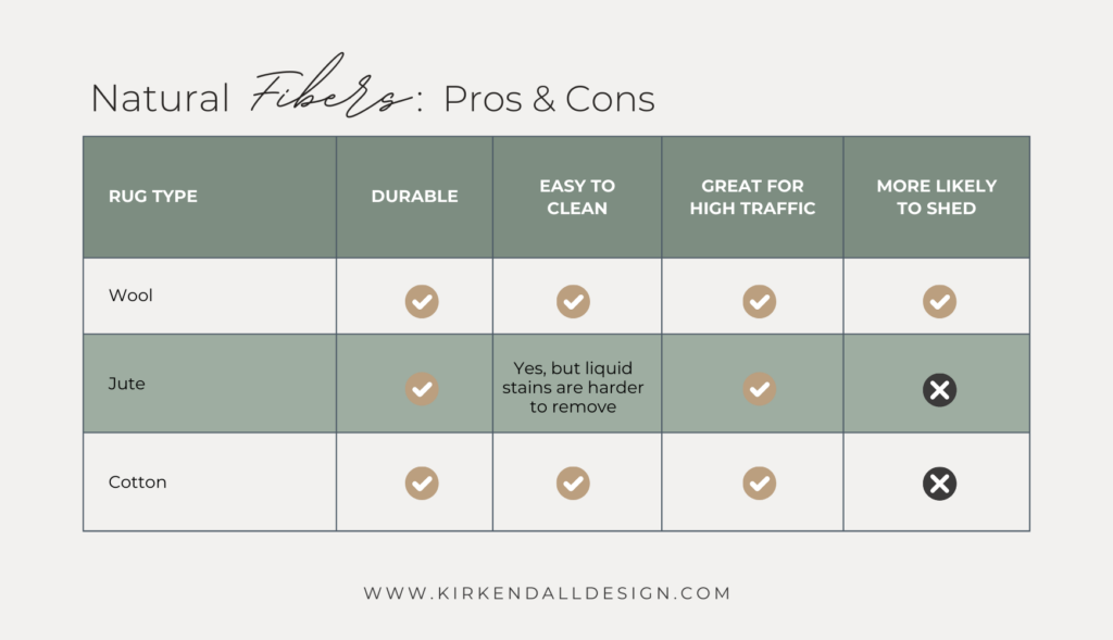
Wool
Wool is tough and resists moisture, making it ideal for busy areas. Its coil- shaped fibers spring back, perfect for high traffic. Wool rugs vary, either tightly braided or soft and fluffy. They’re easy to clean and last long, though shedding may occur, especially in tufted rugs.
Jute
Made from thick plant fibers, jute is eco-friendly, affordable, and durable. Jute easily absorbs moisture which can make it difficult to remove stains. They can be vacuumed to keep them free of dirt, but for any spills, they should be blotted immediately and hung to dry.
Cotton
Cotton rugs are soft, smooth, and durable, though not as tough as wool. Fibers come in short, long (like shag), or hand-knotted styles. They’re super easy to clean—just toss them in the washing machine.
Semi-Synthetic Fibers
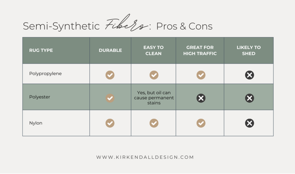
Polypropylene
Polypropylene rugs are machine-made and are stain, moisture, and fade resistant. They are great for high traffic areas. They offer a soft texture, are easy to clean, and can be used indoors and outdoors. It is recommended to vacuum these rugs frequently to keep them free of dirt and dust.
Polyester
When blended with other natural fibers, polyester creates soft and plush rugs that are beautiful, durable, and affordable. They are machine-made and resist stains, moisture, and fading. However, they retain moisture, so they’re best suited for rooms with minimal spills.
Nylon
Nylon rugs are very durable and great for high traffic areas. They can be vacuumed but the beater bar should be disabled.
Viscose
Viscose is a semi-synthetic material made from treated wood pulp and woven to resemble silk. Viscose rugs are very durable, but they should be professionally cleaned because spot cleaning can affect their color and texture consistency.
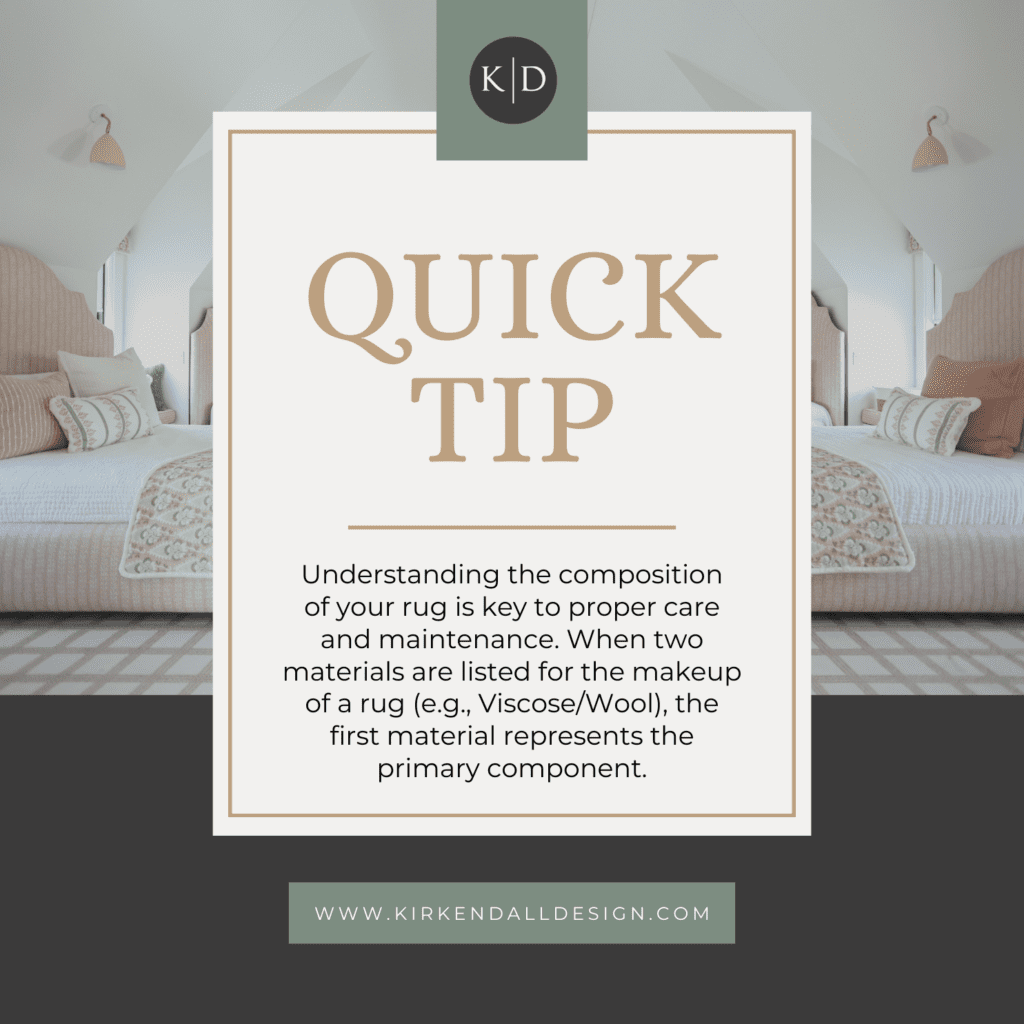
- Viscose is a blendable material so you’ll often find rugs made of Viscose/Wool or Viscose/Cotton.
- It’s important to blot, not rub, when wet. Professional cleaning is recommended for any rug containing viscose.
- Performance rugs with viscose include an acrylic overlay that protects the fibers.
Tip: When two materials are listed for the make up of the rug (i.e. Viscose/Wool), the first material listed will represent the main material of the rug.
Care & Keeping of Your Rug
Caring for your rug starts with knowing the right cleaning method based on its material. Some rugs are durable enough for machine washing, while others need gentle spot cleaning or professional care. Here’s a breakdown of cleaning recommendations by rug type.

While professional cleaning is ideal for hand-knotted or heirloom rugs, most others can be cleaned at home with a few easy steps. Follow this simple guide to safely remove stains and protect your rug’s fibers.
- Blot to remove any excess dirt or liquid
- Mix water with a small amount of liquid mild detergent
- Blot the spot with a sponge and the detergent solution
- Be sure not to rub as this can make the stain spread and go deeper into the fibers
- Clean until the stain is gone
- Blot the area with clean water until the soap is completely removed
- Allow rug to air dry
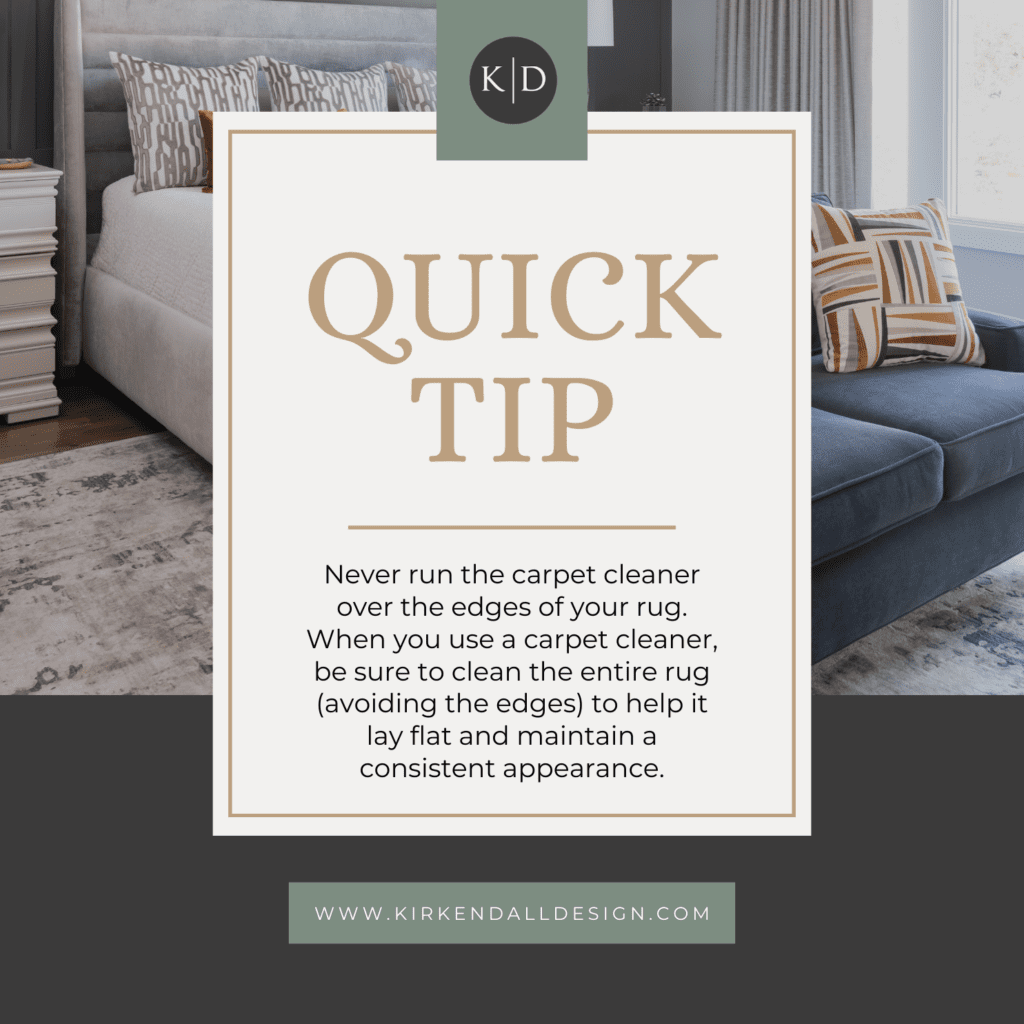
Tip! Never run the carpet cleaner over the edges of your rug. If you do use a carpet cleaner, be sure to clean the entire rug. This ensures the rug to lay flat to maintain a consistent appearance.
Types of Rug Pads
When choosing a rug pad, you’ll find several different options available. Selecting the right one is important to ensure it complements the type of flooring your rug will be placed on. Refer to the following guide to make an informed decision about which rug pad suits your needs best.
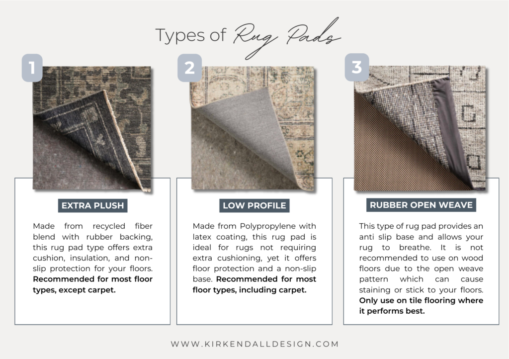
Premium Extra Plush
This recycled fiber blend with rubber backing offers extra cushioning, insulation, and non-slip protection for your floors.
Suitable for use on various flooring types:
- Hardwood
- Engineered Wood
- Linoleum
- Concrete
- Tile
- Vinyl
- Bamboo
- Laminate
Low Profile Premium Plush
Made from Polypropylene with latex coating, this rug pad is ideal for rugs not requiring extra cushioning, yet it offers floor protection and a non-slip base.
Recommended for use on various flooring types:
- Hardwood
- Engineered Wood
- Bamboo
- Laminate
- Tile
- Vinyl
- Carpet
- Concrete
- Linoleum
Rubber Open Weave
This rug pad provides an anti slip base and allows your rug to breathe, though it doesn’t provide cushioning. It is not recommended to use on wood floors due to the open weave pattern which can cause staining or stick to your floors. Only use on tile flooring where it performs best.
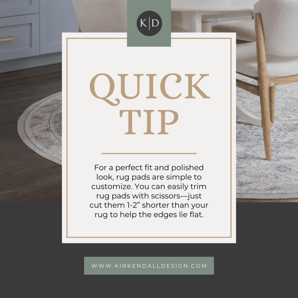
Tip! You can easily trim rug pads with scissors. Trim them 1-2” shorter than your rug for the edges to lie flat.
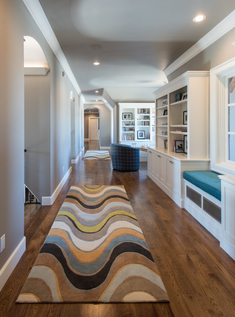
Finding the Perfect Rug Size
Choosing the right rug size significantly impacts a room’s visual appeal. A rug that’s too small won’t cover all areas, making the room seem cramped. An overly large rug can obstruct doors and high-traffic zones. Below, we guide you through each room to help you select the perfect-sized rug.

Entryway
An entryway rug should be proportionate to the doorway size. A 4×6′ rug is usually ideal, as a single front door is typically 3 feet wide.
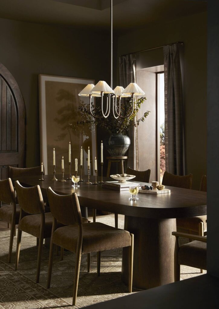
Dining Room
As a rule of thumb, when dining chairs are tucked under the table, their legs should rest on the rug. However, when chairs are pulled out, it’s not essential unless it affects stability. Dining room rug sizes commonly range from 8×10′ to 9×12′, depending on the table size.
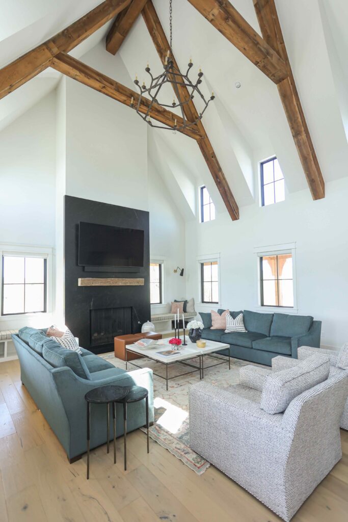
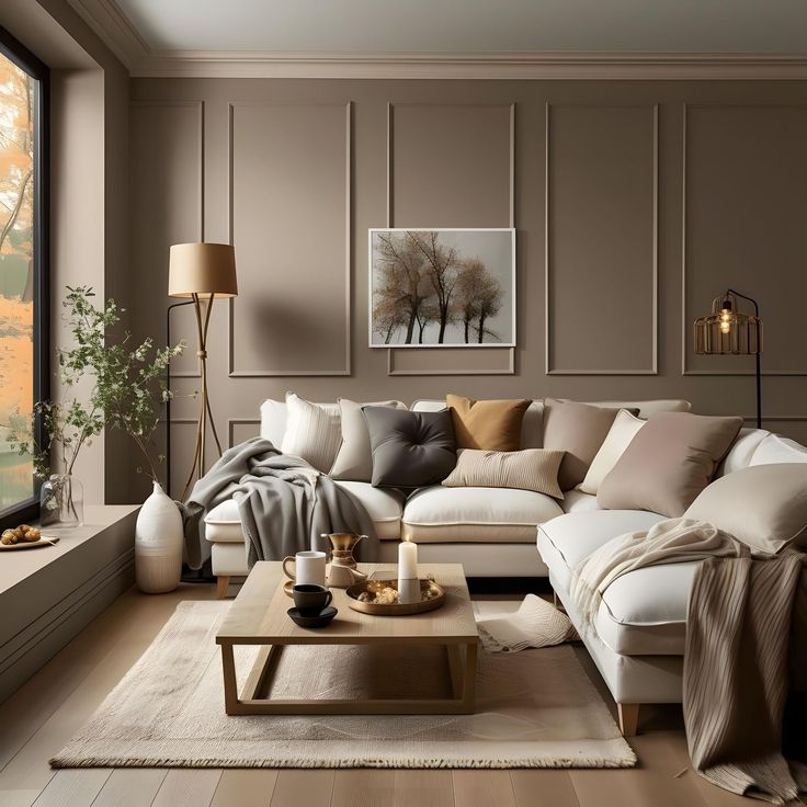
Living Room
To ensure a cohesive look, a living room rug should extend to accommodate all furniture, ideally with at least one leg resting on it. Typically, furniture should overlap the rug by up to 6 inches.
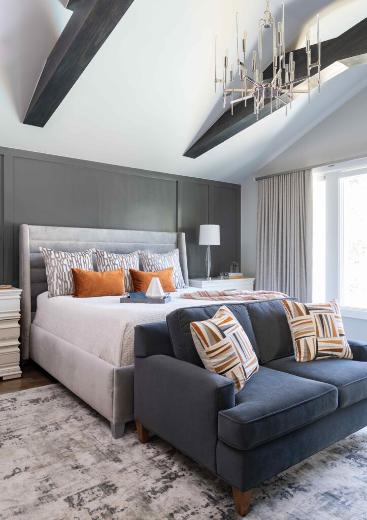
Bedroom
The size of your bed will determine the dimensions for your bedroom rug. The rug doesn’t necessarily need to extend all the way to the headboard; positioning it in front of the bedside tables is ideal. Stepping onto a soft rug when getting out of bed adds a cozy touch to your morning.
- TWIN: Recommended rug size is 5×7′
- QUEEN: Recommended rug size is 7×9′
- KING: Recommended rug size is 8×10′ or 9×12′
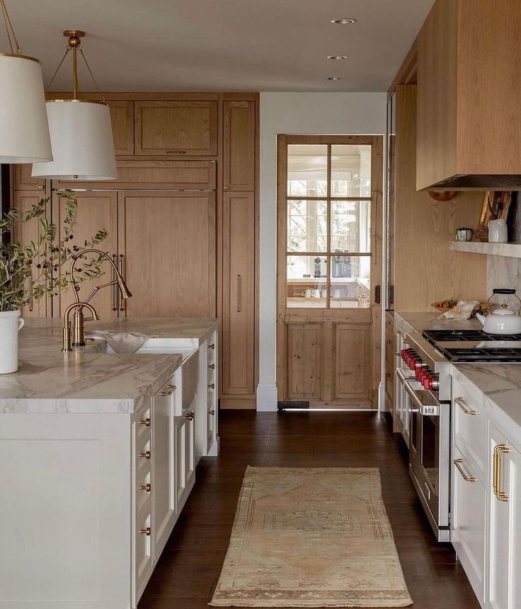
Kitchen
A kitchen rug, typically a runner, is placed between the perimeter cabinets and the island. It usually matches the island’s length, bridging the gap between the two sets of cabinets. Recommended 2×3′ and 3×5′.
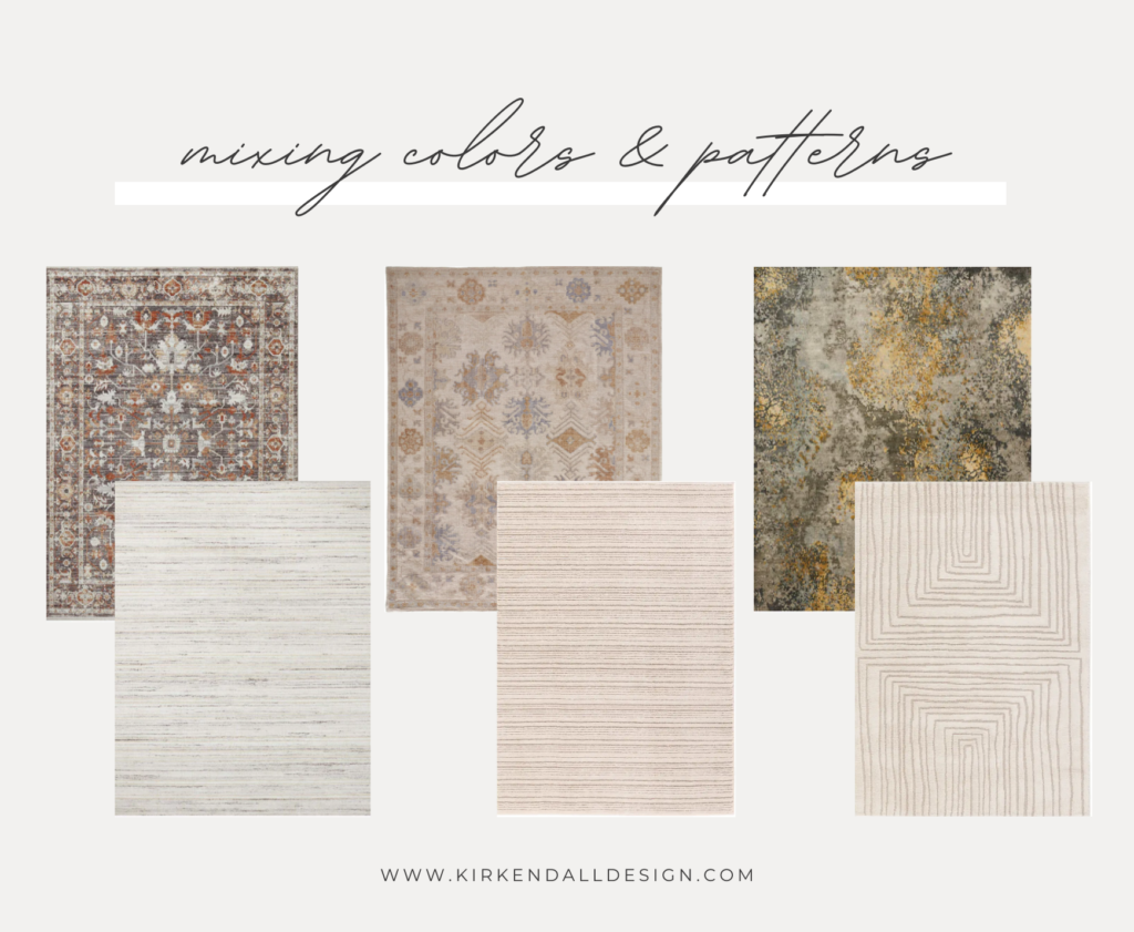
Rug Colors & Patterns
Coordinating two rugs within the same sightline is essential these days with houses often featuring open floor plans. When two rugs can be viewed at the same in your home, you do not want them to compete with one another. To find complementary rug styles, use the tips below.
- Choose colors from each room that look good together, and find rugs with similar colors or shades.
- Make sure the rugs share a shade of the main color in each room
- If you have a bold or large pattern in one room, pick a color from that rug and match it to a solid or small print rug in the next room.
- Using a textured rug, like jute or natural tones, adds variety to the room and blends well with other colors.
NEED GUIDANCE?
Need help selecting the perfect rug for your home? Our personalized Design Concierge service is here to guide you every step of the way. Whether you’re revamping a single room or redesigning your entire space, we offer expert support tailored to your unique design goals and preferences.