Spring is a natural season for renewal — not just outdoors, but throughout your home. Refreshing a space doesn’t have to mean starting over. Thoughtful, intentional updates will improve how a home looks, feels, and functions.
At Kirkendall Design, our approach to spring interior design is rooted in livable luxury: spaces that are timeless, personal, and designed to support real life. Here are 5 ways to refresh your space for spring.
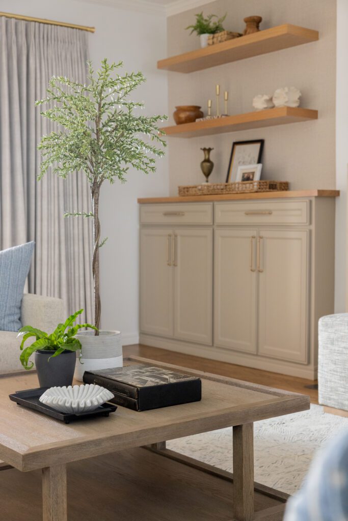
1. Rearrange Your Furniture
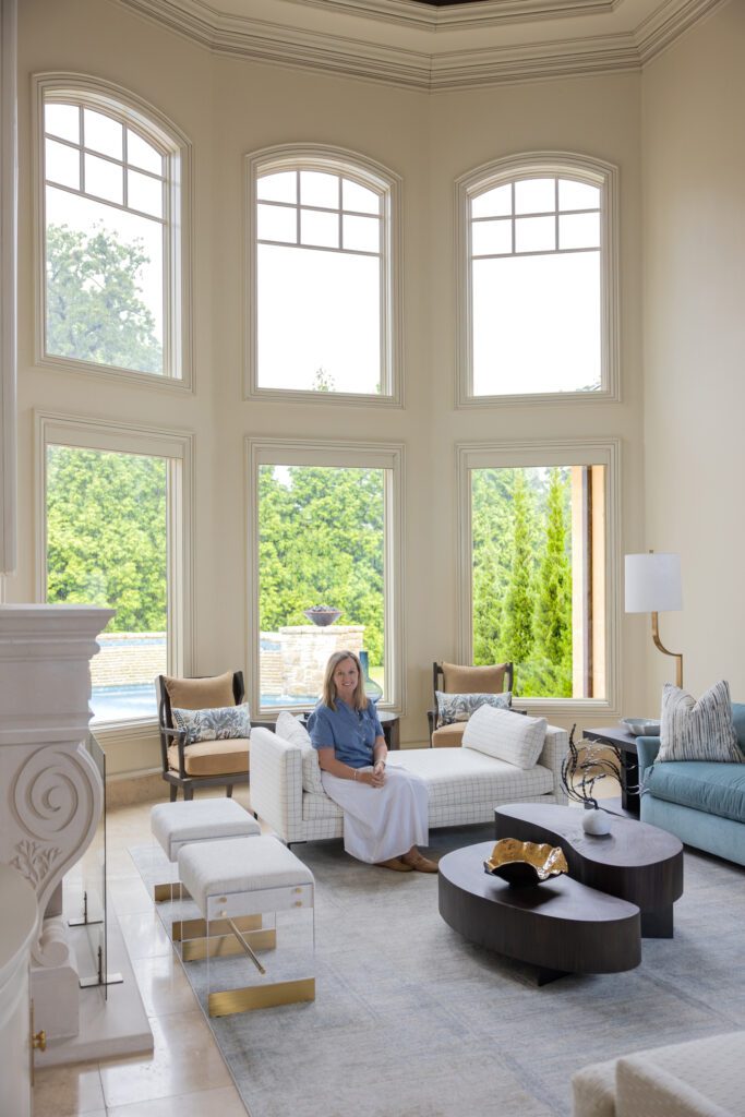
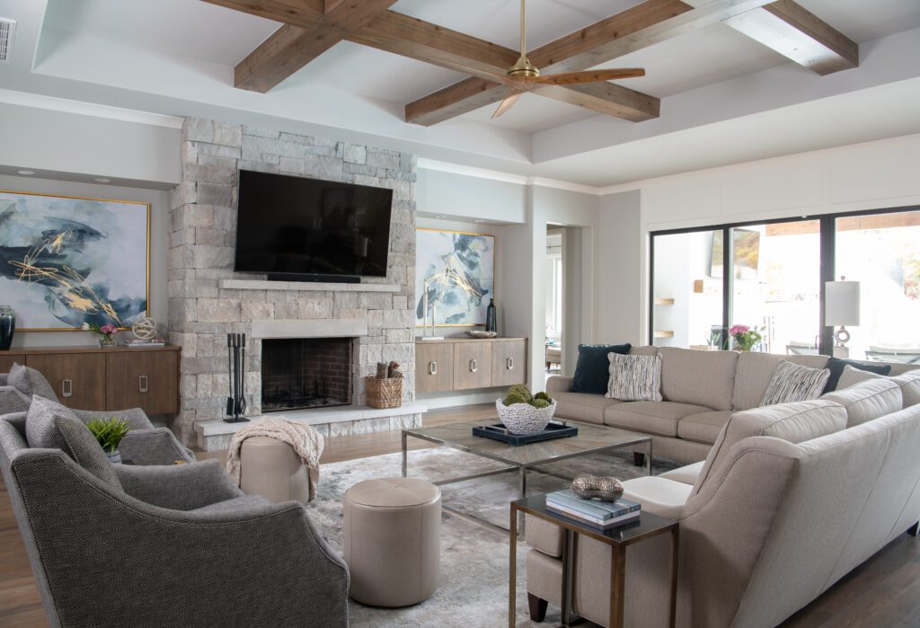
Let’s focus on the living room. Your living room should be designed for comfort and conversation, especially when thinking of hosting upcoming Spring holidays like Easter.
Reposition seating to create clear conversation zones in your living room. Pull furniture slightly away from the walls, angle chairs toward one another, and ensure seating encourages interaction rather than focusing solely on the television.
Design: Kirkendall Design / Photography: Michael Hunter

Design: Kirkendall Design / Photography: Michael Hunter / Luxury western-inspired living room from our Wellington South project.
Why It Matters: Furniture layout and scale shape how a room is used, not just how it looks. When seating is thoughtfully arranged, spaces feel more welcoming and intentional.
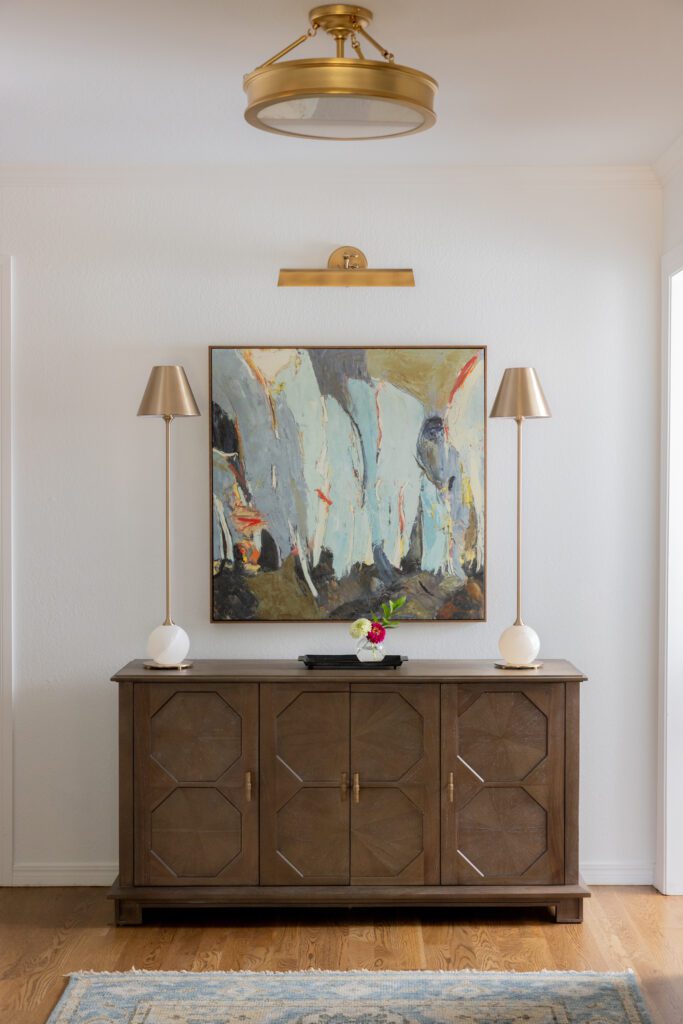
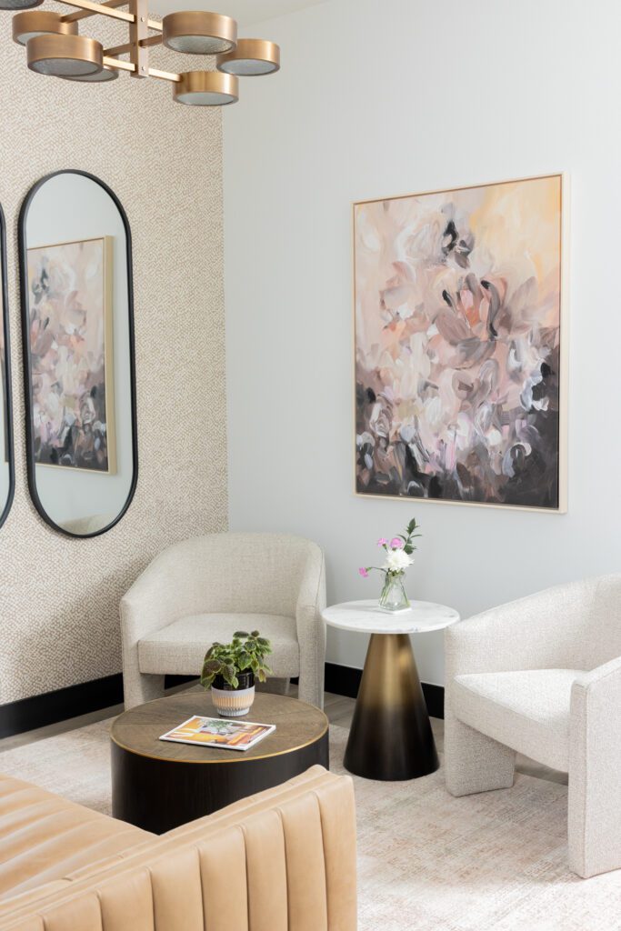
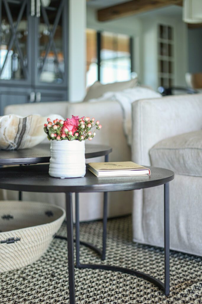
2. Refresh Your Coffee Table Accessories
If your coffee table has become cluttered, it may be time for a quick accessories refresh.
Design: Kirkendall Design / Photography: Valerie Wei-Haas
Design: Kirkendall Design / Photography: Sarah Baker / Sitting room in our Modern Ranch project
Remove everything, then return only three to five meaningful pieces: one organic element (such as fresh flowers, greenery or a branch), one sculptural object, and a functional piece like a book or tray.
Why It Matters: Luxury interiors should feel curated rather than crowded. Editing allows each piece to shine while creating a personalized yet refined space.

3. Create a Welcoming Entry
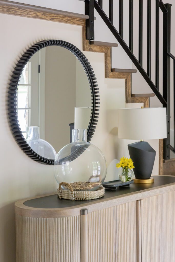
Design: Kirkendall Design / Photography: Valerie Wei-Haas / Modern entry from our Grand Lake Lakehouse project.
Your entryway sets the tone for your entire home — it’s the first impression your guests experience, so how it looks and feels matters. Add one grounding element, such as a rug or bench, one vertical moment like artwork or a mirror, and one practical piece for daily essentials like keys or mail. It’s that simple.
Why It Matters: A well-designed entry needs to feel calm and functional. Adding these essential elements will help bring organization and a welcoming experience.

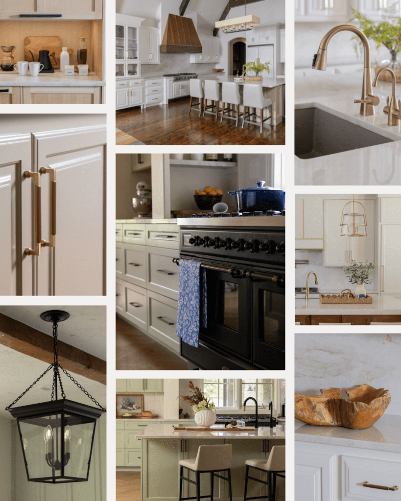
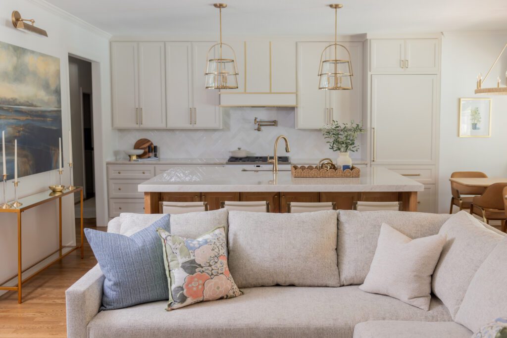
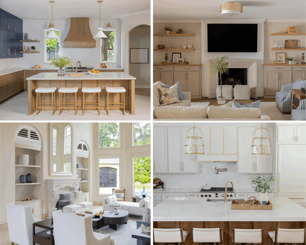
4. Minimize Clutter in the Kitchen
Spring is an great time to bring a lighter, more open feeling to the kitchen. Clear countertops of excess items, keeping only one or two intentional vignettes. Store small appliances inside cabinets and allow cabinetry, finishes, and architectural details to take center stage.
See our recent kitchen roundup for more inspiration.

Design: Kirkendall Design / Photography: Valerie Wei-Haas
Why It Matters: Reducing visual noise lets craftsmanship shine, so your kitchen feels calmer and more refined. Does your kitchen need updating? Let’s talk about the possibilities.
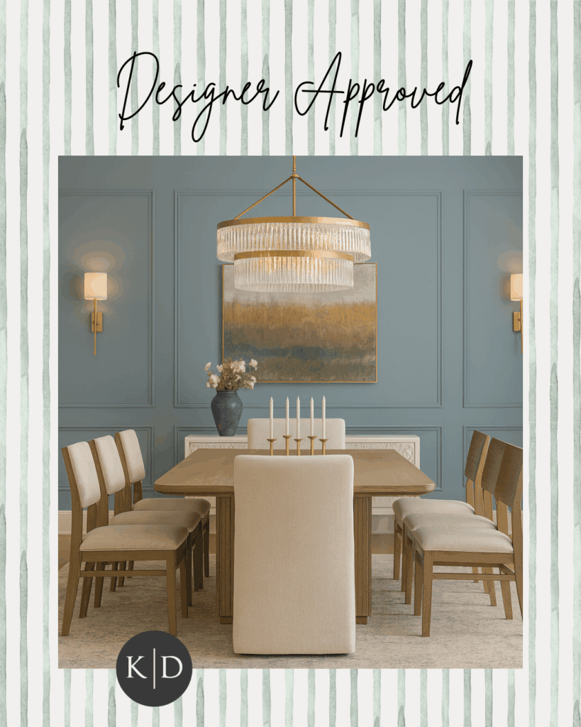
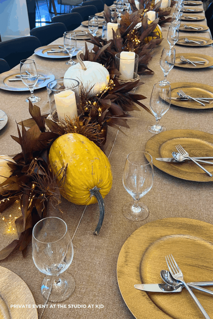
5. Ground Your Dining Room
Notice how your dining room feels — not just how it looks. You want to create a space where life slows down and meaningful conversations are shared.
Center the rug beneath the dining table, ensuring it’s large enough for chairs to remain on it when pulled out. Switch out your dining room light fixture for a new one or adjust the height to create more intimacy and warmth.
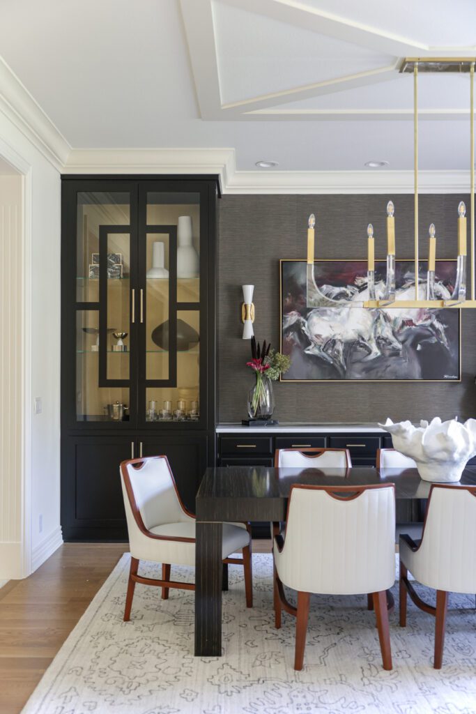
Design: Kirkendall Design / Photography: Sarah Baker / Luxury dining room in our Wellington South project
A Thoughtful Spring Reset
Refreshing your home for spring doesn’t require a renovation — just intention. These small updates reflect the same philosophy we bring to every Kirkendall Design project: creating timeless, livable spaces that tell your story and support the way you live.
If you’re ready for a more comprehensive refresh or planning a future renovation, our interior design team would love to help you envision what’s possible. Submit a design request to schedule your discovery call.