Archive for the ‘General’ Category

When Is the Best Time to Hire an Interior Designer?

Posted on No Comments

A frequent question we get is: When is the best time to hire an interior designer? It’s a great question, and the simple answer is: as soon as possible!

Furniture & Styling Projects

When is the best time to hire an interior designer for Furniture & Styling projects? Some of the most successful projects begin at least 6 months in advance, and here’s why. Once a contract is signed, the design phase typically takes 4 to 6 weeks to develop a detailed plan.

Additionally, lead times for custom furniture can vary, sometimes taking up to 6 to 8 weeks to arrive. By starting design meetings in advance, it gives us time to thoroughly understand your vision, plan out the details, and ensure everything arrives on schedule.

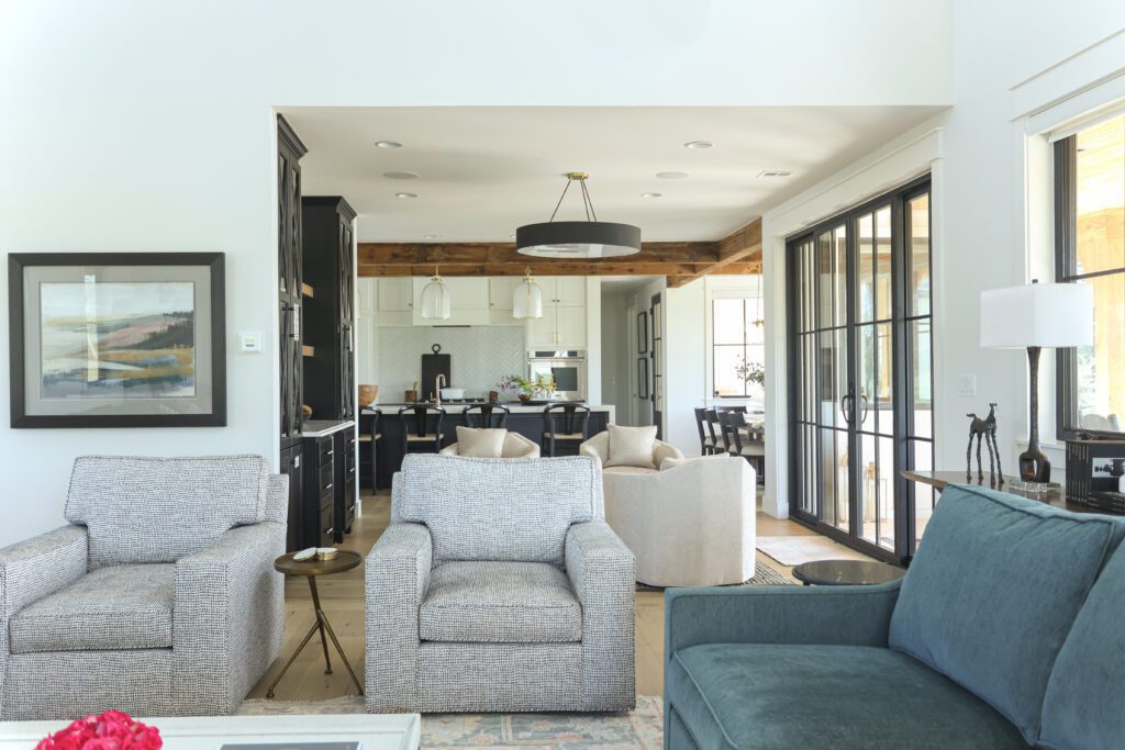
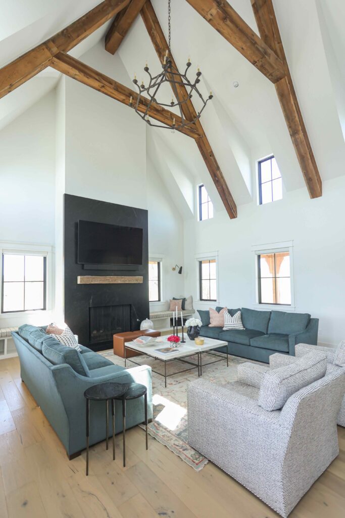
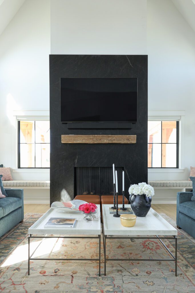
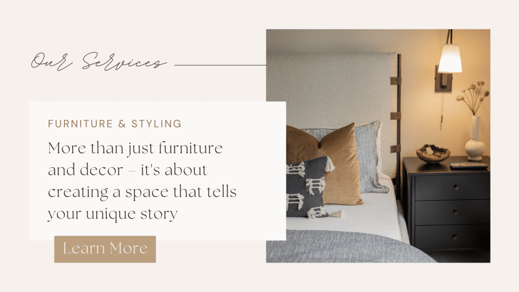
Our Furniture & Styling service goes beyond simply selecting new furniture and decor; it’s about creating a home or commercial space that tells your unique story. From the design plan to selections, we manage everything from ordering, tracking, and installation. Explore our Silverthorne home for project inspiration.
Custom Home Builds & Commercial Projects

If you are starting a custom home or commercial construction project, we recommend that you hire an interior designer either before or at the same time that you begin working with an architect. This collaboration allows us to understand your vision, add custom design features, and ensure that the entire space reflects your style.

Of course, you can also hire a designer after your architect has completed the plans if your needs are more focused on material selections, finishes, and equipment and appliances (often referred to as ‘FF+E’ in contracts, which stands for ‘furniture, fixtures, and equipment’).

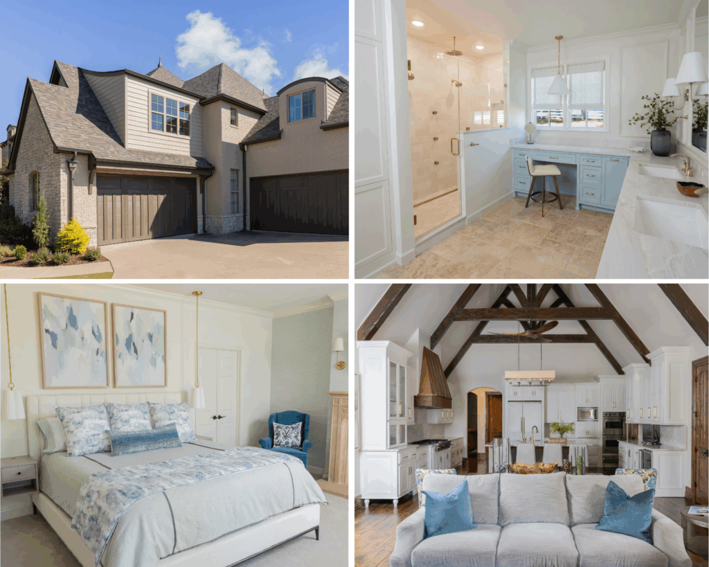
Our New Construction service offers complete interior design services for custom homes and commercial design projects. Our team collaborates with your architect, and/or builder, from start to finish, to ensure that every detail aligns with your vision.

Renovations

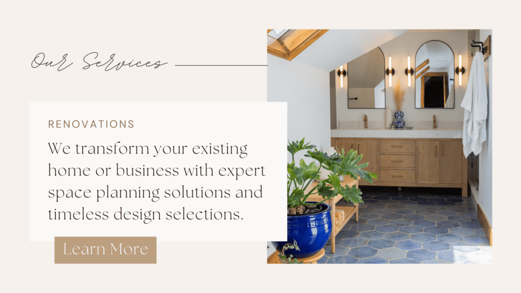
For significant renovations, especially those with structural changes, it’s important to hire an interior designer before hiring a contractor. Interior designers specialize in finding solutions to interior space challenges and can provide design plans that meet your goals and lifestyle needs. We are experts at reimagining spaces to create timeless and cohesive interiors that tell the unique story of our clients. 

We also provide specification sheets or “spec sheets” for your project, which are crucial documents that outline detailed information about the materials, products, and finishes. These serve as a reference for both designers and contractors, ensuring that everyone involved in the project has a clear understanding of the design plans and requirements.

At Kirkendall Design, we specialize in home renovations and commercial remodels, including luxury kitchen and bath remodels. We work with you and your contractors to transform your space into a beautiful and personalized space that meets your needs. 
Now’s The Time

As the year winds down, now is the time to start planning your luxury interior design projects for 2025. Start the process by scheduling your complimentary discovery call and design request form on our website.

Start planning today and let Kirkendall Design help you bring your 2025 project to life!
Benjamin Moore’s 2025 Color of the Year: Cinnamon Slate

Posted on No Comments

We love this time of year in the design world with all the color announcements. Benjamin Moore recently revealed its 2025 Color of the Year, Cinnamon Slate, and the team at Kirkendall Design can’t wait to share our thoughts on this rich, moody hue!

If you missed it, we shared our favorite colors from Sherwin-Williams’ 2025 Colormix Forecast—check it out here. While Pantone hasn’t announced their color of the year yet, the predicted color is Future Dusk–a mix between deep violet and midnight blue. We’re excited to see the official color soon.

Now, back to Benjamin Moore! Color experts describe the Color Trends 2025 palette as “quietly colorful hues that are calm, confident, and adaptable, yet distinct. These shades invite you to explore all ends of the color spectrum.”

Keep reading for our design team’s thoughts on the 2025 Color of the Year and how they envision using the Color Trends palette for clients.

Photo by Benjamin Moore; Wall: Cinnamon Slate 2113-40, Trim: Glacier White OC-37

Photo by Benjamin Moore; Upper Wall: Cinnamon Slate 2113-40, Wainscoting: Ashwood Moss 1484

Photo by Benjamin Moore; Walls: Sea Salt CSP-95, Trim: Glacier White OC-37

Photo by Benjamin Moore; Walls: Tissue Pink 1163, Trim: Glacier White OC-37

Photo by Benjamin Moore; Wall: Tissue Pink 1163; Cabinets: Ashwood Moss 1484, Trim: Glacier White OC-37

Photo by Benjamin Moore; Walls: Sea Salt CSp-95, Trim: Glacier White OC-37


Our Interior Design Team’s Thoughts on the Benjamin Moore Color of the Year: Cinnamon Slate

Julia Kirkendall, Owner and Principal Designer

Cinnamon Slate is a beautiful color for an accent color, and its subtle hue and brown undertones make it easy to use. I’d love to use it in a study or library to create a dark, moody background. My favorite combination from the 2025 palette is Cinnamon Slate with Chowning’s Brown and Tissue Pink—a classic mix I can’t wait to use for a client.”

Jayne, Senior Designer

Cinnamon Slate surprised me! The name makes me think of rust or orange tones, but it’s actually a warm, dusty purple. I’d use it as an accent wall in a bedroom or powder bath. In a bedroom, I’d pair it with soft browns, greens, and a hint of pale pink in the bedding or deep gray accents for a more masculine touch.

My favorite combos with Cinnamon Slate are Rosepine, Sea Salt, Chowning’s Tan and Leather Saddle Brown. But, some of the tan/brown could be brought in with textiles like leather and wood instead of paint.”


Debbie, Interior Designer

Cinnamon Slate has such a calming effect, making it perfect for bedrooms, nurseries, or powder baths. I’d pair it with Sea Salt or Paris Rain in a bedroom or nursery for a soothing feel. From the 2025 palette, I’d use Rosepine on a kitchen island surrounding it with Sea Salt cabinets.”

Lauren, Senior Designer

“This is the perfect color if a client was specifically looking for a purple or mauve tone. I could see it working in a small powder bath, paired with a bold wallpaper, or used to paint a statement piece of furniture. From the 2025 palette, Sea Salt is my favorite—it would look great from walls to trim or cabinetry. Ashwood Moss could be a great exterior color.”


Lindsay, Senior Designer

“I could see Cinnamon Slate fitting perfectly in a historic home, maybe as a cabinet color or in a moody powder bath or butler’s pantry. The depth of this color is amazing, and I’d play with different sheens—flat on the ceiling, satin on the trim—to create contrast. It would also look great as a plaster feature wall, adding texture and age with venetian plaster or roman clay.”


We see so much potential in Cinnamon Slate and the Color Trends 2025 palette and can’t wait to use these colors in future designs!


Thanks for reading! As the year winds down, now is the time to start planning your luxury interior design projects for 2025. Start the process by scheduling your complimentary discovery call and design request form on our website.

The ‘Why’ Behind The Studio at K|D

Posted on No Comments

Wide angle shot of The Studio at KD in Tulsa with its all black exterior, white lettering and lush landscaping

This time last year we celebrated 30 years of Kirkendall Design and the opening of The Studio at K|D! We wanted to take a moment to look back at the ‘why’ behind The Studio and share some exciting updates. 

Over the years of providing interior design services in Tulsa, we’ve built amazing relationships with our clients, helping them create spaces that reflect their unique stories. These connections and our desire to help people live fuller, more beautiful lives is what led to the creation of The Studio at K|D. 

Kirkendall Design owner and interior design, Julia Kirkendall helps client choose samples

In 2022, we began renovating The Studio—previously known as Grogg’s Green Barn, a local plant nursery—into a stunning multi-use space. Now, it serves as our interior design studio and a versatile event venue and photography studio.

We’ve learned a lot over the past year and made a few updates based on your feedback. Here’s what’s new at The Studio at K|D!

Photography Studio

One of the biggest changes since opening, is that you no longer need a memberships to use our photography studio! Our focus remains on high-end lifestyle, corporate, and branding photoshoots, catering to business leaders and professionals looking to elevate their brands with fresh photography.

Whether you are a photographer, or needing photography services, The Studio is the perfect backdrop. Schedule today!

client sits at a conference room table during a professional branding photoshoot at The Studio at K|D

professional photography at The Studio at K|D

Photography client posing on couch at The Studio at K|D for new professional headshots

professional brand shoot at The Studio at K|D's photography studio in Tulsa

Signature Events

Our outdoor space is now complete, featuring a turf lawn, pergola, and spacious deck—perfect for outdoor entertaining! Inside, we can host up to 120 guests for corporate functions, philanthropic events, and business meetings. While we specialize in corporate and philanthropic events, we also welcome select personal occasions for Kirkendall Design clients and referrals. Learn more or inquire.

guests eating having family-style dinner outside at The Studio at K|D, plus string lights on the pergola and turf lawn for relaxing

family style dinner set up for an event at The Studio at K|D in Tulsa

Sweet blue and white set up for a baby shower hosted at The Studio at K|D in Tulsa

family style dinner set up for an event at The Studio at K|D.

Flower Farm

Our flower farm, managed by The Heirloom Acre Farm, has bloomed beautifully, providing us with fresh flowers in The Studio every week. Our recent U-pick events, hosted by The Heirloom Acre, were a big hit. We’re grateful for their partnership and look forward to even more flower experiences next season!

Beautiful blooms in The Studio at K|D Flower Farm in Tulsa

Rows of sunflowers at the Flower Farm at The Studio at K|D in Tulsa

Beautiful blooms in The Studio at K|D Flower Farm


Lifestyle Workshops

We kicked off our workshops with a bang this year, and we loved seeing people come together for classes on cooking, gardening, sourdough bread making, and more! We’re working on the line up for future workshops. See upcoming events and workshops here!

cooking workshop at The Studio at K|D in Tulsa

Several workstations set up in The Studio at K|D for sourdough bread making workshop

learning knife skills at our knife skills workshops led by a local chef

Explore The Studio at K|D website and be sure to sign up for the studio newsletter.

How to Choose the Perfect Paint Sheen

Posted on No Comments

Photo by Valerie Wei-Haas / Design by Kirkendall Design

The right paint sheen can transform your walls from a quiet backdrop to the star of the show. It’s all about choosing a finish that balances style, durability, and practicality. With options ranging from velvety matte to reflective gloss, paint sheen refers to the level of light reflection on the surface, helping you create the perfect ambiance for your space. Let’s explore the different sheen options and how our interior design firm uses each one.

Photo by Sherwin-Williams

Paint Sheen: Flat

Photo by Valerie Wei-Haas / Design by Kirkendall Design

This sheen offers minimal light reflection, helping to smooth out surface textures and imperfections. It’s easy to touch up but harder to clean, making it perfect for ceilings.

Paint Sheen: Matte/Eggshell

Design by Kirkendall Design

A matte or eggshell sheen offers a smooth finish with low to medium light reflection, making it excellent for high-traffic areas like bedrooms, hallways, dining rooms, and living rooms. It hides imperfections well, is easy to touch up, and has just enough sheen to resist moisture.

Paint Sheen: Satin

Photo by Sarah Baker / Design by Kirkendall Design

Satin sheens are both durable and easy to clean. They’re ideal for cabinets, garage walls, trim, and also moisture-prone areas like bathrooms – spaces where you want a balance of durability and a slight glossy finish.

Paint Sheen: Semi-Gloss

With higher light reflection, semi-gloss sheens are perfect for kitchens, baseboards, and doors. It’s durable, washable, and easy to clean, though it can show imperfections and are a bit harder to touch up.

Paint Sheen: High-Gloss

Photo credit: centsationalstyle.com

High gloss sheen, as the name suggests, has the highest level of light reflection, creating a mirror-like finish. We don’t use it often but it can create a high-end look on certain surfaces like cabinets, doors, and furniture.


Designer Inventory Sale, Oct 2-3

Posted on No Comments

Hey Tulsa friends! Join us for our 2-day Designer Inventory Sale at Kirkendall Design on October 2nd and 3rd from 10 AM to 3PM! Shop discounted designer furniture, accessories, art, lamps, rugs, throw pillows, and MORE!

We’ll also have fresh flowers for sale from Heirloom Acre Farm, plus complimentary refreshments.

EARLY BIRD ACCESS – (All Spots Reserved!)

Our Early Bird tickets were claimed faster than we anticipated! Thank you to everyone who signed up. If you didn’t snag a ticket, don’t worry—you can still shop the sale from 10 AM to 3 PM on October 2-3.

OPEN SHOPPING – NO TICKET NEEDED: October 2-3 from 10:00 AM – 3:00 PM


SHARE ON FACEBOOK

Visit the Facebook Event Page to invite your friends & family!

ADDRESS

Kirkendall Design
10105 E. 61st Street Tulsa, OK 74133

Our Design Team’s Favorite Paint Colors From the Sherwin-Williams 2025 Colormix Forecast

Posted on No Comments

As an interior design firm, we’re (obviously) always excited to see what color trends are bubbling up for the new year. Benjamin Moore announced their Color of the Year as Cinnamon Slate, and the Sherwin-Williams 2025 Colormix Forecast does not disappoint! Their latest collection of the top 48 trend-forward colors is full of fresh, vibrant hues to inspire you.

Curated by more than 20 design professionals from across the country, the Colormix Forecast is rooted in deep color analysis, blending expertise from both residential and commercial interior design. This team brings a wealth of knowledge in how color shapes environments, giving color inspiration that meets a wide range of design needs.

There are four distinct color palettes in the Colormix Forecast. Here’s a closer look at the Sherwin Williams 2025 colors!

Sherwin-Williams 2025 Colors – Chrysalis Capsule

Full of peaceful colors, the Chrysalis Capsule is “inspired by wood tones and freshly turned earth.” We asked our interior design team to choose their favorite palettes from the Sherwin Williams 2025 color collection. Out of the four options, three of our designers chose Chrysalis as their top pick. They loved its warm tones and calming mix of colors.

Photo by Sherwin-Williams

Cabinet: Drift of Mist SW 9166, Wall: Thunderous SW 6201

Photo by Sherwin-Williams

Walls: Pure White SW 7005, Sealskin SW7675


Sherwin-Williams 2025 Colors – Paradox Capsule

The Paradox palette is more playful with a bright mix of “grounding neutrals and candy-coated accents.”

Photo by Sherwin-Williams


Photo by Sherwin-Williams

Photo by Sherwin-Williams

Sherwin-Williams 2025 Colors – Wellspring Capsule

Filled with warm neutrals that you would find in nature, the Wellspring collection is meant to “nurture and nourish” through color. It was another favorite among our design team for its neutral base, which still offers bold accents for those who enjoy experimenting with color while preferring a more muted environment.

Photo by Sherwin-Williams

Photo by Sherwin-Williams

Commercial space inspiration by Sherwin Williams

Commercial space inspiration by Sherwin-Williams

Sherwin-Williams 2025 Colors – Kindred Capsule

A well rounded combination, the Kindred Capsule invites you to “embrace abundance with traditional neutrals and electric brights.” The Kindred collection stood out as a top choice for our owner and principal designer, Julia Kirkendall. She highlighted how the colors are comforting and envisions it used in spaces that promote rest and renewal.

Photo by Sherwin-Williams

Walls: Redend Point SW 9081, Trim: Creamy SW 7012

Photo by Sherwin-Williams

Accent Nook: Rockweed SW 2735, Wall: Creamy SW 7012

Photo by Sherwin-Williams

Board and Batten: Icy Lemonade SW 1667, Walls: Creamy SW 7012

Our Interior Design Team’s Top Picks from Sherwin-Williams’ 2025 Colors

Here are Kirkendall Design’s favorite color selections from the Sherwin-Williams’ 2025 Colormix Forecast!

Julia’s Favorite Colors

Which color trend palette is your favorite?
My favorite is Kindred because it represents colors that are nesting and comforting, which is what we lean to when there is any unrest around us. Also, with the election year and wars in the world I think people are looking for their sanctuary at home that can help refresh, renew, and restore them.

What is your favorite color(s) out of all of the palettes?
My favorite color is Thunderous, but the Dark Night is such a good option for connecting color pallets in your home and giving them fresh looks.

Jayne’s Favorite Colors

Which color trend palette is your favorite?
Wellspring-because it has a great neutral palette, but also offers some bold choices for those who dare to experiment but thrive in neutral environments.

What is your favorite color in the Chrysalis collection?
Studio Clay! It’s a great neutral but the undertones of gray/green give you some color where you might not want to stick with a beige, or greige.

How do you envision that color being used in a client’s home or commercial project?
I think Studio Clay could be used in a variety of situations. Bedroom, study, bathroom walls. Cabinets in laundry or study or even a bathroom.

Lauren’s Favorite Colors

Which color trend palette is your favorite?
I would choose Chrysalis. I’m enjoying that warmer color tones are trending and I think this is a nice collection that anyone could incorporate into their home.

What is your favorite color in the Paradox collection? Cascades!

How do you envision that color being used in a client’s home or commercial project?
In a home I think that the dark green color could be used on a piece of furniture, a bathroom vanity, maybe even as an accent in a kitchen.  I would also love to see it on a front door.  

Debbie’s Favorite Colors

Which color trend palette is your favorite?
I would say overall I like Chrysalis for open areas or field colors.

What is your favorite color in the Paradox collection? Dark Night!

How do you envision that color being used in a client’s home or commercial project?
I like the overall moodiness it can bring in a more concealed space.  I would use it on an accent wall in an office or a piece of furniture.  It would also be good in a powder bath with gold accents.

Lindsay’s Favorite Colors

Which color trend palette is your favorite?
Chrysalis – I am a neutral girl through and through and I like the range of browns and tans here, plus there is a light toned mauve/lilac that is pretty as well. Thunderous can lean a little on the green side which I think goes well with all the other neutrals. Overall, it’s a color scheme that really brings the outdoors in, which I love. That, to me, is calming and authentic! 

What is your favorite color in the Wellspring collection?
Gallery Green is my favorite in that collection!

How do you envision that color being used in a client’s home or commercial project?
I would envision Gallery Green as a laundry room or mudroom cabinet color. Or possibly a powder bath color!


Thank you for reading! This post was inspired by Postcards from the Ridge. We loved her deep dive into Sherwin Williams 2025 Colors – Find it on here.


Creating Livable Style: The Role of Performance Fabrics in Luxury Interior Design

Posted on No Comments

Up close phot of white couch featuring performance fabrics sourced by Kirkendall Design in Tulsa OK

Choosing the right fabrics and furniture for your home is essential, especially if your life includes kids, pets, or frequent entertaining. At Kirkendall Design, we often source performance fabrics for our clients because they offer the perfect blend of style, function, and durability.

What Are Performance Fabrics?

Performance fabrics are specially designed to resist stains, spills, and everyday wear. Whether it’s blotting a wine spill or removing crayon marks, these fabrics are built to handle life’s little messes. We often source them for high-traffic pieces like sofas, sectionals, dining chairs, and outdoor furniture. At Kirkendall Design, we have access to hundreds of performance fabrics through our exclusive interior design vendors.

With three decades of experience in the interior design industry, our design motif has always been “Creating Livable Style,” and performance fabrics are key to achieving that. While these fabrics have advanced significantly in durability and function, it’s important to remember that they aren’t indestructible.

Kirkendall Design Hosts ‘Havana Nights’ Charity Dinner for Tulsa’s RMHC

Posted on No Comments

outdoor dining set up at The Studio at K|D in Tulsa

We’re excited to finally share some highlights from our recent Havana Nights event! A few months ago, we had the honor of hosting a “Havana Nights” event to benefit Tulsa’s Ronald McDonald House Charities (RMHC). Chef Shannon Smith prepared a delicious 5-course Cuban dinner for 40 guests, and we dined al fresco in our new outdoor space at The Studio at K|D.

Exterior Stone Refresh Q & A

Posted on

Exterior stone refresh using limewash, by Kirkendall Design

When considering a new home or updating the exterior of your home, many clients are not happy with and struggle with the color of their stone. We recently shared how we helped our client in Tulsa improve their home’s curb appeal with an exterior stone limewash treatment. If you missed it, be sure to check it out here.

We partnered with Beeler Painting – a local and trusted Tulsa company to execute the limewash. To gain a painter’s perspective on this exterior stone refresh, we consulted Austin Beeler from Beeler Painting.

Exterior Stone Refresh Q & A With Beeler Painting

before and after of dramatic exterior stone refresh using limewash

KD: Any home project can seem daunting when doing it alone. Even with the assistance of contractors, homeowners can feel overwhelmed by the countless design and color selections. From a painter’s perspective, why is it important to work with an interior designer when choosing to change your exterior brick or stone?

Beeler Painting: A professional, experienced interior designer can navigate the challenge of selecting the correct color and technique. They are also helpful in working as a partner to help instill additional trust in the customer as we go through the process.

KD: Over time, due to sun and rain exposure, exterior stone can take on unflattering color palettes. Similar to how we all age and change (no matter how much we fight it!), exterior stone will change colors. Is this a challenge that your company has seen a lot of homeowners in the Tulsa area facing?

Beeler Painting: Due to most of Tulsa’s Stonework being Sand Stone and Fieldstone, I believe many homes could be transformed from limewash, it can drastically change the overall appearance of their home.

KD: Many homeowners may choose to pursue costly plans to replace their stone or repaint the entire exterior. How does this particular paint/limewash process address exterior discoloration?

Beeler Painting: Limewash offers a relatively low cost solution to alter the color of stone, while maintaining a natural stone look. Paint is another option but many people prefer the look of natural stone.

Watch the Exterior Stone Refresh Reel on our Instagram!


We take immense pride in the opportunity to solve problems like these and love to partner with local and skilled subcontractors, like Beeler Painting. If you’re facing a similar issue with your exterior stone, or need help with improving your home’s curb appeal – don’t hesitate to reach out.

Submit a design request, and let us take the guesswork out of your curb appeal project.

Exterior Stone Refresh

Posted on

Beautiful stone exterior after limewash treatment by Kirkendall Design.

Many homeowners choose natural stone as a way to add timeless beauty, durability, and character to their home’s exterior. However, as the stone changes over time it can become an unappealing color and detract from your home’s curb appeal.

Due to most of Tulsa’s stonework being Sand Stone and Fieldstone, many homeowners struggle with stone they are not happy with. We recently had the opportunity to help a client in Tulsa improve their home’s curb appeal and overcome this issue with an exterior stone limewash refresh!

The Problem – Why Exterior Stone Changes

Similar to how we all age and change (no matter how much we fight it!), exterior stone also changes colors and loses its charm. Over time, as mineral deposits work their way to the surface due to sun and rain exposure, rocks can take on unflattering color palettes.

Our client’s exterior was the perfect example of a weathered and discolored stone that needed to be refreshed. Initially, our client had intended to pursue a costly plan to replace their stone and repaint the entire exterior.

However during the initial consult, we discovered a limewash treatment would be a more cost-effective plan for addressing the issue and improving our client’s curb appeal.

Exterior Before –

Exterior of a beautiful home before limewash treatment. By Kirkendall Design.

Exterior of a beautiful home before limewash treatment. By Kirkendall Design.

Exterior of a beautiful home before limewash treatment. By Kirkendall Design.

The Solution – How To Refresh Your Exterior Stone

We wanted to see the natural variations of color in the stone, this is why we chose a limewash treatment. Limewash, when paired with the proper application technique, can completely transform the appearance of the stone at a fraction of the cost and still maintain the natural beauty.

We partnered with Beeler Painting – a local and trusted Tulsa company to execute the limewash. After several swatches and meticulous color mixing, we were able to find the perfect shade and develop a process to replicate on our client’s entire exterior. Our client not only loved the end result, but it saved them money and time!

before and after of dramatic exterior stone refresh using limewash

Exterior After –

exterior stone refreshed with limewash treatment

exterior stone refresh, limewash by Kirkendall Design


When limewash is not the best solution, paint is often a great option to refresh your home’s exterior. One of our favorite curb appeal projects was a remarkable transformation where we redesigned the exterior architecture and painted the brick on our client’s home. Such a simple, yet striking upgrade!

We take immense pride in the opportunity to solve problems like these and help clients tackle big home projects! If you’re facing a similar issue with your exterior stone, or need help with improving your home’s curb appeal – don’t hesitate to reach out.

Submit a design request, and let us take the guesswork out of your curb appeal project.

Read Pt. 2 of this Exterior Stone Refresh project here.