Posts Tagged ‘interior lighting’

Modern Ranch Reveal

Posted on

We’ve been teasing photos of this home for more than a year and now it’s finally time to share this project in its entirety! It’s always fun to reveal a whole house because you get to see the end result as it’s always been imagined and intended by our team.
This particular project originated when our longtime clients came to us with the idea to build a weekend home. Already owners of vacation homes in Florida and Wyoming, they purchased approximately 90 acres just north of downtown with the intent to build a ranch home to entertain family closer to their primary Tulsa residence.
After a couple of months weekending at the new house, they love it so much they have decided to make it their permanent Tulsa residence and sell their home in the city. As a designer I don’t know if there is any greater compliment. Let’s take a look!

Main Living
How a client will use a space dictates our design of it. The number one purpose of this home: hosting family. So, we designed it to do just that! From the fireplace to the kitchen, we designed the home with gathering in mind.
The house is about 4,000 square-feet and every room is large, so the furniture needed to match that scale. It also needed to accommodate plenty of people, which is why you will find so many seating opportunities throughout the open-concept kitchen, living and dining areas.
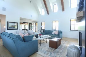
Our client is a “black-and-white” girl, but in this home she wanted to bring in color to evoke happiness and create a cheerful environment. We found a one-of-a-kind rug at market, which set our design in motion. From there, we chose the sofas and introduced subtle colors and patterns throughout the home that would play off each other. Of course, we kept the background neutral to keep that familiar black-and-white element and to let the colors shine.
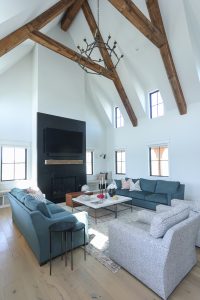
The living room’s soaring ceiling features reclaimed wood beams from Timber and Beam, and is adorned with a massive 66-inch-wide Ralph Lauren chandelier. We flanked the black granite slab fireplace with two large sofas and club chairs. You’ll have to look closely to find the TV in this room– we specifically chose the black granite as a way to disguise it above the fireplace.
Coffee Bar
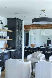
A coffee bar between the living area and kitchen offers an intimate space to gather with four swivel chairs that allow views into both rooms as well as the outdoors. This home may be for large groups of people, but we wanted to create intimate moments too. Any time you can gather chairs together into two to four directly across from each other you tend to have more direct conversation. It’s a great little spot to have a cup of coffee and read the paper or your iPad while enjoying the amazing scenery outside.
Kitchen
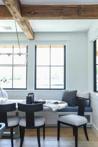
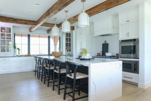
In the kitchen, she wanted views out of both sides of the home. The kitchen sink faces the front of the property while the dining area overlooks the back of the home and the pond. The large dining table offers seating for the entire family with a built-in bench seat for grandkids on one side and chairs for adults on the other.
   
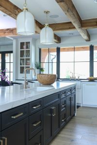
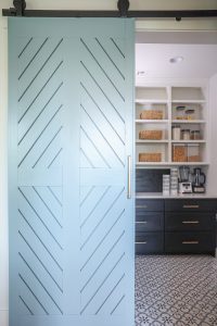
To break up the large space, we chose San Benedicto leathered granite for the perimeter countertops and a durable Bianco Statuario Quartz for the island, which features even more seating opportunities. As the workhorse of the kitchen, and the home, the island is lit with Hudson Valley pendants and painted Sherwin Williams Tricorn Black. The rest of the cabinetry is painted Simply White while a barn door painted Benjamin Moore’s Courtland Blue hides the generous pantry.
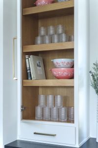
The homeowner had beautiful heirloom dishes, so we lit the cabinet shelves and carefully lined up the collection so that each piece would be visible between the cabinetry mullions. We never want our clients to walk into a home that feels like it’s out of a magazine. We always want them to walk into a home that feels like it’s their personal signature. Creating moments like this is what our design is all about.
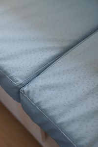
Choosing high-performing yet attractive materials was imperative. The light wood flooring is actually engineered wood, which makes it really durable for all the in-and-out traffic as well as the family’s large dogs. The dining bench seat is a “pleather” so it’s easy to wipe up spills.

Primary Suite
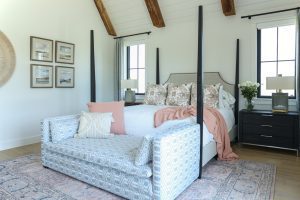
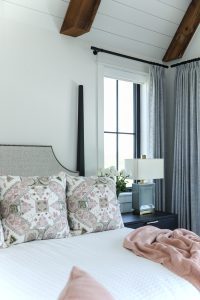
As with all my designs, the primary suite is meant to be a restful retreat for the homeowners. The oversized room features a stunning four-poster bed at one end, while the opposite end offers a seating area where the couple can relax and watch TV away from the main living area.
The home may be in the country, but we had to include all the modern amenities for comfort such as the remote controlled shades and black out curtains. Imagine waking up, pressing a button and seeing llamas and horses outside—such a dream!
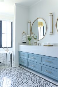
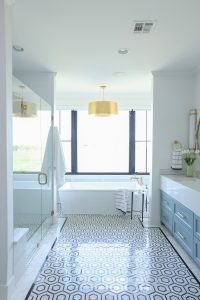
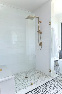
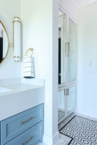
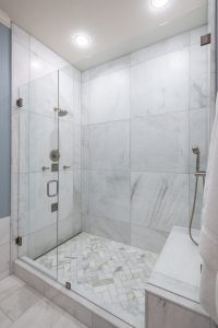
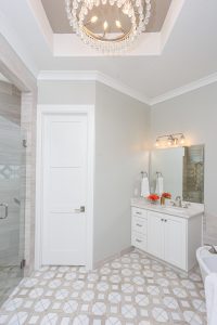
The owners’ bath is spa-like with a large soaking tub, walk in shower and double vanities. We kept the colors muted in here and let the tile design take center stage.
The floor is the star of the show with a stone hexagon pattern and Carrara subway border.  A linen closet with antique mirrored fronts adds a touch of glamour and hides necessities.

Guest Suites
The owners have three granddaughters and one grandson, so we planned the guest rooms accordingly. The larger bedroom became the girls’ “bunk room” and the smaller was dedicated to the boy.
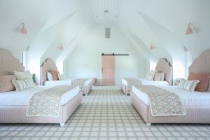
We had so much fun designing the girls’ quarters. Four custom made beds line the walls between individual window seats at each dormer window. It’s a precious room that reminds me of the story Madeline where they’re all lined up in their beds.
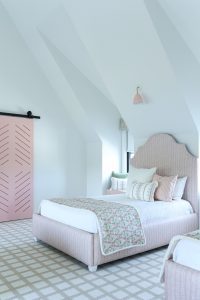
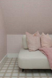
We chose a rosy pink as the predominant color. From the Pinecone Hill bedding to the custom pink sconce shades, everything is soft and subtle, but still very colorful and cheery like the client wanted. The carpet is neutral with a window pane pattern that really helps it stand out. The patterns all play so well off each other.
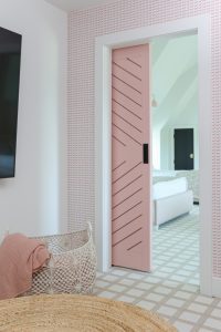
A barn door painted in Benjamin Moore’s Eraser Pink opens to reveal a secret hideout with a sectional and TV. For now, the girls use it to play and watch movies, but it is large enough to accommodate air mattresses for even more guests.
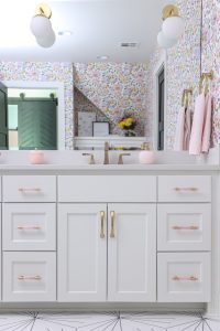
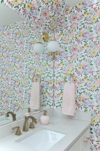
In the girls’ bathroom, we did the opposite of the primary bath. While the floor is black and white, we added color all over the walls with Caitlin Wilson’s ultra-cheerful Penelope wallpaper.
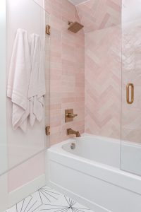
The same soft pink of the bedroom is repeated in the tile for the “princess bath” shower/tub combo. Instead of one glass partition we used two shower doors atop the tub so you can open both when bathing and not feel totally enclosed.
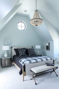
The grandson’s bedroom has a distinctly masculine tone. It’s arguably the most neutral room in the house with black, white, grey and taupe comprising the color palette. A wooden chandelier hints at a rustic element, while the oval metal nightstands add an industrial feel. The showstopper of the room, however, is the bed, which features fabric stretched over a wood and pipe frame.
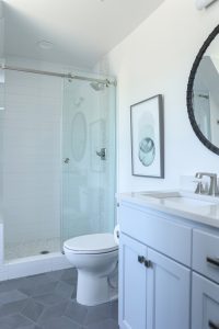
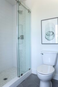
The en suite bath echoes the neutral theme with grey being the predominant color. While it may be monochromatic, we still managed to add visual interest with a mosaic penny tile on the shower floor as well as a vertical accent stripe on the shower wall.

Outdoor Living
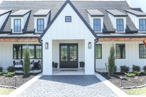
Cedar posts, pine ceilings, batten board siding, black frame windows and metal roofing give the exterior of the home a farmhouse feel, but with a level of classic sophistication.
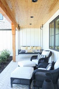
The wrap-around porch is meant for about five different opportunities for outdoor gathering. There’s a fire pit seating area overlooking the pond, a cozy daybed swing for afternoon naps, a huge outdoor fireplace for chilly nights under the stars, a dining and grilling area, and the lounge area just off the primary suite. We even hung some swings from the cedar beams on the porch for the grandkids.
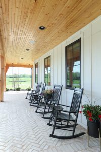
One detail I love is the brickwork on the porch floor, which is laid in a herringbone pattern. We paid close attention to details and worked with the brick layers to make sure that whatever direction you’re walking is the direction the herringbone pattern is laid. Many people don’t know that is the way you’re supposed to install it—almost like a little road map.
This is one home and property that will be explored and loved for many years to come. We are so grateful we were able to help bring it to life—and share it with you!

Bathing Beauty: A look at the latest in bathroom design trends

Posted on

We are now more than two years into the pandemic and people are still cocooning. It’s almost as if we are still realizing the volatility we had in our lives that caused us to go home in the first place. People are seeking to make their homes life-friendly. Just as we want our bedrooms to make us feel like we are in a hotel on vacation, we want our bathrooms to feel like a spa—a truly luxurious retreat with top of the line design and finishes.  So, let’s take a look at the latest interior design bathroom trends.

Tile 
Probably one of the newest trends out there is the use of large formatting porcelain tile. They are now manufacturing porcelain tile in five-foot panels, essentially slabs. We are able to use this in shower walls, wainscoting, you name it. It looks like marble for a fraction of the cost and its performance is incredible—it won’t chip or shatter.

kirkendall design large formatting porcelain tile

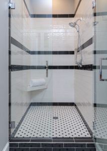
Speaking of tile, we aren’t using as much of the 12×24 size, as people really are looking for more visual interest. That could be through use of a classic retro black and white floor tile or perhaps something that pays homage to our past like a terrazzo type tile. Likewise, we are seeing a lot of patterned floors which allows us to really make a splash (no pun intended!) and use some truly bold and unusual tile designs.

kirkendall design retro black and white tile shower

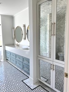
In larger bathrooms, one easy way to give visual interest and break up the area is to do a border tile. We recently completed a job with a very large master bath. Had this particular bath been wall-to-wall white tile it would have been overwhelming. By creating a border with the floor tile it brought interest to the design and helped define the spaces within the room.

kitkendall design border tile

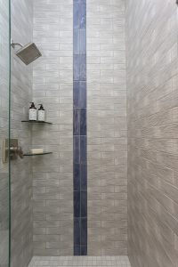
Another way to bring a break in the color of tile, especially in the shower, is to add a vertical stripe with an accent tile. Also think about balancing out your countertops, floors and walls with different tones. A dark charcoal floor balances light walls nicely and vice versa, a dark marble vanity top is easily balanced by white floors.

kirkendall design vertical stripe shower tile

Getting that Glow
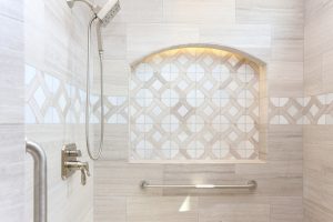
Lighting in general has changed a lot with the LED influence and the bathroom may be the biggest room in the house to benefit from this advancement. We are using indirect LED lighting all throughout bathrooms to create a really pretty indirect light. We have used LEDs under floating vanities, in a shower niche, to backlight a mirror or around the entire perimeter of a room.
If we have room to add a source of light on the vanity wall, we always recommend doing so as it directs the light towards your face and does not cause shadows. Recently, however, we have been using more hanging pendants in place of sconces as it can be positioned in the same height and still cast a flattering light. Larger hanging fixtures and chandeliers are still popular, but we only use them if the room is large enough to properly accommodate them.

kirkendall design LED shower nichekirkendall design bathroom trends 2022

It’s All in the Details
People are looking for character so we are constantly looking for ways to add a little something extra to their spaces. A great vehicle for this is always the bathroom vanity cabinets. Our goal is to make them special, in other words they should not look like your kitchen cabinets! We have recently used rift cut white oak slab for a vanity which was absolutely gorgeous. An all-time favorite of mine was a scalloped door pattern we did for a client, and don’t underestimate the power of a simple applied molding pattern to dress things up and make the bathroom unique but always functional.

Half Bath, Full of Design
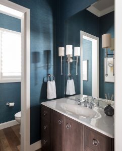
People often want to make a statement in their powder baths. That may be as simple as staying on trend with a matte black finish on the faucet or perhaps something more daring like a wall of tile behind the vanity. Wallpaper is definitely back and the powder bath is a great place to put it to use. It’s the place where you can go bold or do something different and it’s not overbearing throughout the house. But, even though it’s a small space, people often get overwhelmed with choices. I tell people to think about dressing your powder bath just as you would think of putting an outfit together. If you’re putting on an outfit of full color, black and white is always a classic to go with it. Then, think of the sconces as your earrings. It’s such a small space and so individualized that you can actually make it have a look all its own that’s really well coordinated.

kirkendall design wallpaper in small bathroom

Bath Time
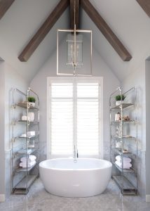
As I like to say, we are having a lot of “bathtub moments.” The freestanding bathtub has been back for years and is still going strong, with a few updates. It is now possible to have a deck mounted faucet for your freestanding tub, which thankfully causes the cost to go down considerably. Remember when I said people are still cocooning? We are seeing the resurgence towards curves and soft lines in all areas of design from furniture to bathtubs. It’s directly related to our desire to cocoon! Whereas we used to install more rectangular tubs, we are now seeing most with a curve in bathroom design.

kirkendall design curved free standing bathtub