Posts Tagged ‘color’

Pantone’s 2025 Color of the Year: Mocha Mousse

Posted on No Comments

Pantone has named Mocha Mousse as its Color of the Year, and our team is loving its versatility and soothing qualities. This shade is perfect for creating calm and inviting spaces, which aligns with the current trend of prioritizing warmth and comfort in design.

Mocha Mousse is an excellent grounding color that pairs beautifully with various palettes. The Floral Pathway palette shows off Mocha Mousse’s playful side, making it a great choice for vibrant bedrooms or whimsical nurseries. For a feminine touch, it works well with soft rose and green.

To create a more masculine or neutral look, it complements deep chocolates and forestry greens. For those who prefer timeless elegance, combining Mocha Mousse with creams, taupes, and soft roses offers a subtle and sophisticated palette.

Source: Pantone

Photo by Valerie Wei-Haas, Design by Kirkendall Design

Photo by Homes & Gardens

Chocolate brown dining room chairs, Photo by Four Hands

Brown accents; Photo by Sarah Baker, Design by Kirkendall Design

Leather wallpaper accent wall; Photo by Sarah Baker, Design by Kirkendall Design

Source: Pinterest

Photo by Sample Board

Source: Pantone

“In a world that often feels overwhelming, Mocha Mousse offers a soothing antidote. It bridges the gap between grounded earthiness and refined elegance, making it a perfect fit for both modern interiors and timeless fashion. Whether it’s cozying up a living room with plush textiles or adding a touch of understated glamour to your wardrobe, this versatile hue promises to bring harmony to any space. Laurie Pressman, Vice President of the Pantone Color Institute, highlights the deeper message behind this choice. “Mocha Mousse is about connection – between ourselves, our environment, and each other. It’s a reminder that even in our fast-paced, tech-driven lives, there’s beauty in slowing down and savoring the present.” – Excerpt from Design Milk. “Pantone Color of the Year 2025: Pantone 17-1230 Mocha Mousse”

The new year’s color announcements are full of inspiration! Check out our take on Benjamin Moore’s 2025 Color of the Year: Cinnamon Slate and the Sherwin-Williams’ 2025 Colormix Forecast for even more color ideas.

Ready to transform your space with new paint? Head to our services page to learn about our Paint Consults (scroll to the bottom of the page).

Benjamin Moore’s 2025 Color of the Year: Cinnamon Slate

Posted on No Comments

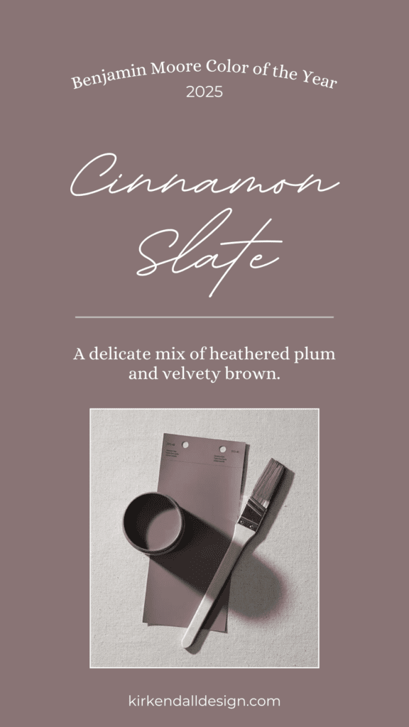
We love this time of year in the design world with all the color announcements. Benjamin Moore recently revealed its 2025 Color of the Year, Cinnamon Slate, and the team at Kirkendall Design can’t wait to share our thoughts on this rich, moody hue!

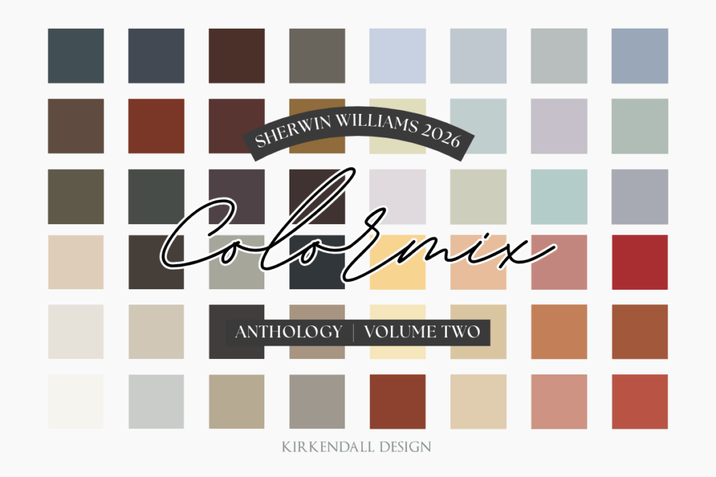
If you missed it, we shared our favorite colors from Sherwin-Williams’ 2025 Colormix Forecast—check it out here. While Pantone hasn’t announced their color of the year yet, the predicted color is Future Dusk–a mix between deep violet and midnight blue. We’re excited to see the official color soon.

Now, back to Benjamin Moore! Color experts describe the Color Trends 2025 palette as “quietly colorful hues that are calm, confident, and adaptable, yet distinct. These shades invite you to explore all ends of the color spectrum.”

Keep reading for our design team’s thoughts on the 2025 Color of the Year and how they envision using the Color Trends palette for clients.

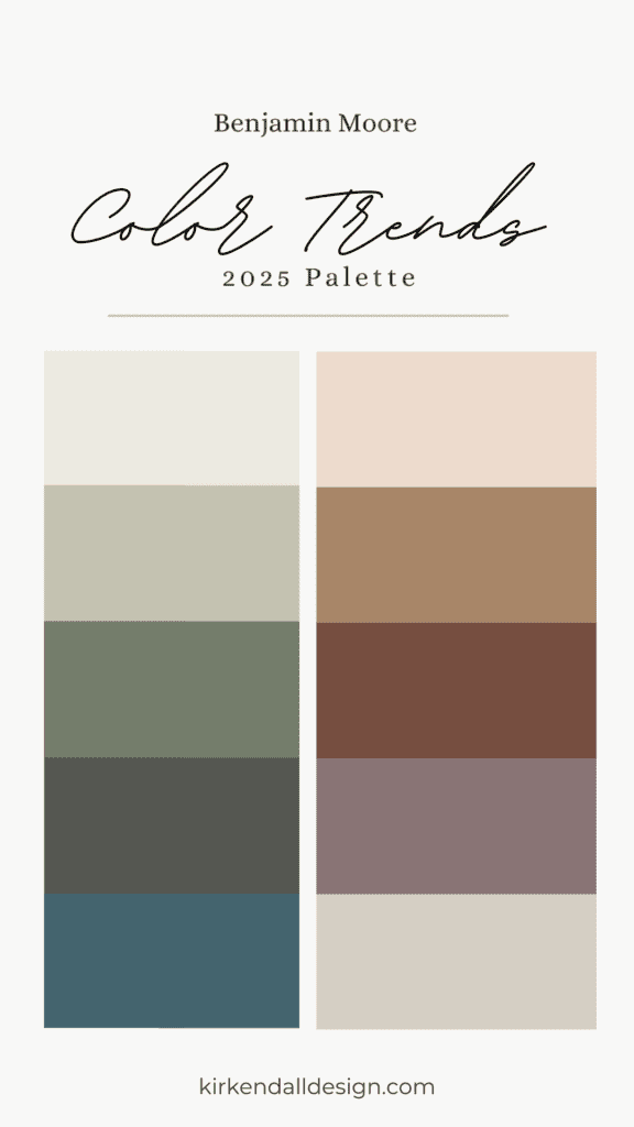
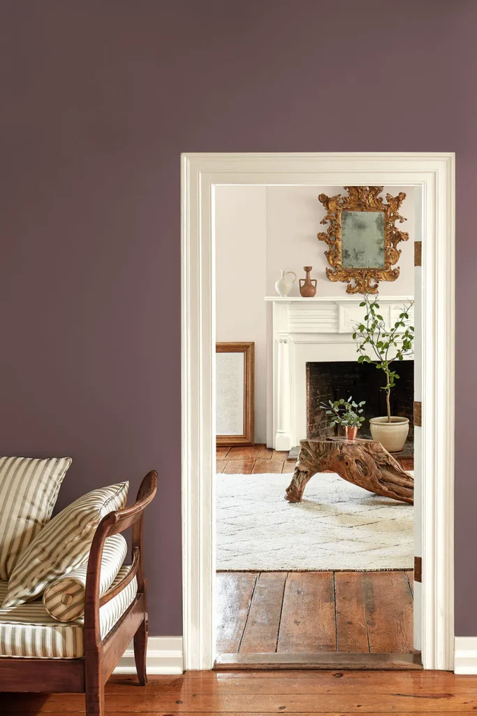
Photo by Benjamin Moore; Wall: Cinnamon Slate 2113-40, Trim: Glacier White OC-37

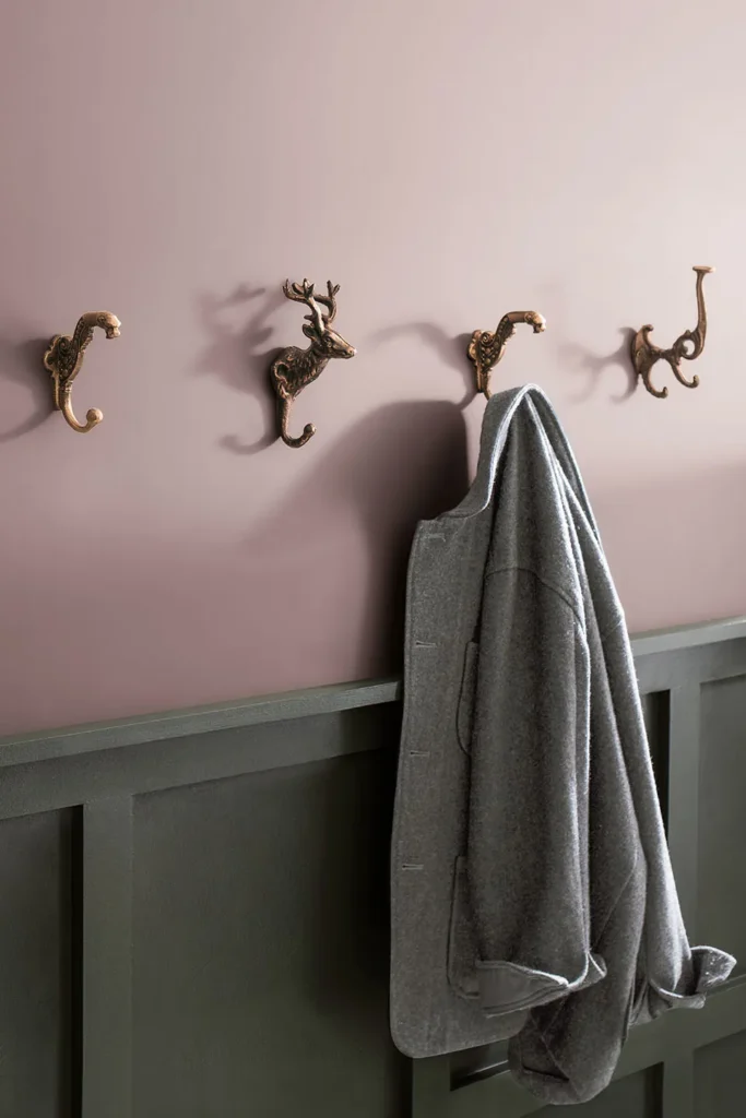
Photo by Benjamin Moore; Upper Wall: Cinnamon Slate 2113-40, Wainscoting: Ashwood Moss 1484

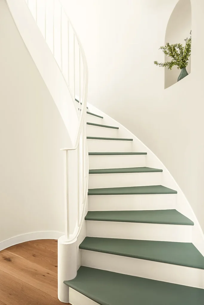
Photo by Benjamin Moore; Walls: Sea Salt CSP-95, Trim: Glacier White OC-37

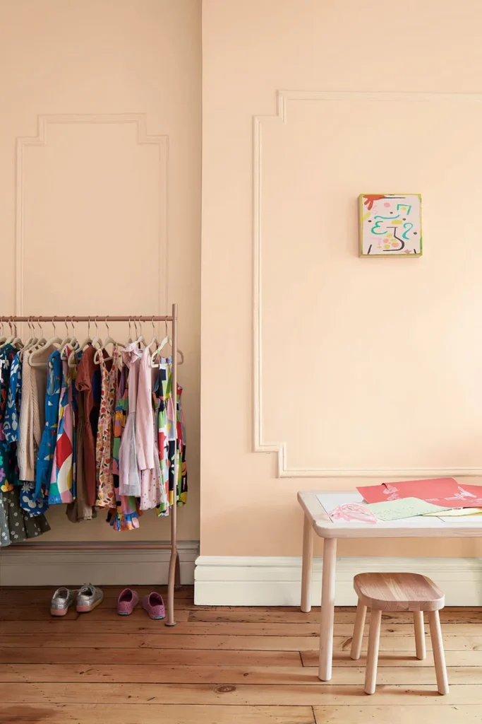
Photo by Benjamin Moore; Walls: Tissue Pink 1163, Trim: Glacier White OC-37

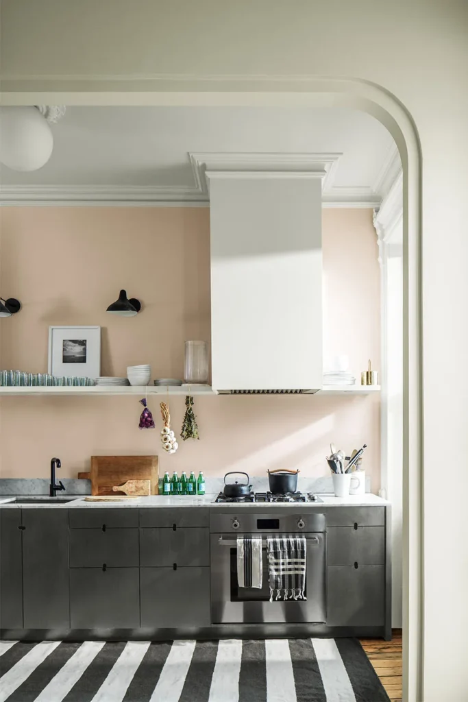
Photo by Benjamin Moore; Wall: Tissue Pink 1163; Cabinets: Ashwood Moss 1484, Trim: Glacier White OC-37

Photo by Benjamin Moore; Walls: Sea Salt CSp-95, Trim: Glacier White OC-37


Our Interior Design Team’s Thoughts on the Benjamin Moore Color of the Year: Cinnamon Slate

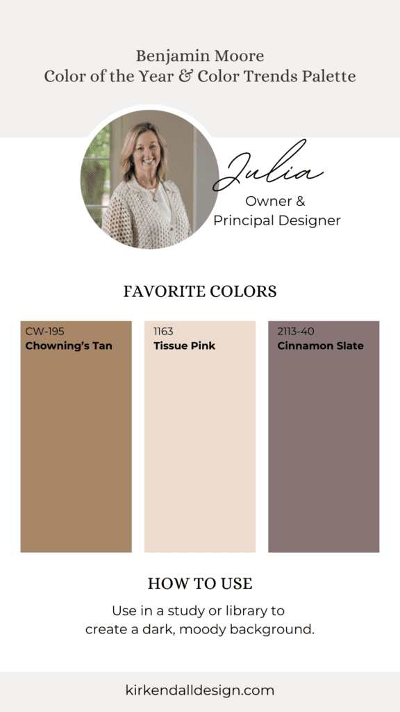
Julia Kirkendall, Owner and Principal Designer

Cinnamon Slate is a beautiful color for an accent color, and its subtle hue and brown undertones make it easy to use. I’d love to use it in a study or library to create a dark, moody background. My favorite combination from the 2025 palette is Cinnamon Slate with Chowning’s Brown and Tissue Pink—a classic mix I can’t wait to use for a client.”

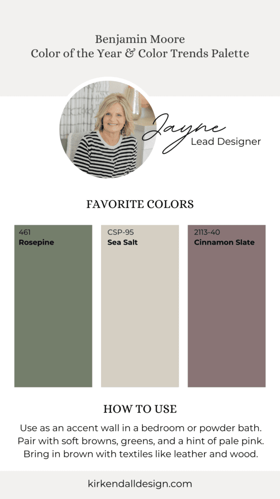
Jayne, Senior Designer

Cinnamon Slate surprised me! The name makes me think of rust or orange tones, but it’s actually a warm, dusty purple. I’d use it as an accent wall in a bedroom or powder bath. In a bedroom, I’d pair it with soft browns, greens, and a hint of pale pink in the bedding or deep gray accents for a more masculine touch.

My favorite combos with Cinnamon Slate are Rosepine, Sea Salt, Chowning’s Tan and Leather Saddle Brown. But, some of the tan/brown could be brought in with textiles like leather and wood instead of paint.”


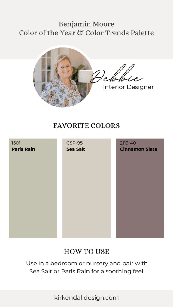
Debbie, Interior Designer

Cinnamon Slate has such a calming effect, making it perfect for bedrooms, nurseries, or powder baths. I’d pair it with Sea Salt or Paris Rain in a bedroom or nursery for a soothing feel. From the 2025 palette, I’d use Rosepine on a kitchen island surrounding it with Sea Salt cabinets.”

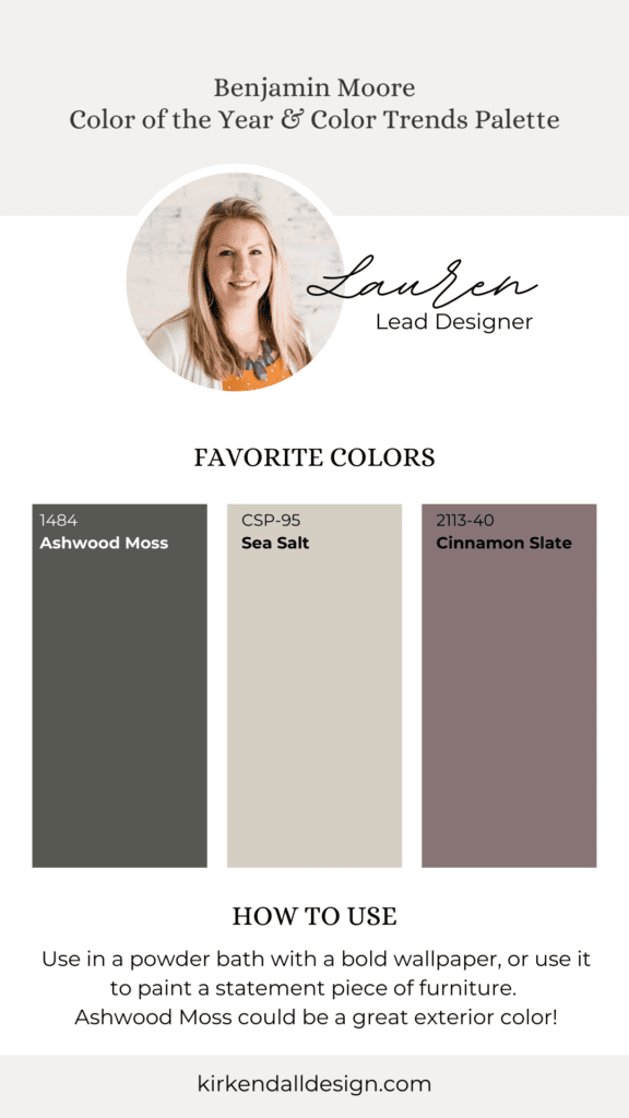
Lauren, Senior Designer

“This is the perfect color if a client was specifically looking for a purple or mauve tone. I could see it working in a small powder bath, paired with a bold wallpaper, or used to paint a statement piece of furniture. From the 2025 palette, Sea Salt is my favorite—it would look great from walls to trim or cabinetry. Ashwood Moss could be a great exterior color.”


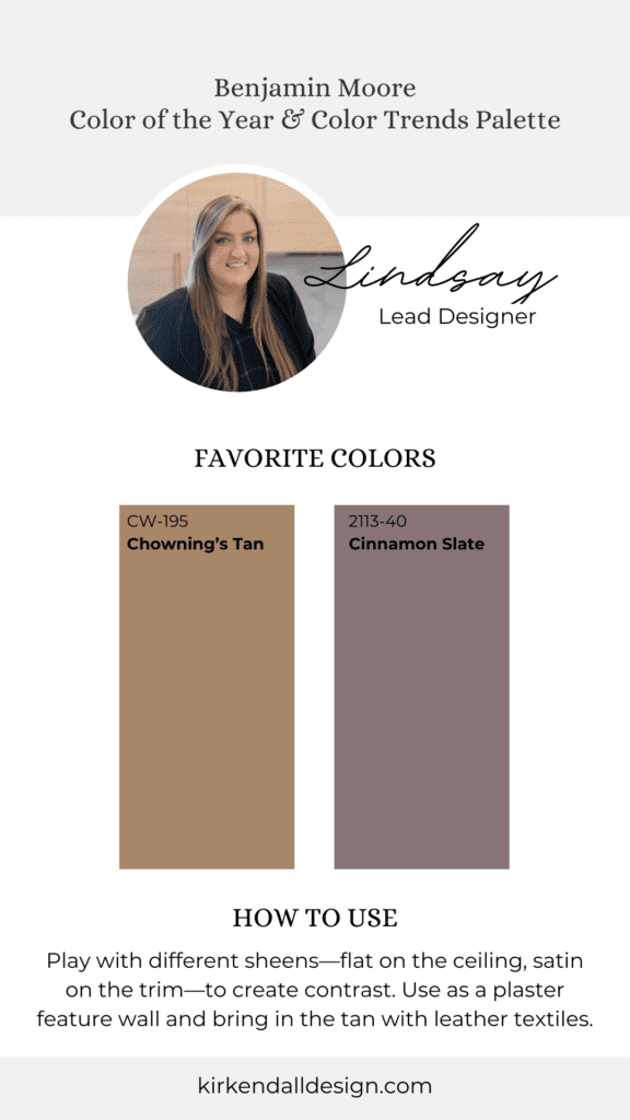
Lindsay, Senior Designer

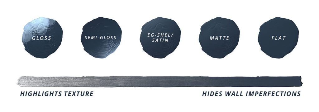
“I could see Cinnamon Slate fitting perfectly in a historic home, maybe as a cabinet color or in a moody powder bath or butler’s pantry. The depth of this color is amazing, and I’d play with different sheens—flat on the ceiling, satin on the trim—to create contrast. It would also look great as a plaster feature wall, adding texture and age with venetian plaster or roman clay.”


We see so much potential in Cinnamon Slate and the Color Trends 2025 palette and can’t wait to use these colors in future designs!


Thanks for reading! As the year winds down, now is the time to start planning your luxury interior design projects for 2025. Start the process by scheduling your complimentary discovery call and design request form on our website.

How to Choose the Perfect Paint Sheen

Posted on No Comments

Photo by Valerie Wei-Haas / Design by Kirkendall Design

The right paint sheen can transform your walls from a quiet backdrop to the star of the show. It’s all about choosing a finish that balances style, durability, and practicality. With options ranging from velvety matte to reflective gloss, paint sheen refers to the level of light reflection on the surface, helping you create the perfect ambiance for your space. Let’s explore the different sheen options and how our interior design firm uses each one.

Photo by Sherwin-Williams

Paint Sheen: Flat

Photo by Valerie Wei-Haas / Design by Kirkendall Design

This sheen offers minimal light reflection, helping to smooth out surface textures and imperfections. It’s easy to touch up but harder to clean, making it perfect for ceilings.

Paint Sheen: Matte/Eggshell

Design by Kirkendall Design

A matte or eggshell sheen offers a smooth finish with low to medium light reflection, making it excellent for high-traffic areas like bedrooms, hallways, dining rooms, and living rooms. It hides imperfections well, is easy to touch up, and has just enough sheen to resist moisture.

Paint Sheen: Satin

Photo by Sarah Baker / Design by Kirkendall Design

Satin sheens are both durable and easy to clean. They’re ideal for cabinets, garage walls, trim, and also moisture-prone areas like bathrooms – spaces where you want a balance of durability and a slight glossy finish.

Paint Sheen: Semi-Gloss

With higher light reflection, semi-gloss sheens are perfect for kitchens, baseboards, and doors. It’s durable, washable, and easy to clean, though it can show imperfections and are a bit harder to touch up.

Paint Sheen: High-Gloss

Photo credit: centsationalstyle.com

High gloss sheen, as the name suggests, has the highest level of light reflection, creating a mirror-like finish. We don’t use it often but it can create a high-end look on certain surfaces like cabinets, doors, and furniture.


New Year, New Look

Posted on

Simple Ways to Update Your Home

I don’t know about you, but after the holiday decor is all boxed up and put away I am always ready for a little design refresh in my home. I often hear the same thing from clients so I thought I would share some easy tips for breathing new life into your home this month.

ACCESSORIES

The easiest way to make a change in your decor has and always will be with your accessories. But—here is the fun part, and a shift that has me very excited—I am seeing people gravitate towards incorporating family heirlooms and vintage/organic pieces into their homes again.

I’ve had several clients want to keep and display meaningful pieces they have either inherited or come across. For example, one client had three grandfather clocks. We discarded one and kept the other two, saving one from each side of the family. We gave them both a fresh coat of high-gloss paint and now they are the showstopper in her home. With another client, instead of hiding her expansive collection of barware, we chose to display it all in the bar area which in turn created a truly unique design statement. It’s all about finding creative ways to breathe new life into pieces that are meaningful to you. Don’t just keep them to keep them! Instead, update them, rethink them and give them a significant place in your home. The bonus is that yours will have something no other home will have—a truly one-of-a-kind design element!

If you haven’t inherited any wonderful pieces, don’t fret. Antique stores, resale shops and even various online sites can be a goldmine for quality pieces. Being one of eight siblings, I lost the bid for our family cookie jar when it went to my oldest brother. But, that heirloom was so special to me I eventually found an identical jar and bought it so I could incorporate it into my home. I love teasing my brother now and making him second guess who actually has the real deal! Likewise, I recently came across a vintage 1970s lamp that was incredibly well made and fit into today’s design aesthetic beautifully. It had a horrible shade, but I know that is an easy fix. I can’t wait to find the perfect home for it.

COLOR

Thankfully, the trend over the past several years has been towards monochromatic, somewhat sparse spaces, which makes it very easy to introduce color in small, noncommittal ways. Think pillows, art and small accessories. Benjamin Moore did a great job capturing the color palettes we are asked about most as of late with their 2022 color story. The trend now in color is earthy—terra cotta (I love Benjamin Moore’s “Wildfire”), sage and deep charcoal blues. Benjamin Moore’s “Natural Linen” is a great neutral that is not gray. The neutral trend is here to stay, but it is trending warmer and this color hits the nail on the head. For white, I usually gravitate towards an off-white like Benjamin Moore’s “Wind’s Breath.”  You can find Benjamin Moore locally at Spectrum Paint.

TEXTURE

Like I said, the neutral palette is still a strong trend whether it is your total color scheme or a backdrop to the earthy tones mentioned above. The key to making neutral interesting and pleasing to the eye, however, is texture, texture, texture. When it comes to pillows and throws, be sure to incorporate various materials. For accessories, think about layers and juxtaposing elements. Perhaps you have a beautiful bowl on your coffee table…try adding some moss balls. The harmonious blend of opposing materials will make your design pop.


If your home is ready for a refresh and you need our team to be your eyes and ears on the project, fill out a design request form HERE.  We’ll go from there!