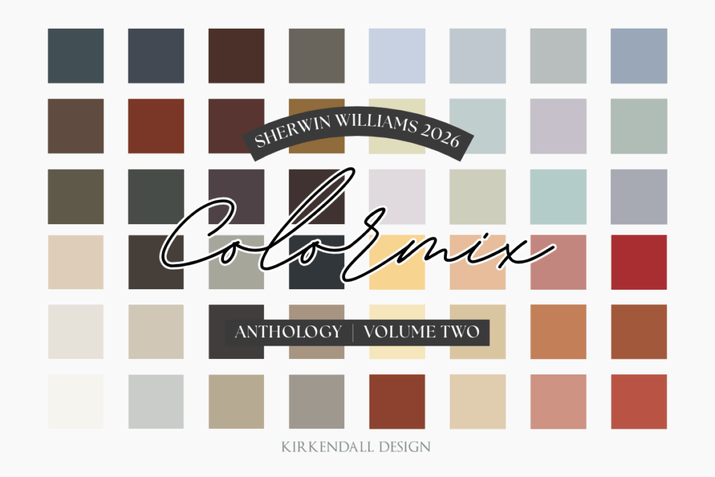
Here’s how Sherwin-Williams describes each of the Colormix 2026 palettes, highlighting the inspiration and feeling behind the colors.
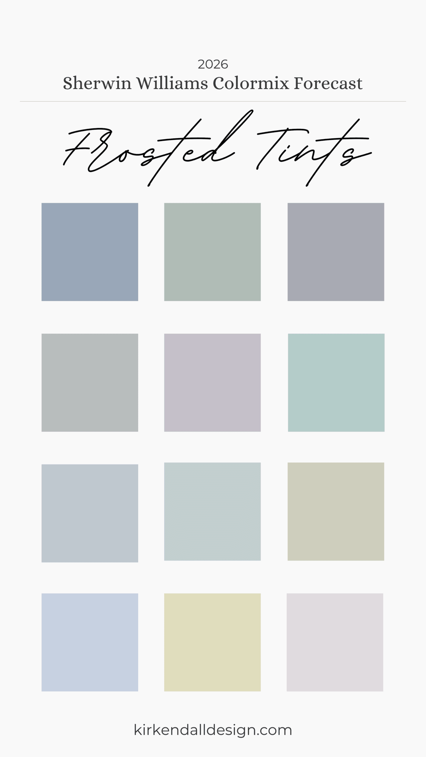
- Frosted Tints: Discover the cool, analogous tones of icy tinted pastels in whispers of blue, green, and purple—a palette of weightless and wondrous colors destined to complement each other in any combination.
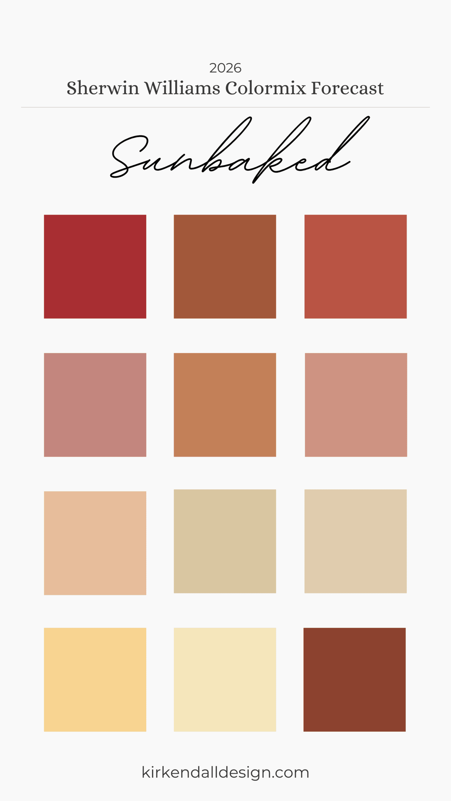
- Sunbaked Hues: Stoke the fires of creativity with the warmth of natural clay, buttery yellow, and intensely enriched red in a palette that ignites a nostalgic reverie, dramatic potential, and the confidence to play with color.
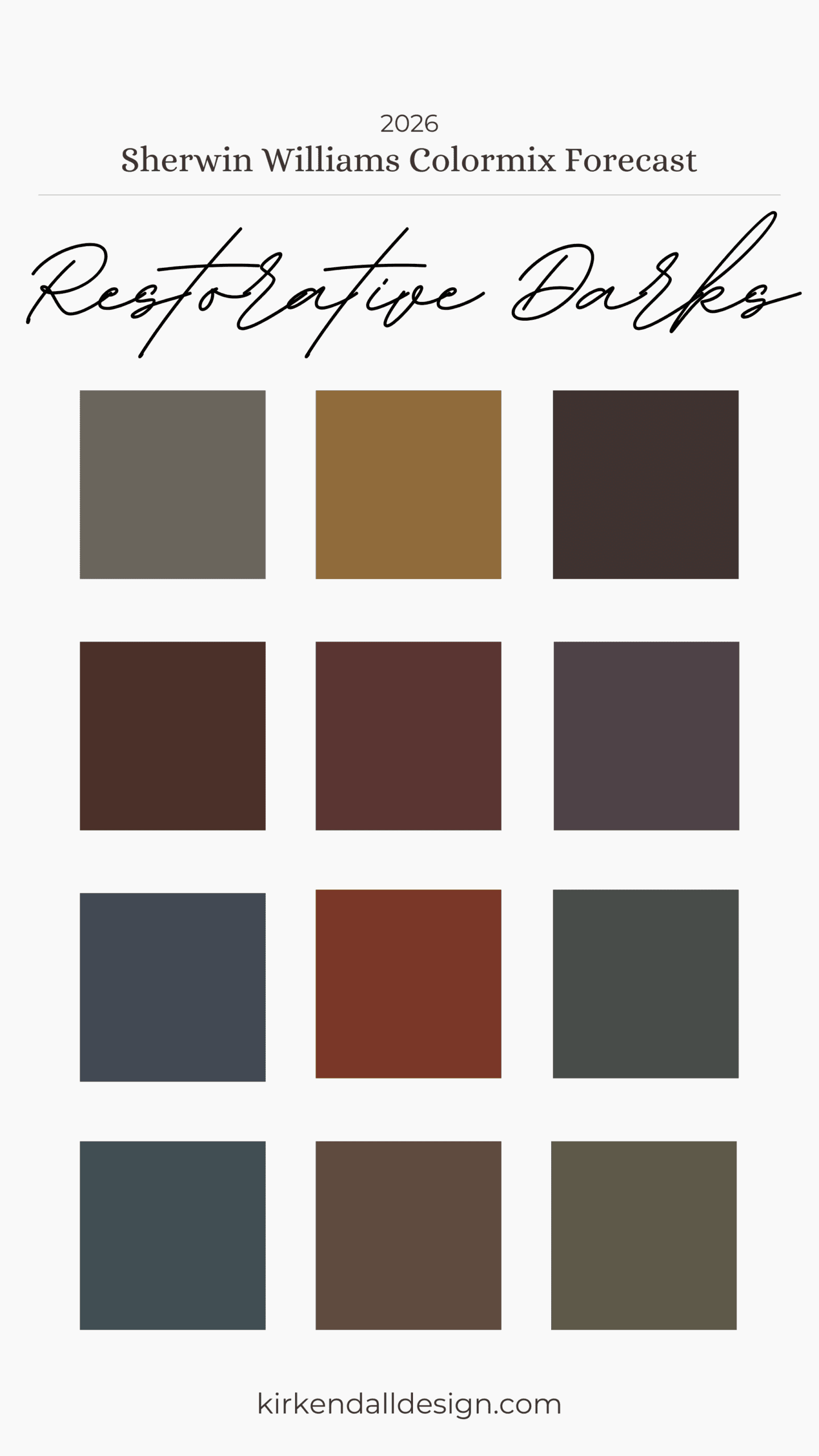
- Restorative Darks: Find sanctuary within a sophisticated palette of deep, nocturnal colors chosen to inspire restfulness, release, and a harmonious richness that makes a quietly compelling impact.
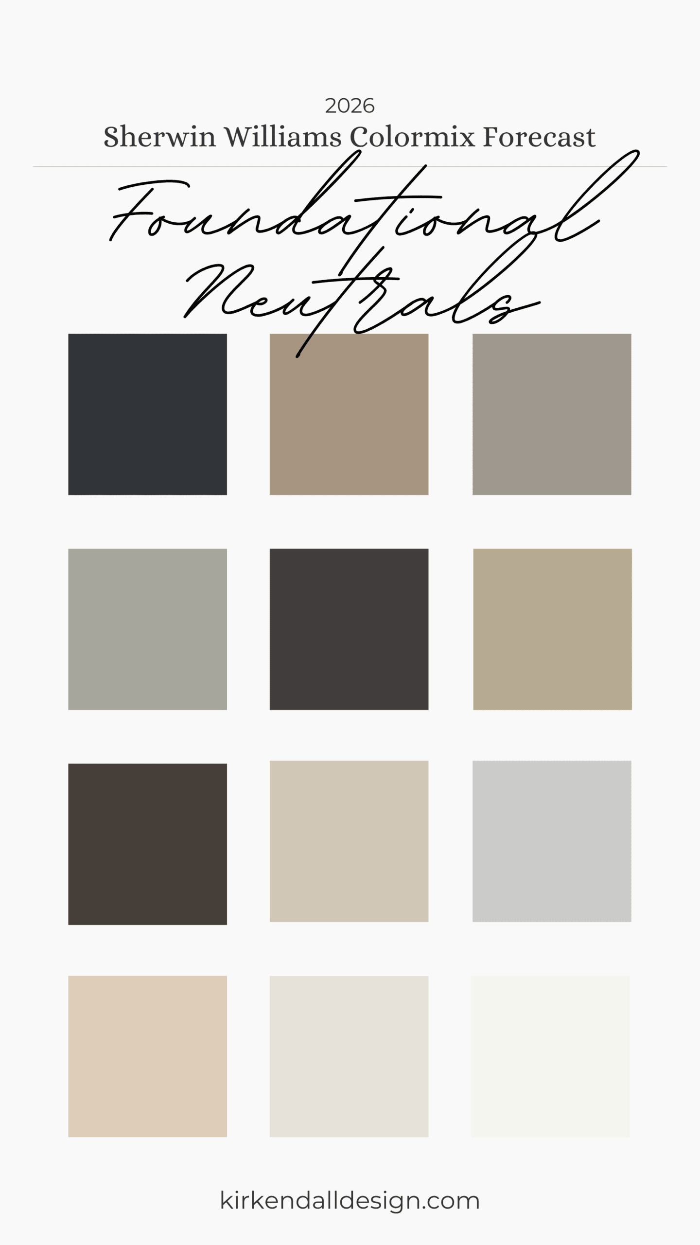
- Foundational Neutrals: The most essential neutrals of the moment expand on the concept of black and white with a gradient of strongly saturated near-black, silvery gray, extraordinary tans and taupes, and sparkling white.
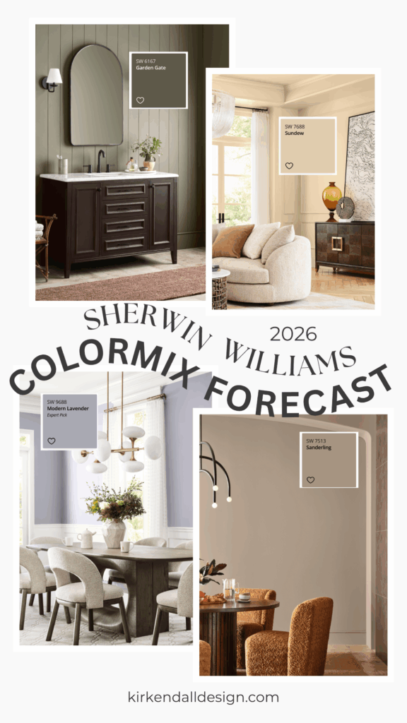
Our Design Team’s Favorite Colors in the Sherwin-Williams 2026 Colormix Forecast
We asked each designer to share their favorite collection (there was a clear winner!) and then assigned one collection per designer, asking them to pick a favorite color from it and share how they would bring these hues to life.
Want to see what we chose last year? Read our 2025 favorites here.
Julia’s Favorite Colors
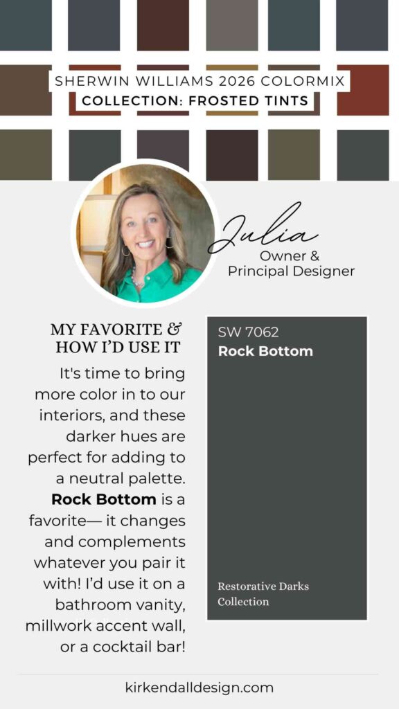
Favorite Collection: Restorative Darks
“It’s time to bring more color into our interiors, and these hues are just right to add to a neutral palette.”
- Favorite color: Rock Bottom
- Why: This shade changes and complements whatever you pair it with.
- How she’d use it: On a bathroom vanity, a millwork accent wall, or even a custom cocktail bar.
Lauren’s Favorite Colors
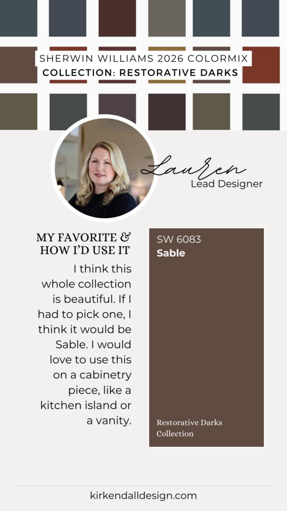
Favorite Collection: Foundational Neutrals
“This collection has some really great moody colors we’re trending toward. They’re incredibly versatile for walls, trim, and cabinetry. I really like Inkwell, Clove, and Paveston; Sanctuary and Mushroom are really nice lighter tones as well.”
- Favorite from Restorative Darks: Sable
- How she’d use it: On a cabinetry piece, like a kitchen island or vanity.
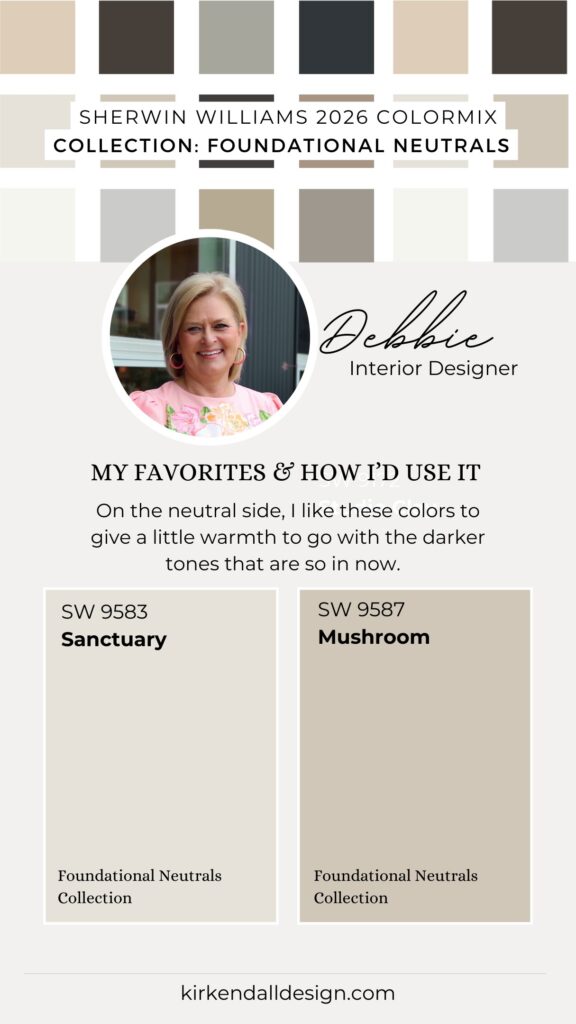
Debbie’s Favorite Colors
Favorite Collection: Restorative Dark
“I like the richness of color for color-drenched walls in an office or powder bathroom. The darker colors give a more moody vibe. If it’s too much for you, then think about using it for a furniture cabinet color.”
- Favorite from Foundational Neutrals: Sanctuary and Mushroom
- How she’d use it: To give a little warmth to go with the darker tones that are so in now.
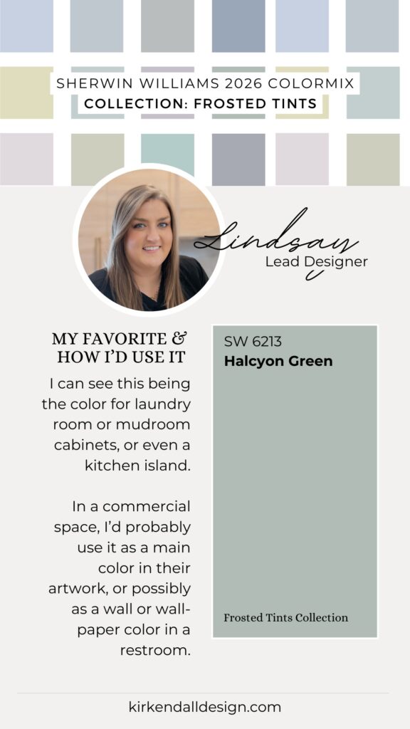
Lindsay’s Favorite Colors
Favorite Collection: Restorative Darks
“I’m loving jewel tones and color drenching rooms in deeper colors than people expect. It calls back to how large estate homes were painted in Europe and Britain. When used in small spaces, these dark colors can create a cozy, moody, classy vibe.”
- Favorite from Frosted Tints: Halcyon Green
- How she’d use it: Laundry or mudroom cabinets, or a kitchen island. In a commercial space, I would probably use it as a main color in their artwork, or possibly a wall or wallpaper color in a restroom.
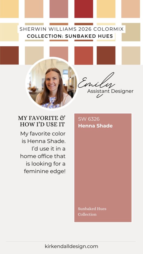
Emily’s Favorite Colors
Favorite Collection: Restorative Dark
“These rich colors are perfect for color drenching, which I’ve been loving lately—they offer an immersive, moody experience.”
- Favorite from Sunbaked Hues: Henna Shade
- How she’d use it: In a home office looking for a feminine edge.
Source: Sherwin-Williams Color Collections Colormix Forecast 2026