Our Design Team’s Favorites from the Sherwin-Williams 2027 Colormix Forecast

Our Design Team Favorites from the Sherwin Williams Colormix Forecast 2027 Kirkendall Design

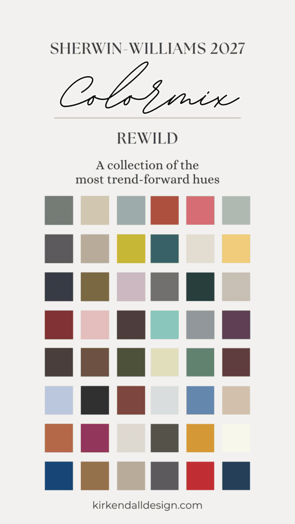
Every year, Sherwin-Williams’ Colormix® Forecast gives us a glimpse at the colors influencing design. The 2027 forecast, Rewild, features 48 colors inspired by nature and mixing unexpected shades.

Sherwin-Williams also announced their 2027 Color of the Year is Celery SW 6421. Described as “the perfect balance between an airy pastel and a grounded, herbal hue,“ this organic-inspired color can give a space a fresh and inviting feel.

The full Colormix palette has earthy greens, moody hues, and versatile neutrals.

We asked our design team to choose their favorite colors from the Sherwin-Williams’ Colormix® Forecast and tell us how they would use them in a home.

Our Design Team’s Favorites from the Sherwin-Williams 2027 Colormix Forecast
Julia’s Favorite Colors

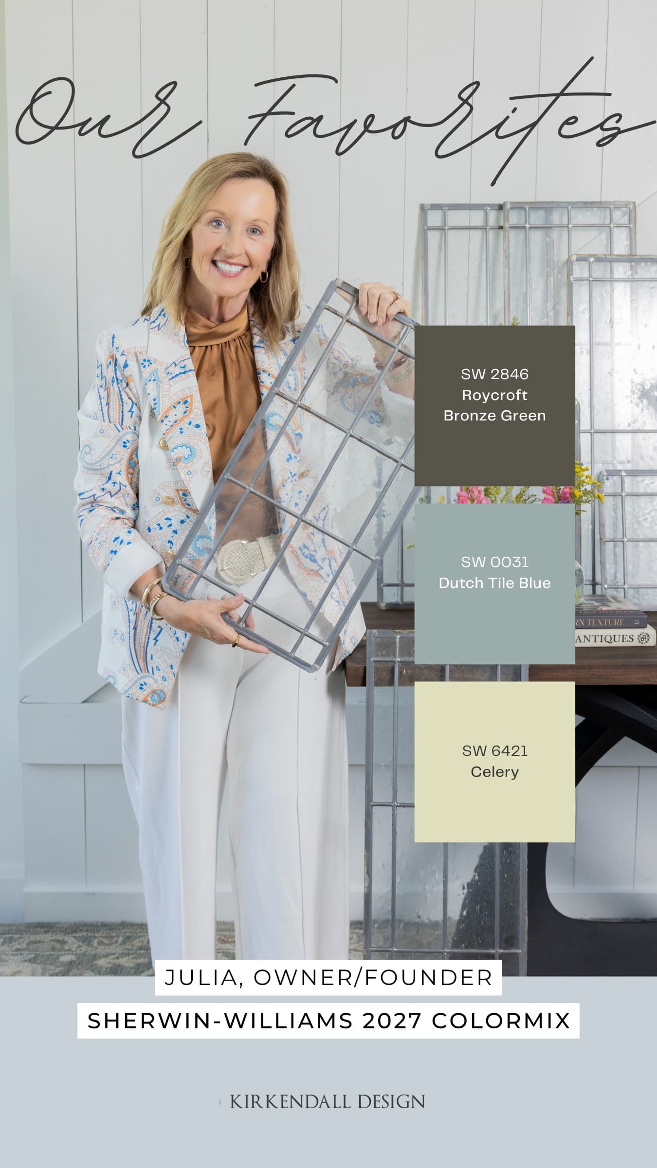
Favorite color: Roycroft Bronze Green SW 2846

I think it has a rich undertone of brown, which feels earthy. This color does not jump out at you, but if used as a background, it could really set the stage for other moments in the room.

Pair it with: Dutch Tile Blue SW 0031 and Celery SW 6421

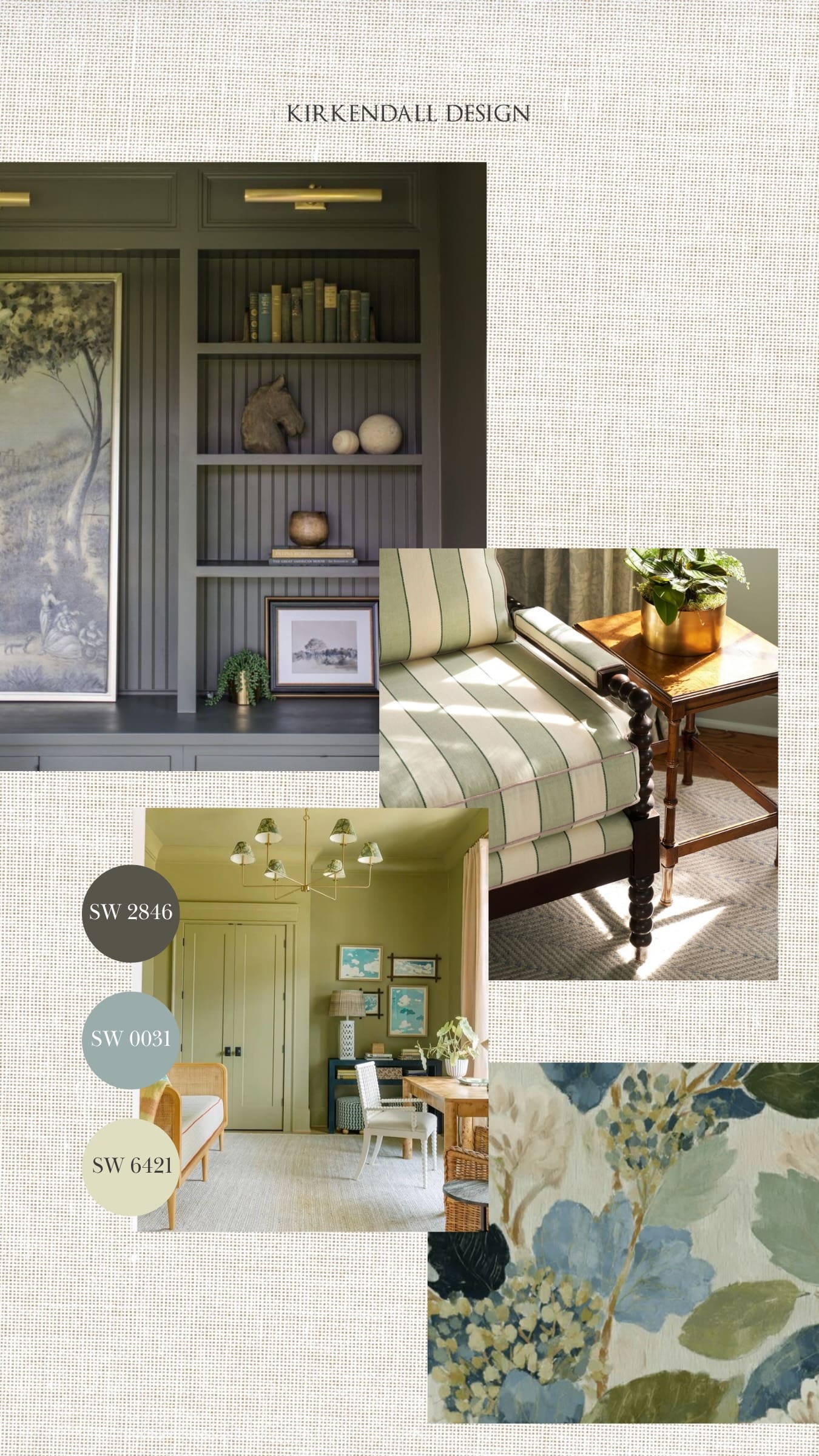
I would use Roycroft Bronze Green as a dramatic entry color, accent wall, or small butler’s bar, then bring in Dutch Tile Blue and Celery through furniture, paintings, textiles, and accessories.

Julia Kirkendall’s favorite Sherwin-Williams 2027 Colormix Forecast colors, Roycroft Bronze Green, Dutch Tile Blue, and Celery
Interior design inspiration featuring Roycroft Bronze Green, Dutch Tile Blue, and Celery paint colors selected by Kirkendall Design

A Fun Note — Color of the Year

Our founder and owner, Julia, chose Celery as one of her favorite colors from the 48 Colormix Forecast colors days before Sherwin-Williams announced it as their 2027 Color of the Year.

Just a fun little reminder of the delicate balance Julia has mastered over more than three decades: creating timeless interiors that will stand the test of time while staying ahead of the trends and ever-changing design world.

Debbie’s Favorite Colors

Favorite color: Roycroft Bronze Green SW 2846

If you’re looking for luxury design this color showcases that aesthetic and will last for years to come. It offers a very rich, elegant look.

Pair it with: Cordovan SW 6027

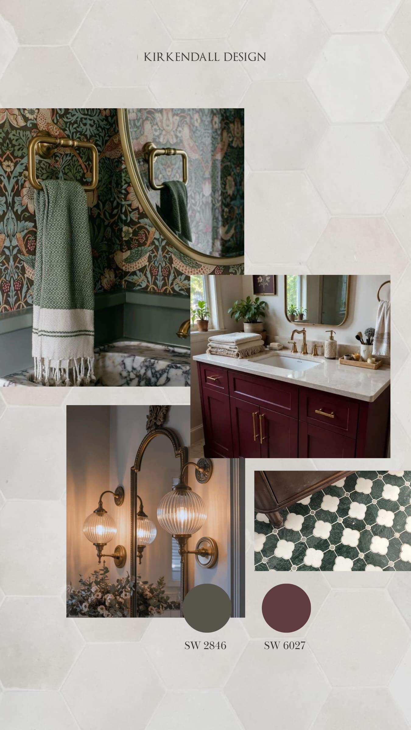
Use these rich colors on a powder room vanity or piece of furniture, paired with gold fixtures, elegant wallpaper, and beautiful flooring.

Debbie’s favorite Sherwin-Williams 2027 Colormix Forecast colors, Roycroft Bronze Green and Cordovan
Interior design inspiration featuring Roycroft Bronze Green and Cordovan paint colors selected by Kirkendall Design designer Debbie

Lindsay’s Favorite Colors

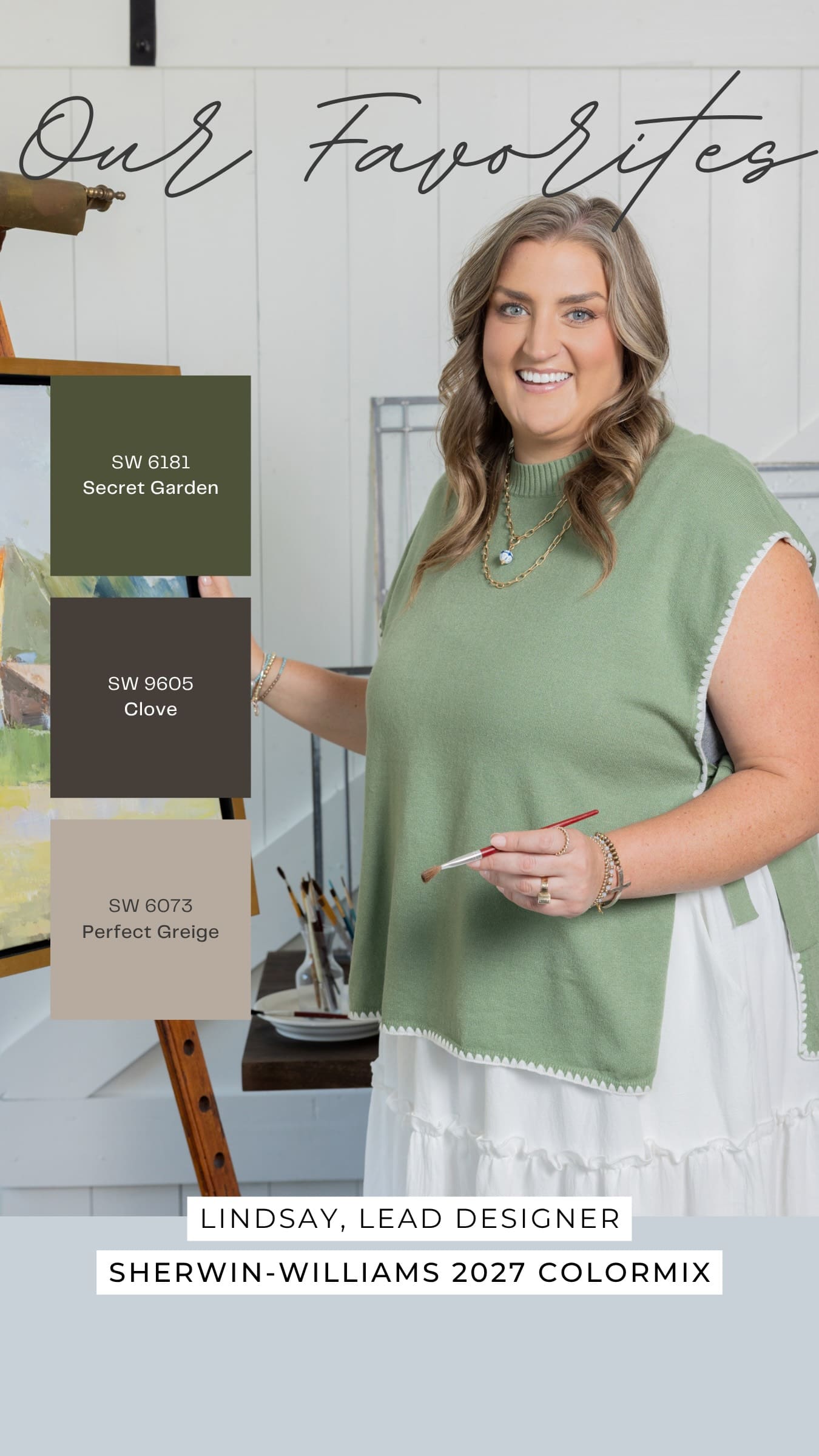
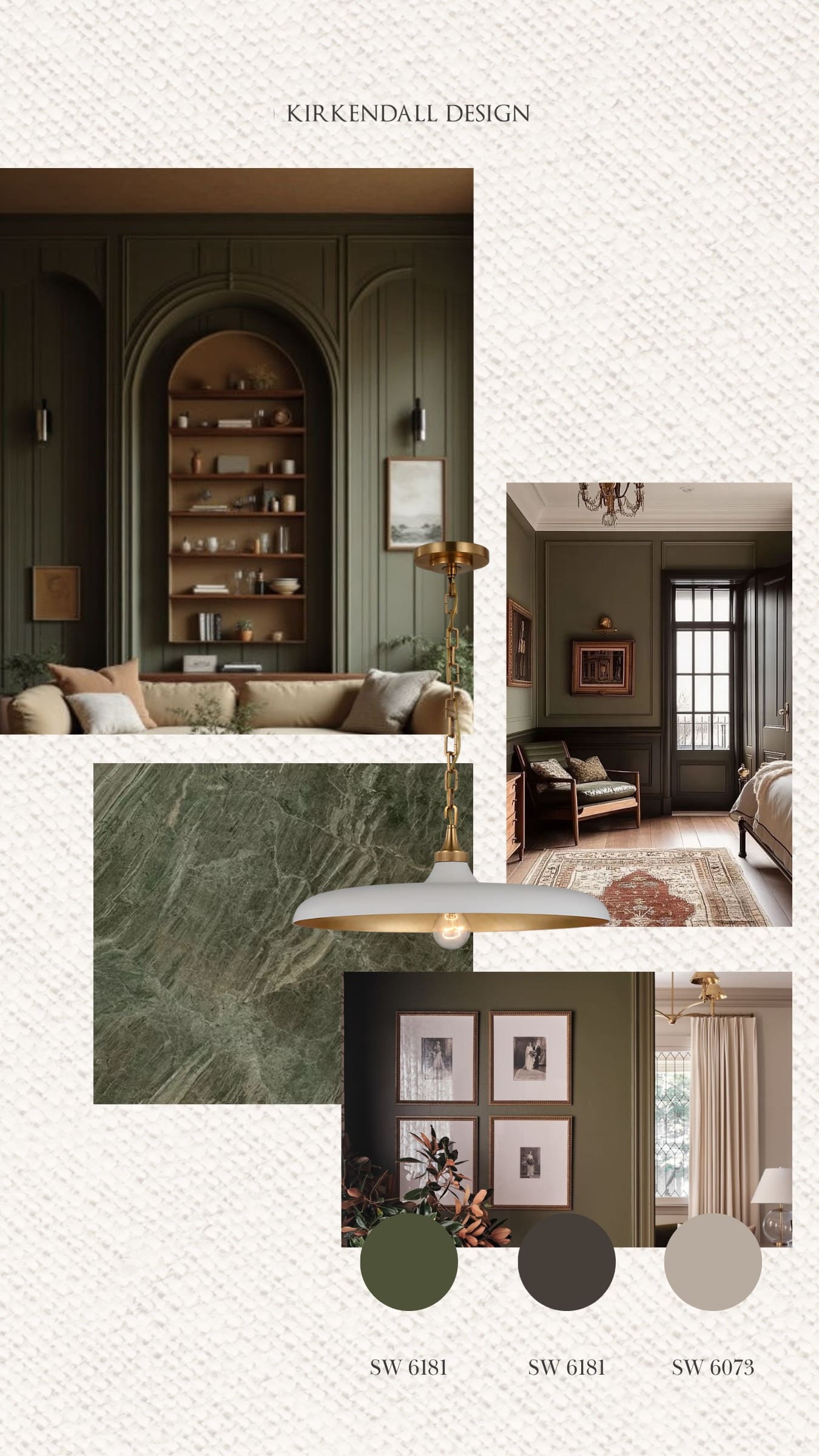
Favorite color: Secret Garden SW 6181

I love that this is a very true olive and would have a lot of applications, whether that is in cabinetry, walls, or textiles. I love a natural green color.

Pair it with: Clove SW 9605 and Perfect Greige SW 6073

Clove is a good, deep accent color and gives the essence of tree bark, while Perfect Greige is a nice cooler-toned neutral that balances the darker tones well. Clove could be a trim color or represent the deeper tones in hardware, lighting, wood stain, or window trim, while Perfect Greige could be the wall or countertop color.

Lindsay’s favorite Sherwin-Williams 2027 Colormix Forecast colors, Secret Garden, Clove, and Perfect Greige
Interior design inspiration featuring Secret Garden, Clove, and Perfect Greige paint colors selected by Kirkendall Design designer Lindsay

Sweta’s Favorite Colors

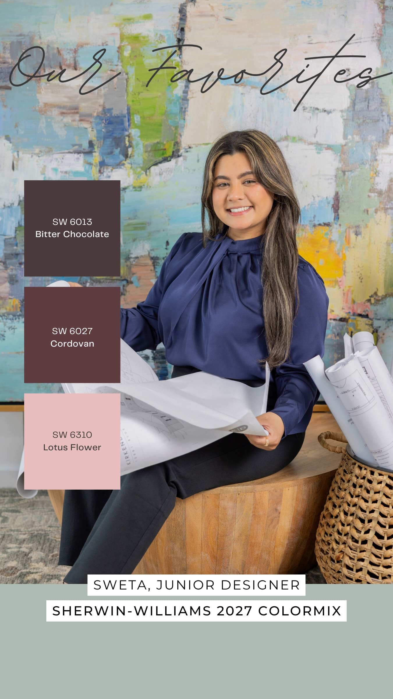
Favorite color: Bitter Chocolate SW 6013

I like that this is a deep, rich color that would work well to bring a moody feel to a space.

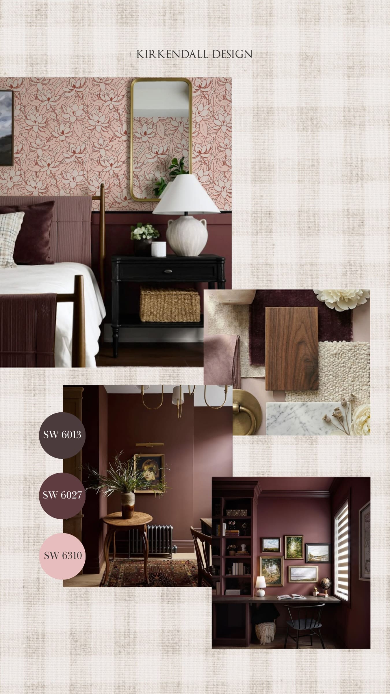
Pair it with: Cordovan SW 6027 and Lotus Flower SW 6310

I would use Cordovan for color drenching, especially on the walls, trim, or built-ins. Lotus Flower could add a softer contrast through wallpaper, artwork, or textiles. They’d be perfect together to create a moody, sophisticated office without feeling too dark.

Sweta’s favorite Sherwin-Williams 2027 Colormix Forecast colors, Bitter Chocolate, Cordovan, and Lotus Flower
Interior design inspiration featuring Bitter Chocolate, Cordovan, and Lotus Flower paint colors selected by Kirkendall Design designer Sweta

Lauren’s Favorite Colors

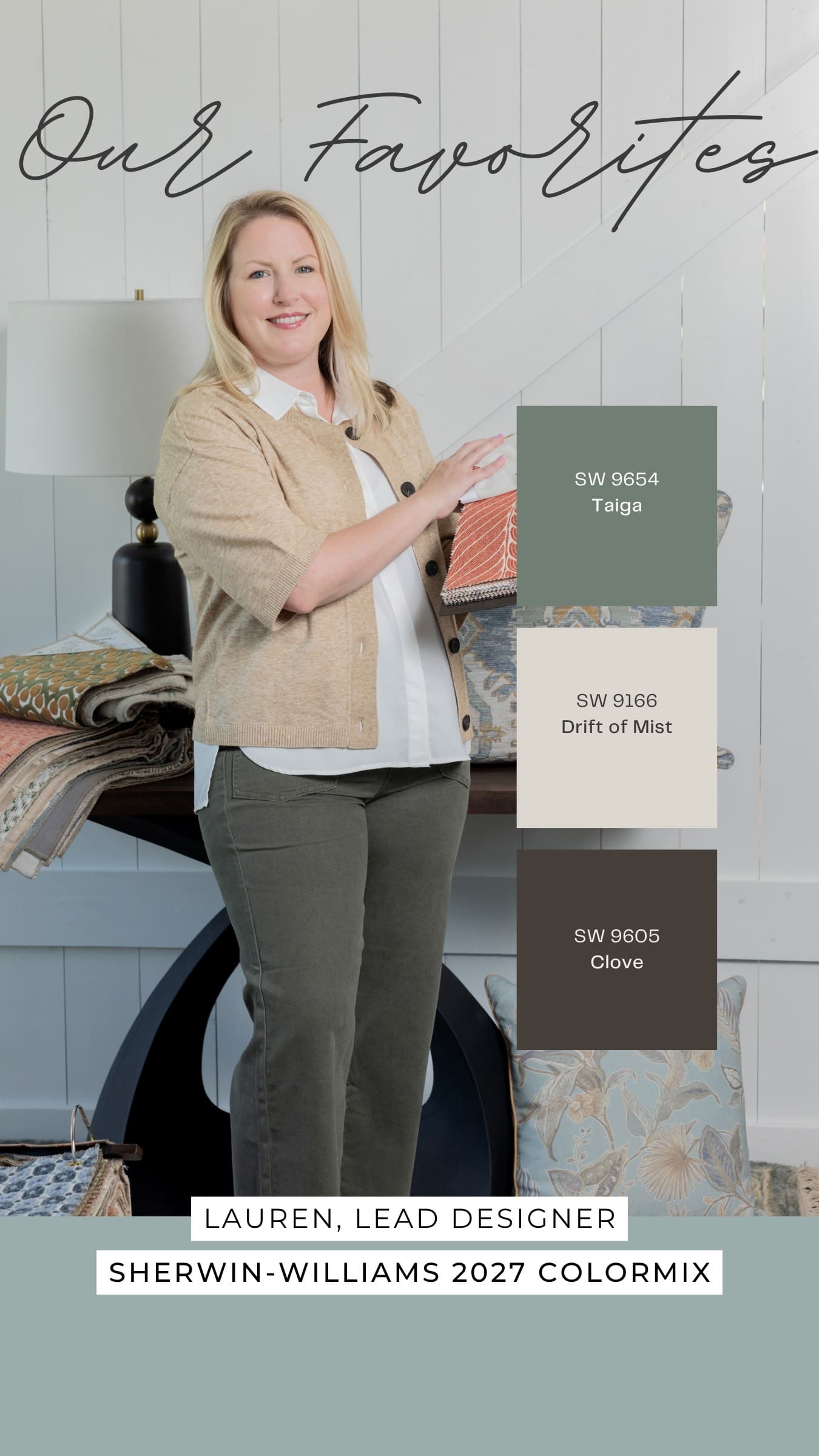
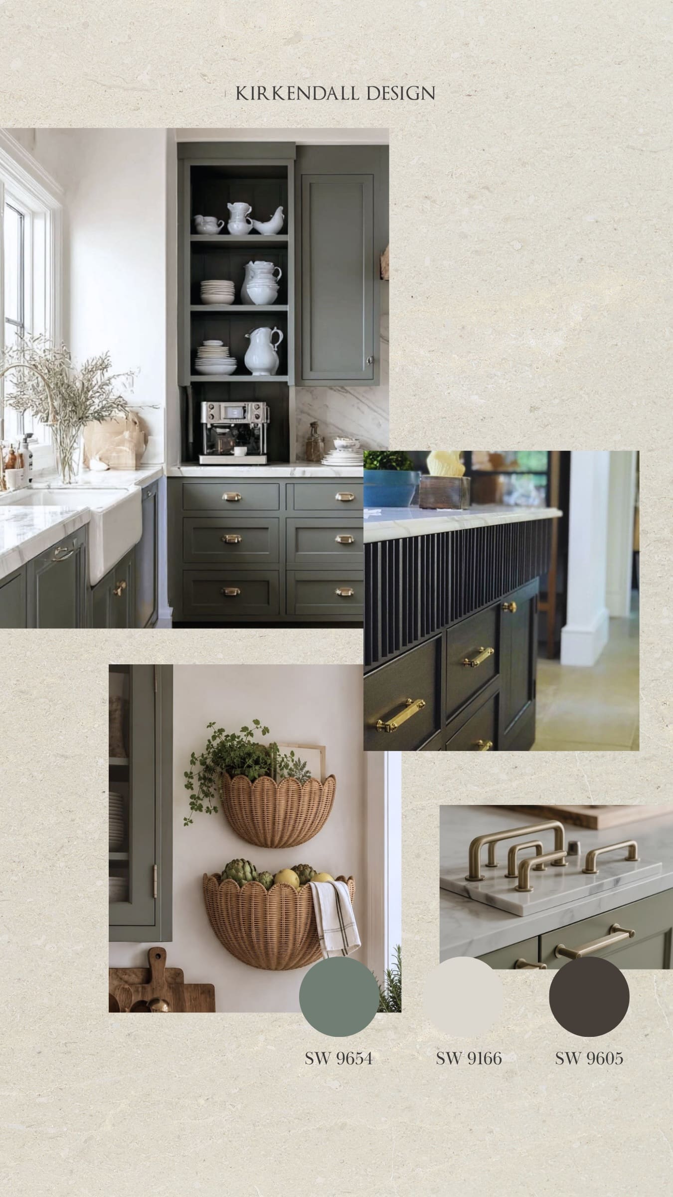
Favorite color: Taiga SW 9654

This is a very neutral blue-green tone that would be very easy to work with throughout a home on cabinetry and millwork.

Pair it with: Drift of Mist SW 9166 and Clove SW 9605

Use Drift of Mist as a neutral wall or trim color, Taiga on cabinetry, and Clove as an accent color like on a kitchen island.

Lauren’s favorite Sherwin-Williams 2027 Colormix Forecast colors, Taiga, Drift of Mist, and Clove
Interior design inspiration featuring Taiga, Drift of Mist, and Clove paint colors selected by Kirkendall Design designer Lauren

Kalah’s Favorite Colors

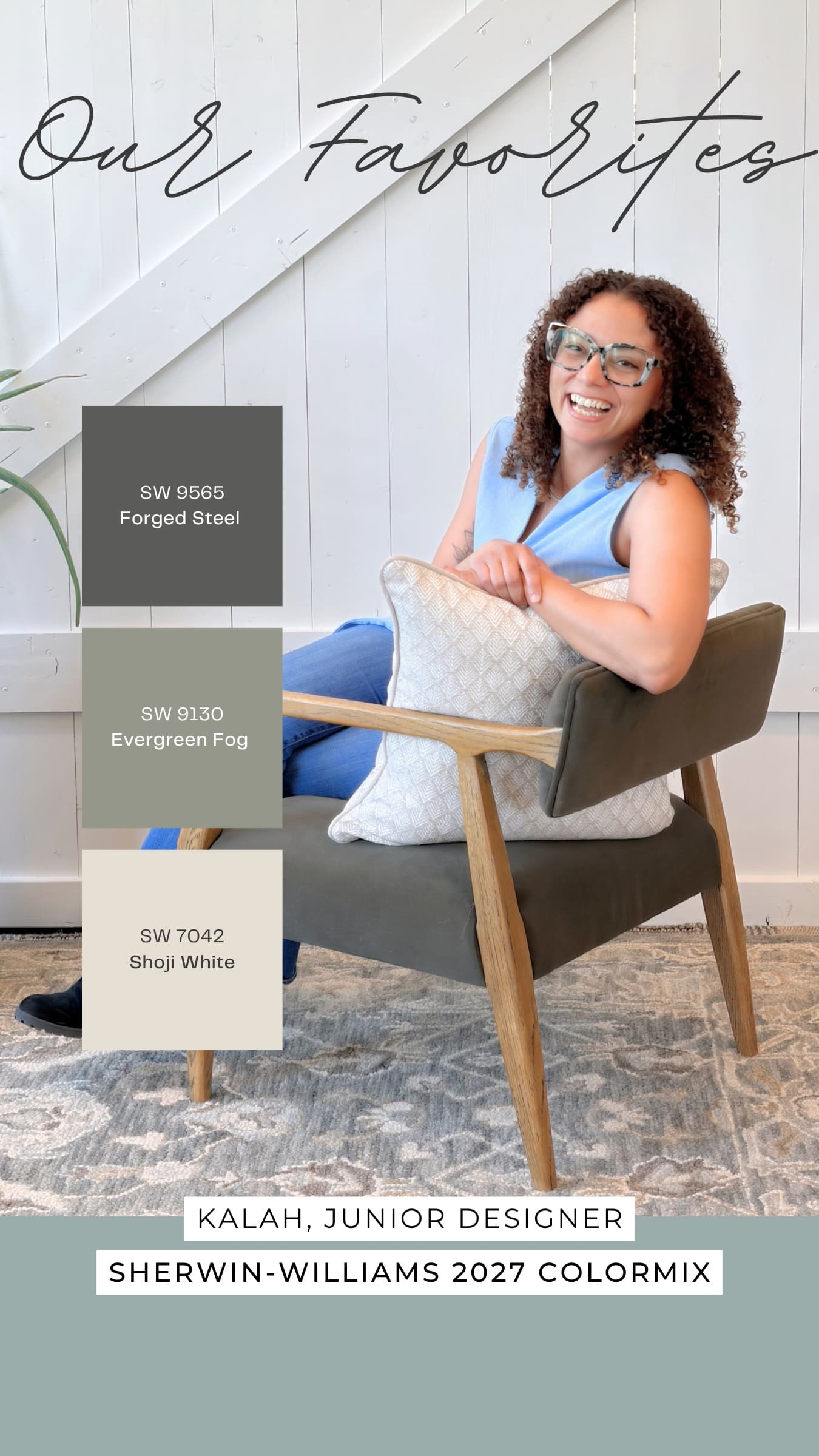
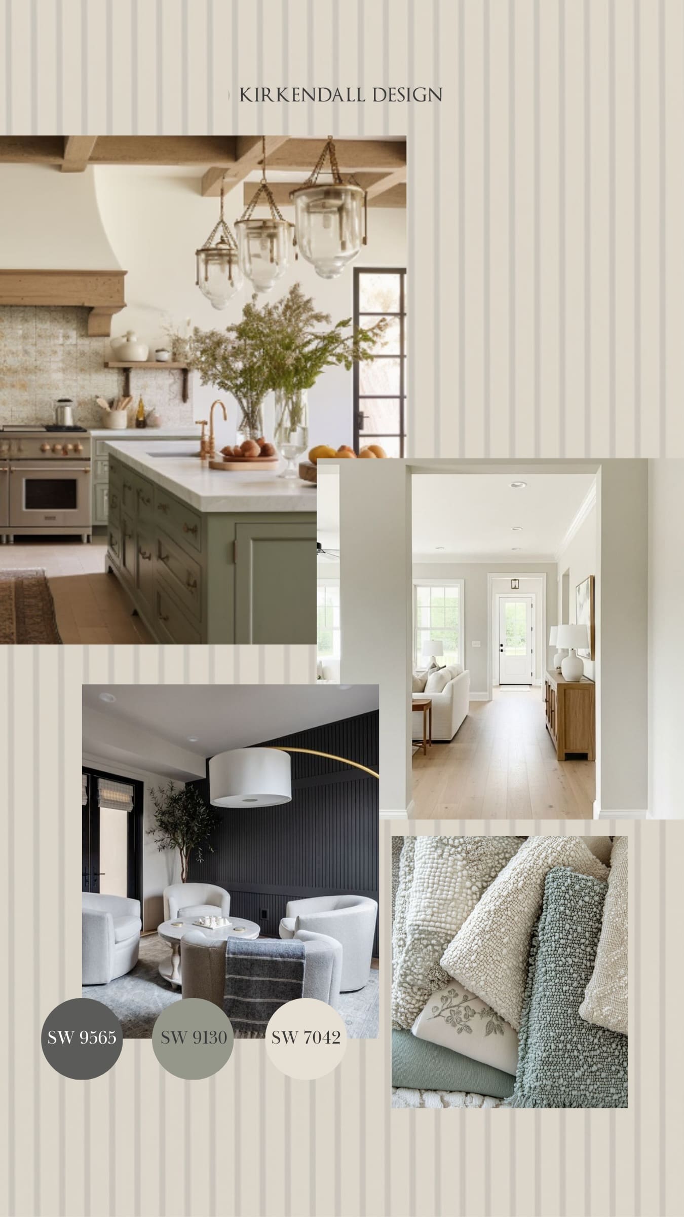
Favorite color: Forged Steel SW 9565

It’s a really beautiful moody accent color. It isn’t quite a traditional neutral, but it has enough versatility to pair with a variety of colors and materials. I could see it working as a subtle accent, but it also has enough depth and character to command an entire room.

Pair it with: Evergreen Fog SW 9130 and Shoji White SW 7042

Shoji White would work beautifully as the field color throughout an entire home. Evergreen Fog and Forged Steel as accents bring in moodier, layered tones while keeping the overall design approachable.

I envision Evergreen Fog on island cabinetry. Forged Steel could be used as a subtle accent through built-ins, interior doors, furniture, or smaller architectural details. Together, they create a layered palette that feels moody and sophisticated without becoming too heavy.

Kalah’s favorite Sherwin-Williams 2027 Colormix Forecast colors, Forged Steel, Evergreen Fog, and Shoji White
Interior design inspiration featuring Forged Steel, Evergreen Fog, and Shoji White paint colors selected by Kirkendall Design designer Kalah

Emily’s Favorite Colors

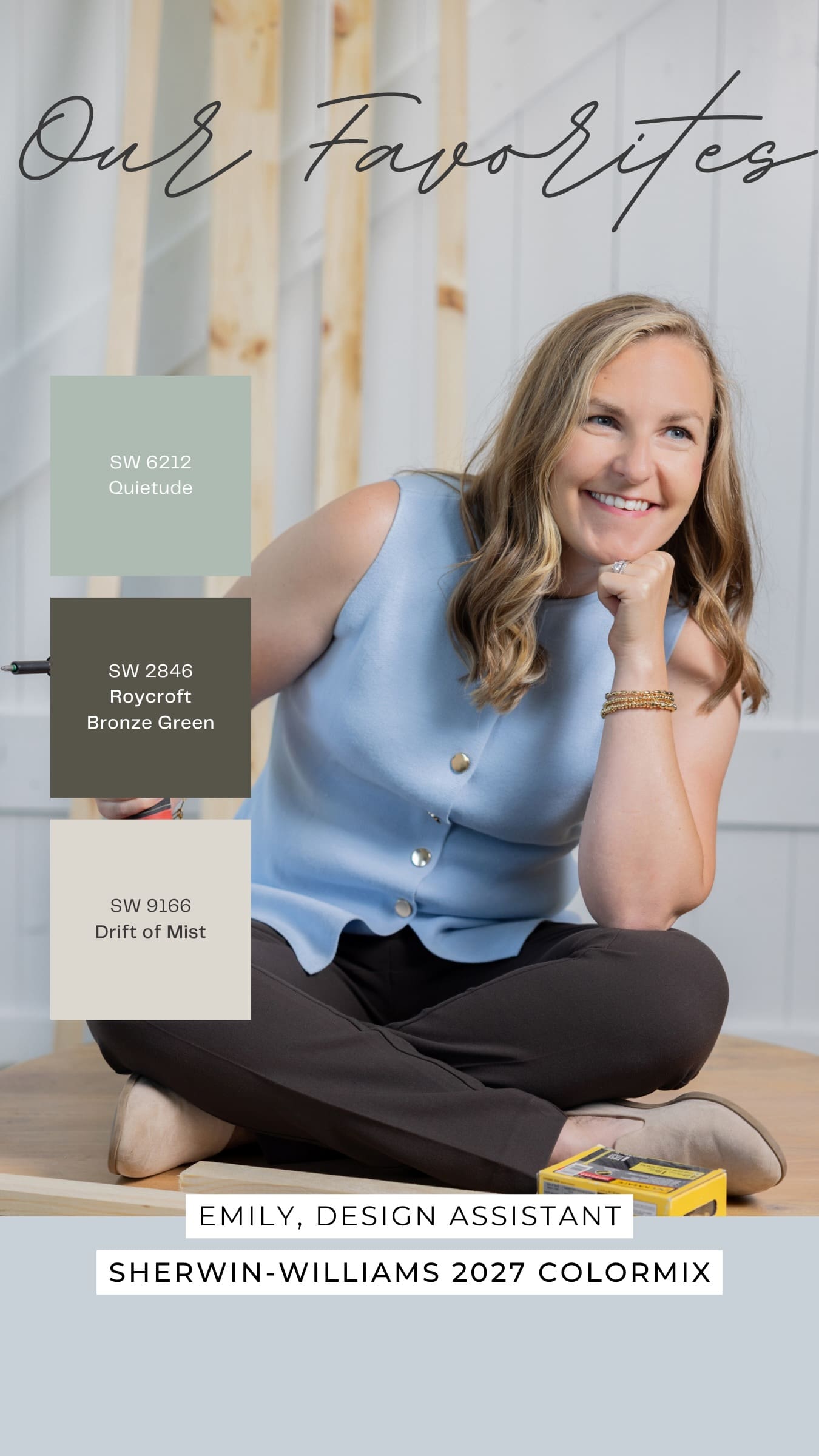
Favorite color: Quietude SW 6212

Quietude is a neutral green that could work well in many settings of your home. I love a green paint color. It makes me feel calm and works well with greys, browns, and beiges.

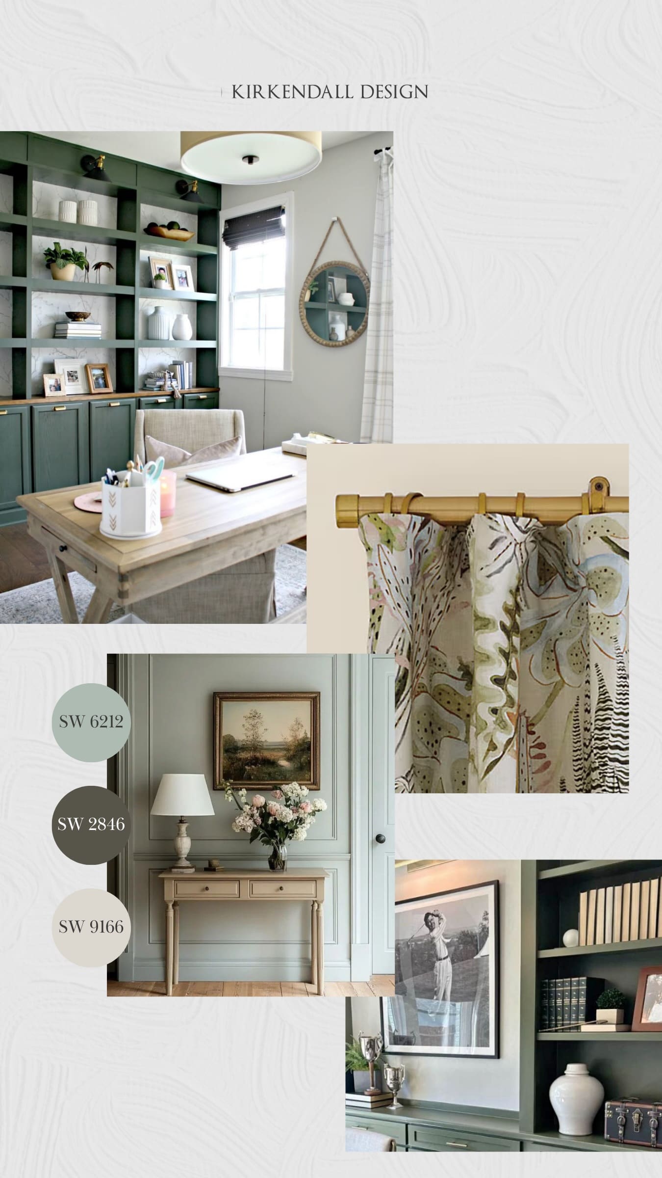
Pair it with: Roycroft Bronze Green SW 2846 and Drift of Mist SW 9166

I see these colors being used in a bathroom or office, with Quietude on the walls, Roycroft Bronze Green on cabinetry or built-ins, and Drift of Mist on the trim.

Emily’s favorite Sherwin-Williams 2027 Colormix Forecast colors, Quietude, Roycroft Bronze Green, and Drift of Mist
Interior design inspiration featuring Quietude, Roycroft Bronze Green, and Drift of Mist paint colors selected by Kirkendall Design designer Emily

More Color Inspiration

One of the things we love about a color forecast is seeing how different designers interpret the same palette. For us, color is never about following a trend simply because it is popular. It is about finding the colors that work with your home, your style, and the way you live.

Not sure which paint color is right for your home? Our Paint Consult service helps you find colors that work beautifully with your home, furnishings, lighting, and personal style.

help choosing paint colors paint consult services in tulsa by Kirkendall Design

We enjoy sharing these color round-ups every year. Check out our previous posts for more color inspiration.