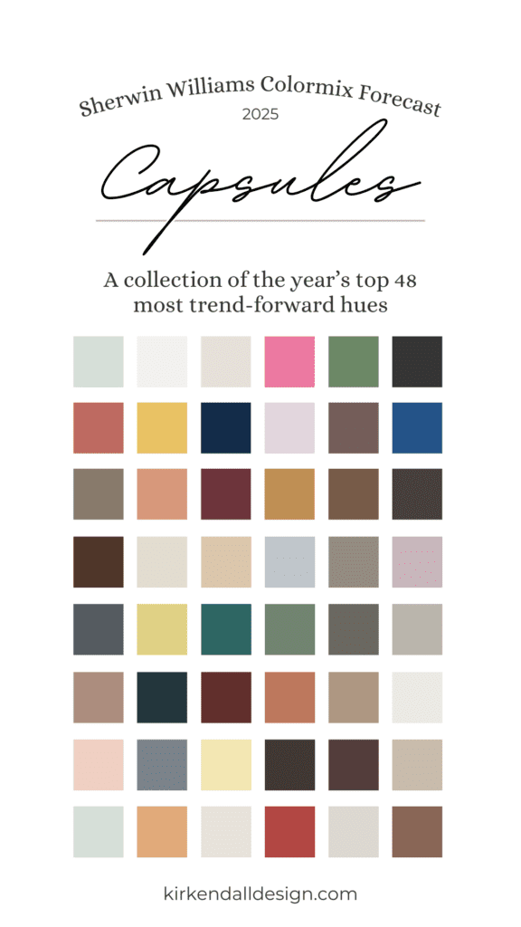
As an interior design firm, we’re (obviously) always excited to see what color trends are bubbling up for the new year. Benjamin Moore announced their Color of the Year as Cinnamon Slate, and the Sherwin-Williams 2025 Colormix Forecast does not disappoint! Their latest collection of the top 48 trend-forward colors is full of fresh, vibrant hues to inspire you.
Curated by more than 20 design professionals from across the country, the Colormix Forecast is rooted in deep color analysis, blending expertise from both residential and commercial interior design. This team brings a wealth of knowledge in how color shapes environments, giving color inspiration that meets a wide range of design needs.
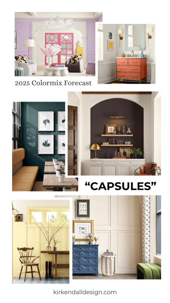
There are four distinct color palettes in the Colormix Forecast. Here’s a closer look at the Sherwin Williams 2025 colors!
Sherwin-Williams 2025 Colors – Chrysalis Capsule
Full of peaceful colors, the Chrysalis Capsule is “inspired by wood tones and freshly turned earth.” We asked our interior design team to choose their favorite palettes from the Sherwin Williams 2025 color collection. Out of the four options, three of our designers chose Chrysalis as their top pick. They loved its warm tones and calming mix of colors.
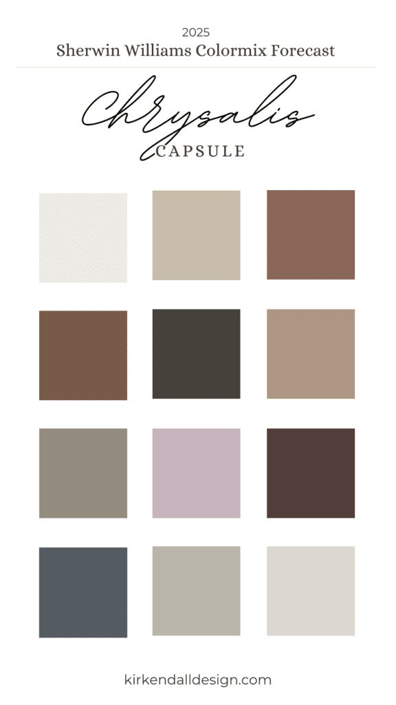
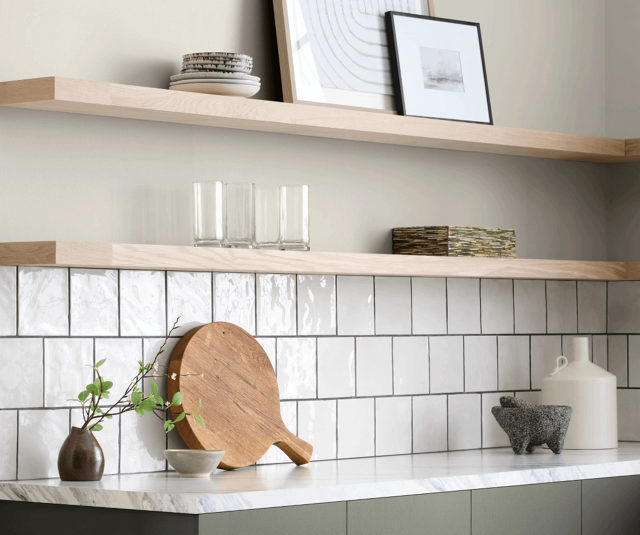
Photo by Sherwin-Williams
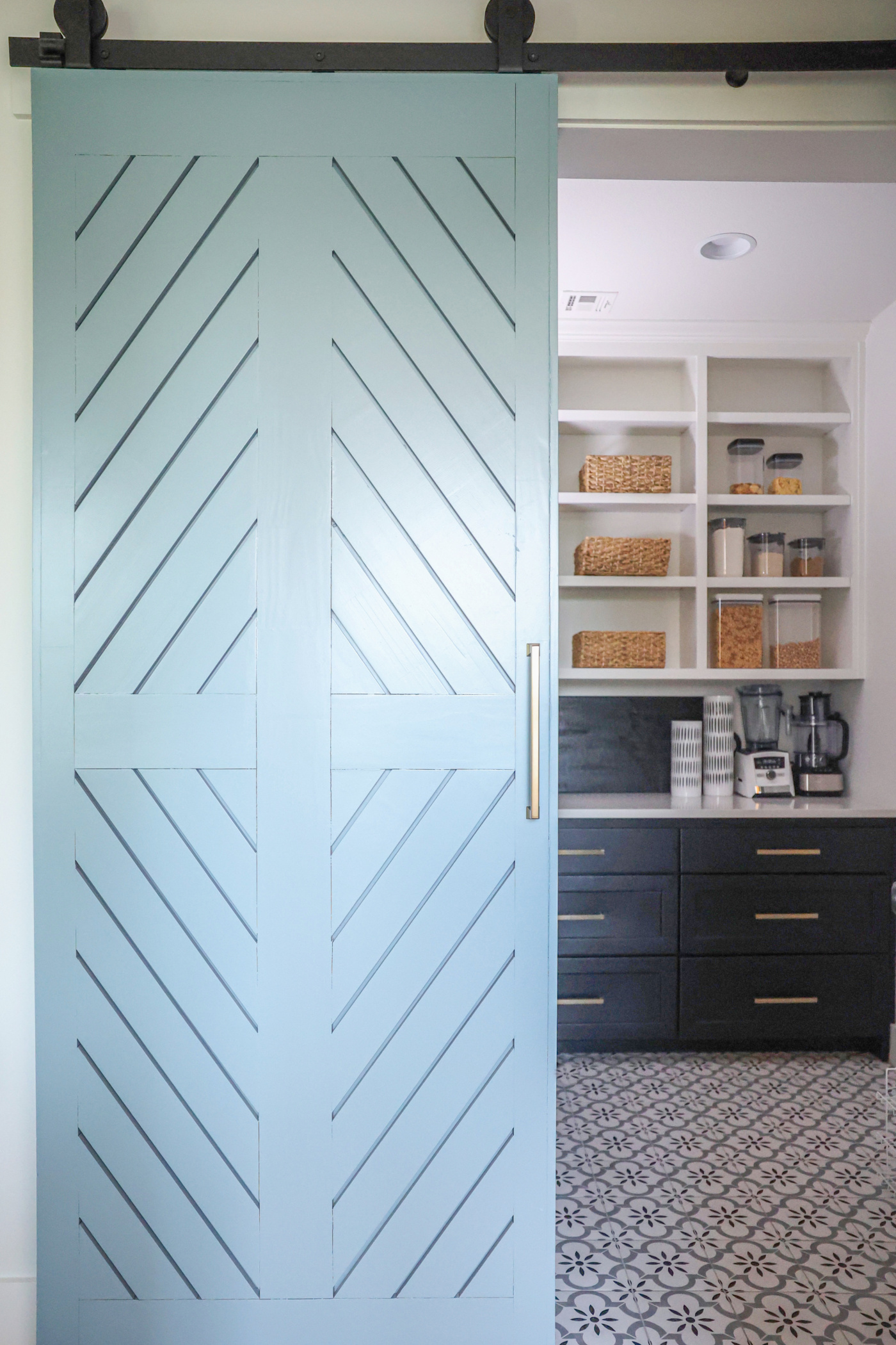
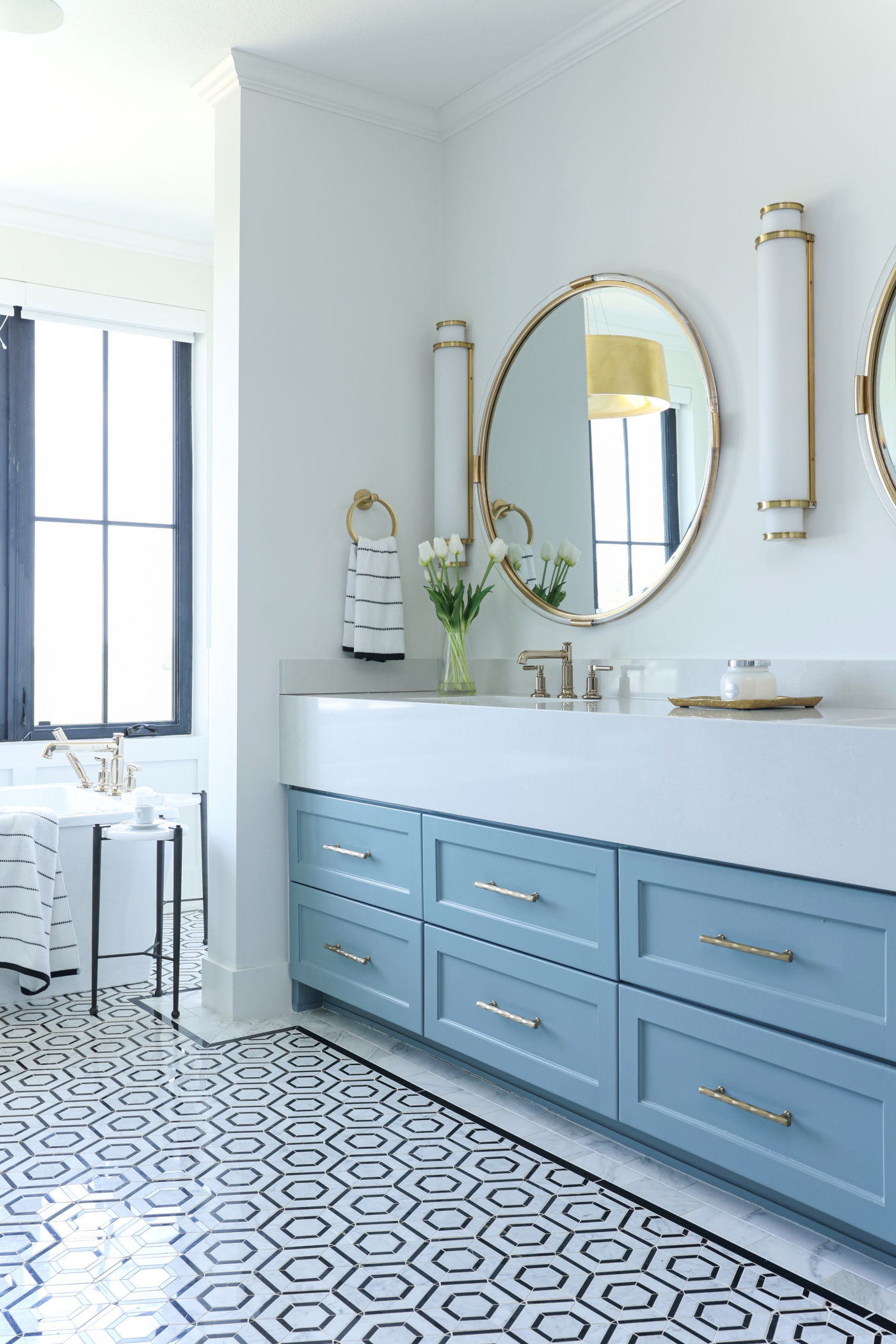
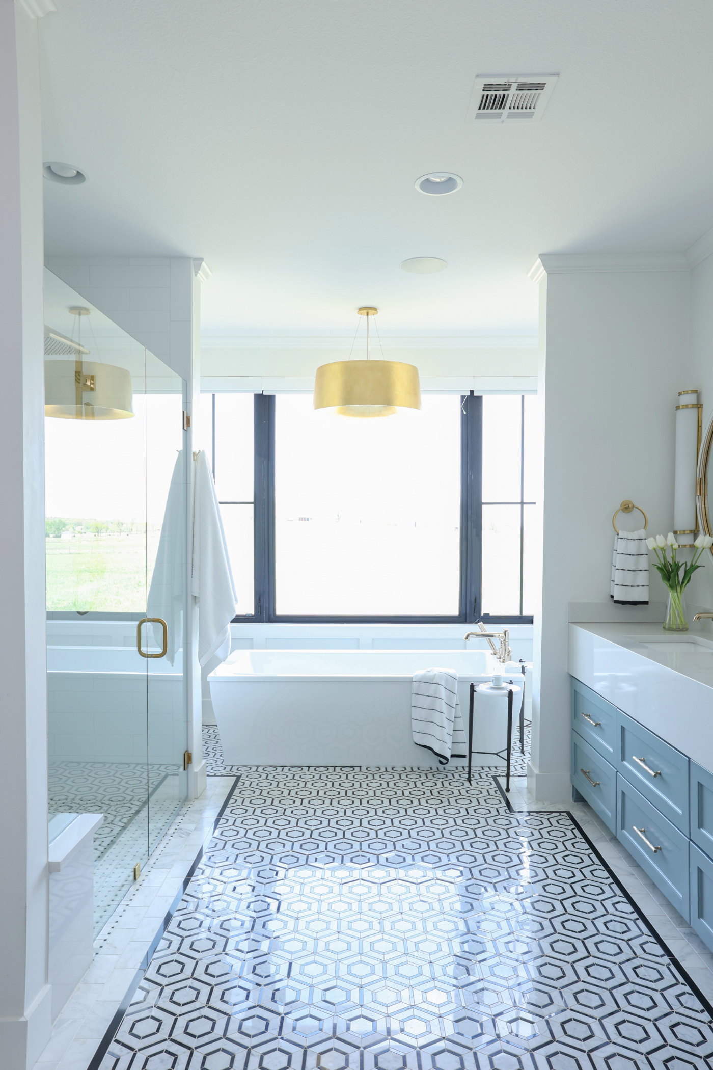
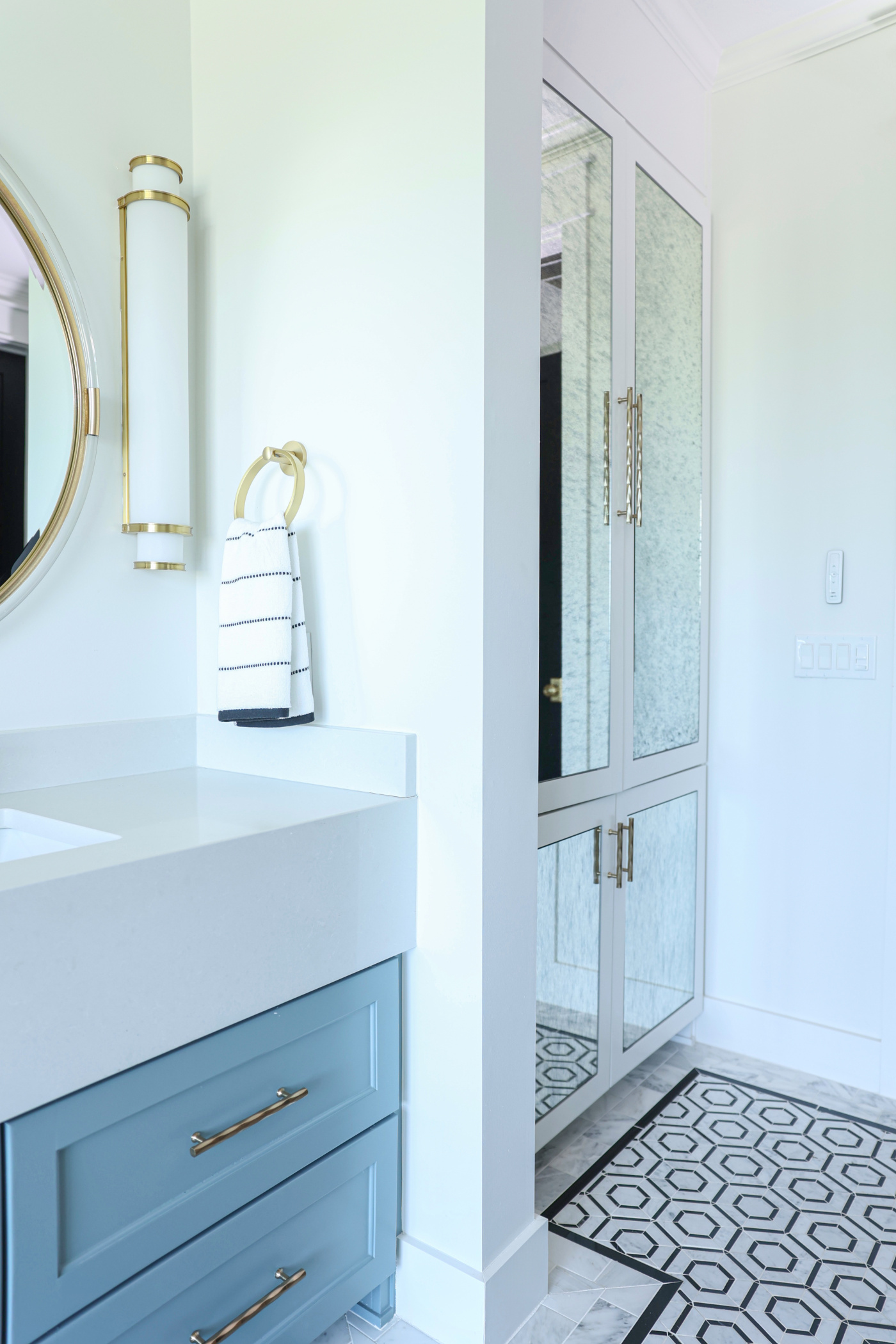
Cabinet: Drift of Mist SW 9166, Wall: Thunderous SW 6201
Photo by Sherwin-Williams
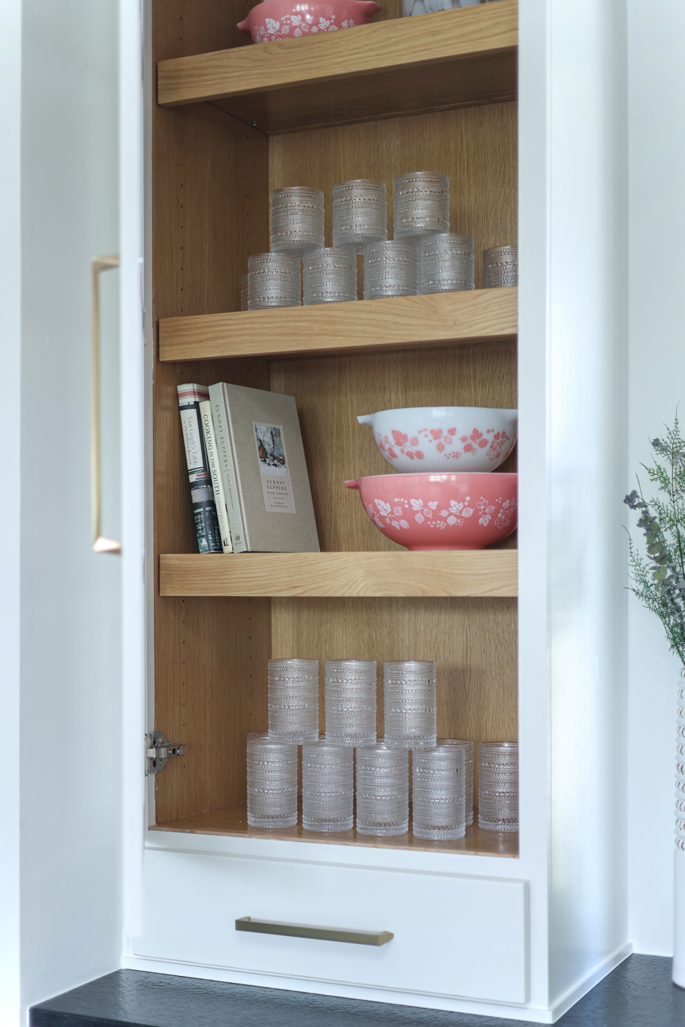
Walls: Pure White SW 7005, Sealskin SW7675
Sherwin-Williams 2025 Colors – Paradox Capsule
The Paradox palette is more playful with a bright mix of “grounding neutrals and candy-coated accents.”
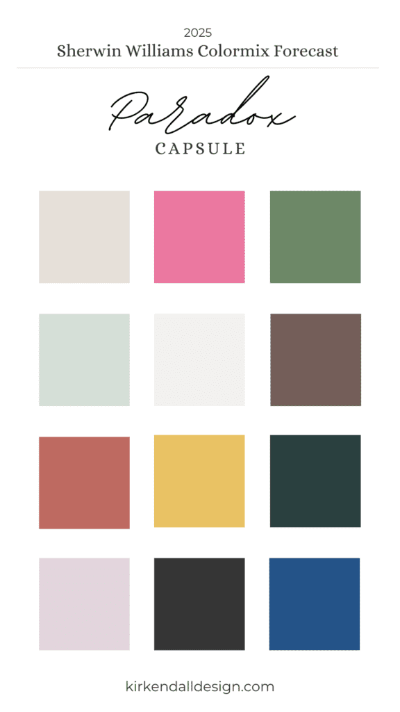
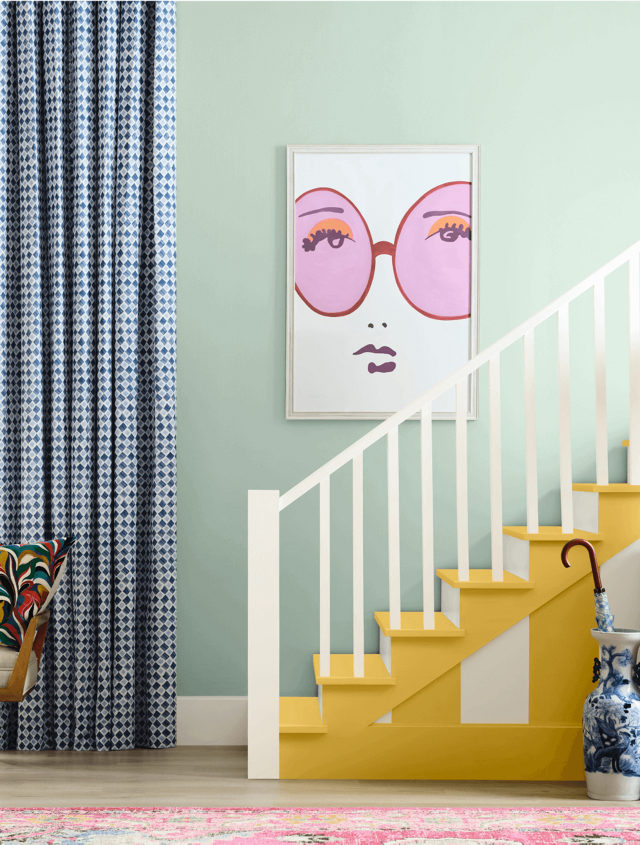
Photo by Sherwin-Williams
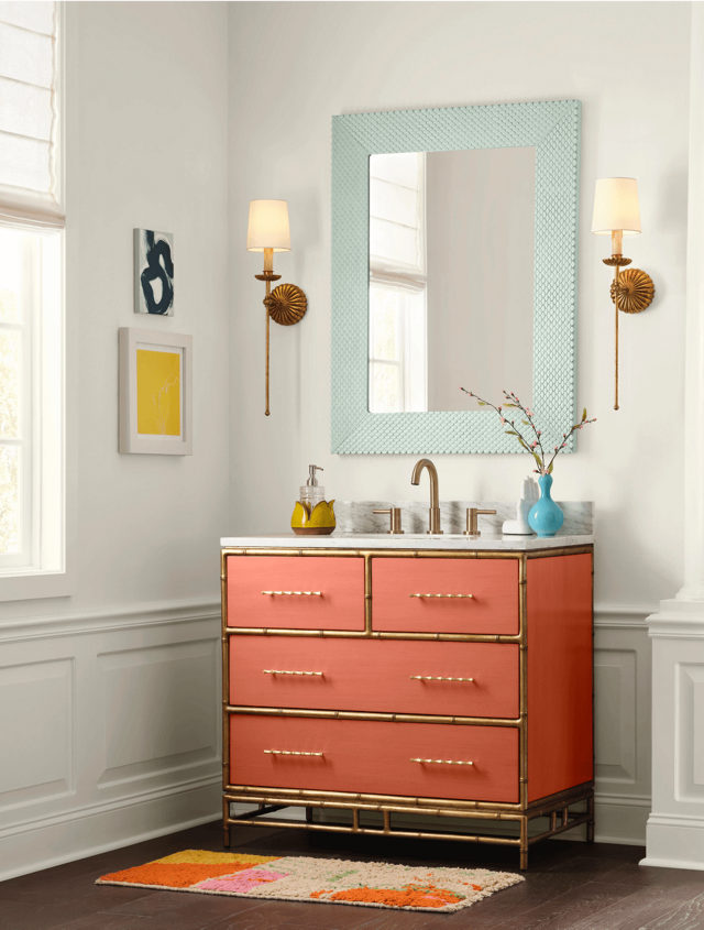
Photo by Sherwin-Williams
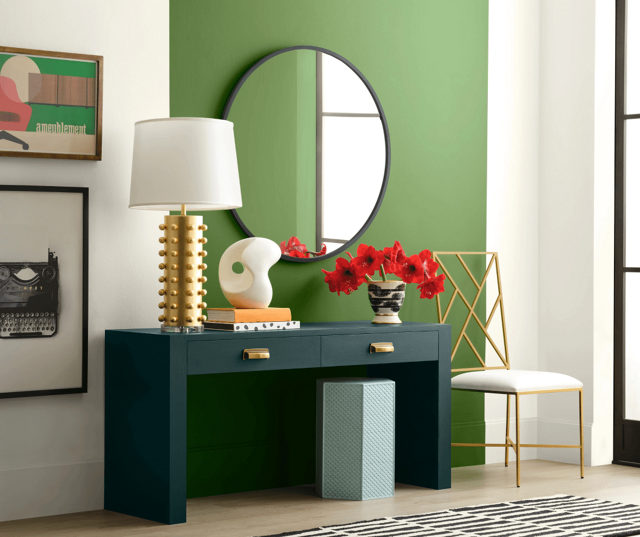
Photo by Sherwin-Williams
Sherwin-Williams 2025 Colors – Wellspring Capsule
Filled with warm neutrals that you would find in nature, the Wellspring collection is meant to “nurture and nourish” through color. It was another favorite among our design team for its neutral base, which still offers bold accents for those who enjoy experimenting with color while preferring a more muted environment.
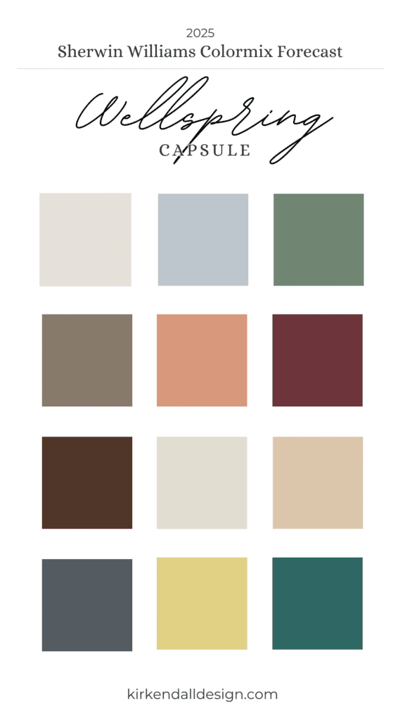
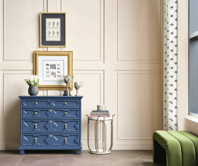
Photo by Sherwin-Williams
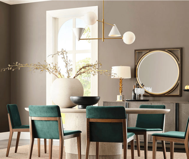
Photo by Sherwin-Williams

Commercial space inspiration by Sherwin-Williams
Sherwin-Williams 2025 Colors – Kindred Capsule
A well rounded combination, the Kindred Capsule invites you to “embrace abundance with traditional neutrals and electric brights.” The Kindred collection stood out as a top choice for our owner and principal designer, Julia Kirkendall. She highlighted how the colors are comforting and envisions it used in spaces that promote rest and renewal.
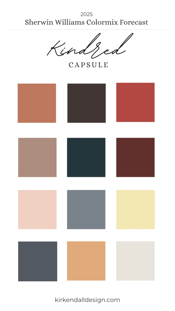
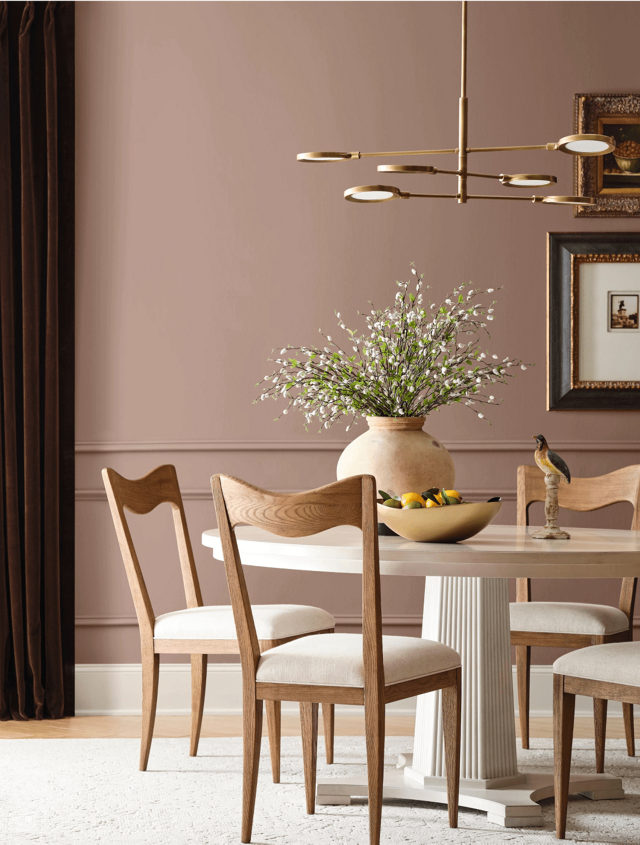
Photo by Sherwin-Williams
Walls: Redend Point SW 9081, Trim: Creamy SW 7012
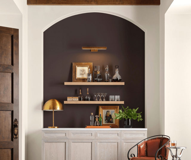
Photo by Sherwin-Williams
Accent Nook: Rockweed SW 2735, Wall: Creamy SW 7012
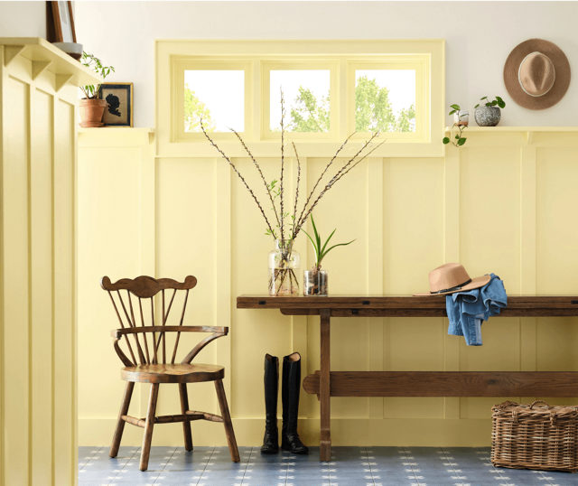
Photo by Sherwin-Williams
Board and Batten: Icy Lemonade SW 1667, Walls: Creamy SW 7012
Our Interior Design Team’s Top Picks from Sherwin-Williams’ 2025 Colors
Here are Kirkendall Design’s favorite color selections from the Sherwin-Williams’ 2025 Colormix Forecast!
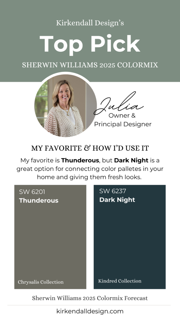
Julia’s Favorite Colors
Which color trend palette is your favorite?
My favorite is Kindred because it represents colors that are nesting and comforting, which is what we lean to when there is any unrest around us. Also, with the election year and wars in the world I think people are looking for their sanctuary at home that can help refresh, renew, and restore them.
What is your favorite color(s) out of all of the palettes?
My favorite color is Thunderous, but the Dark Night is such a good option for connecting color pallets in your home and giving them fresh looks.
Jayne’s Favorite Colors

Which color trend palette is your favorite?
Wellspring-because it has a great neutral palette, but also offers some bold choices for those who dare to experiment but thrive in neutral environments.
What is your favorite color in the Chrysalis collection?
Studio Clay! It’s a great neutral but the undertones of gray/green give you some color where you might not want to stick with a beige, or greige.
How do you envision that color being used in a client’s home or commercial project?
I think Studio Clay could be used in a variety of situations. Bedroom, study, bathroom walls. Cabinets in laundry or study or even a bathroom.
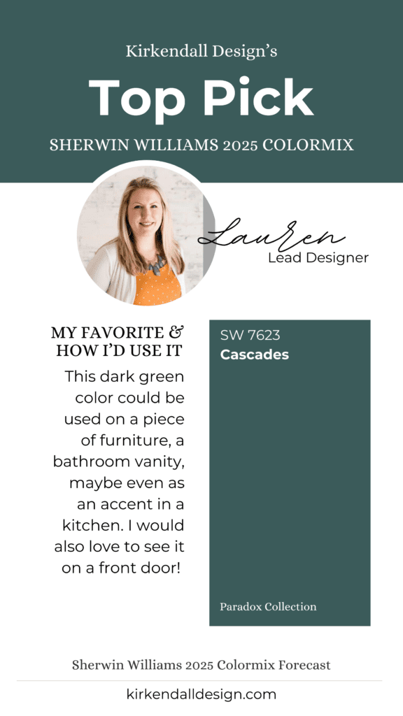
Lauren’s Favorite Colors
Which color trend palette is your favorite?
I would choose Chrysalis. I’m enjoying that warmer color tones are trending and I think this is a nice collection that anyone could incorporate into their home.
What is your favorite color in the Paradox collection? Cascades!
How do you envision that color being used in a client’s home or commercial project?
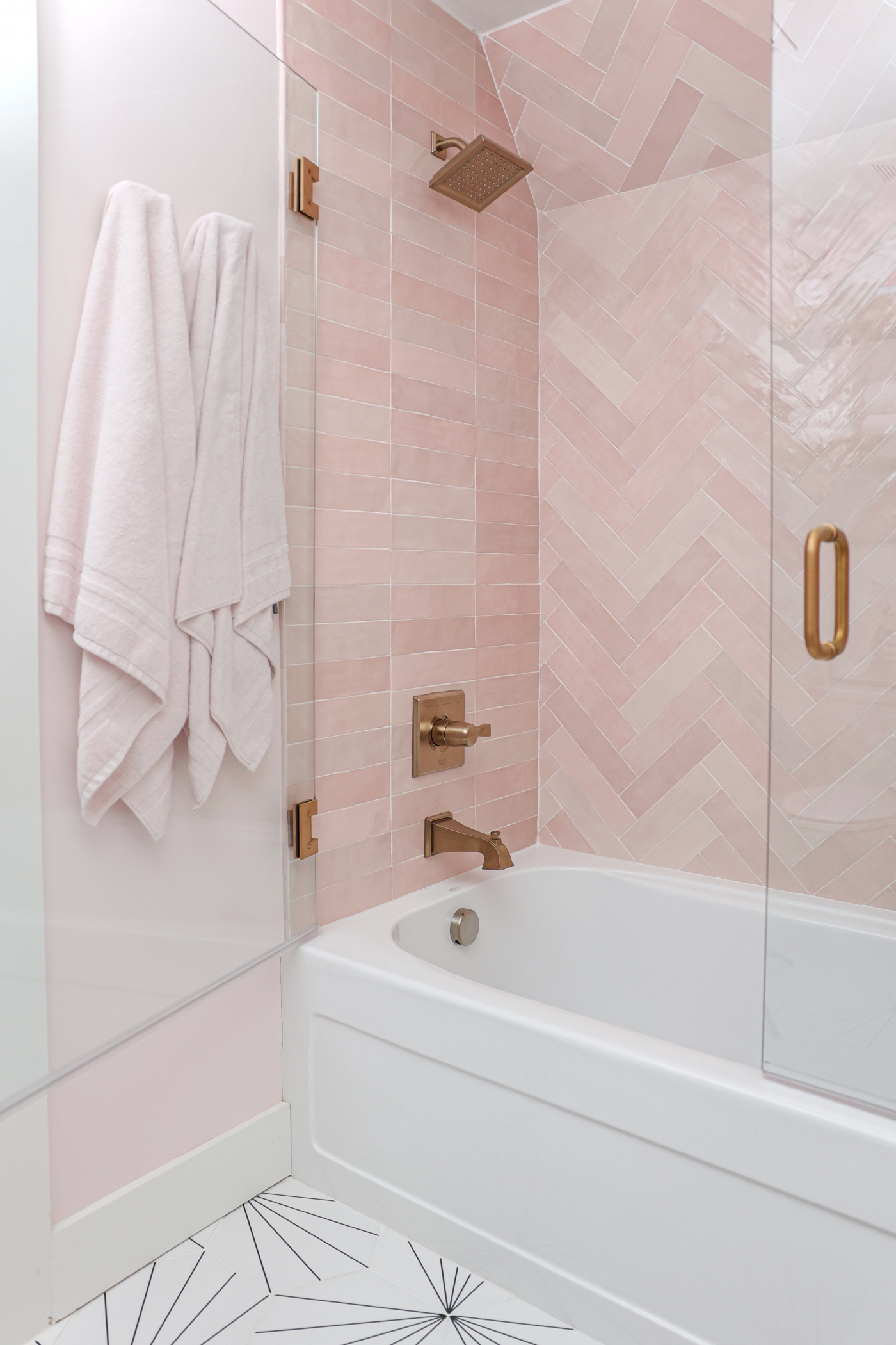
In a home I think that the dark green color could be used on a piece of furniture, a bathroom vanity, maybe even as an accent in a kitchen. I would also love to see it on a front door.
Debbie’s Favorite Colors
Which color trend palette is your favorite?
I would say overall I like Chrysalis for open areas or field colors.
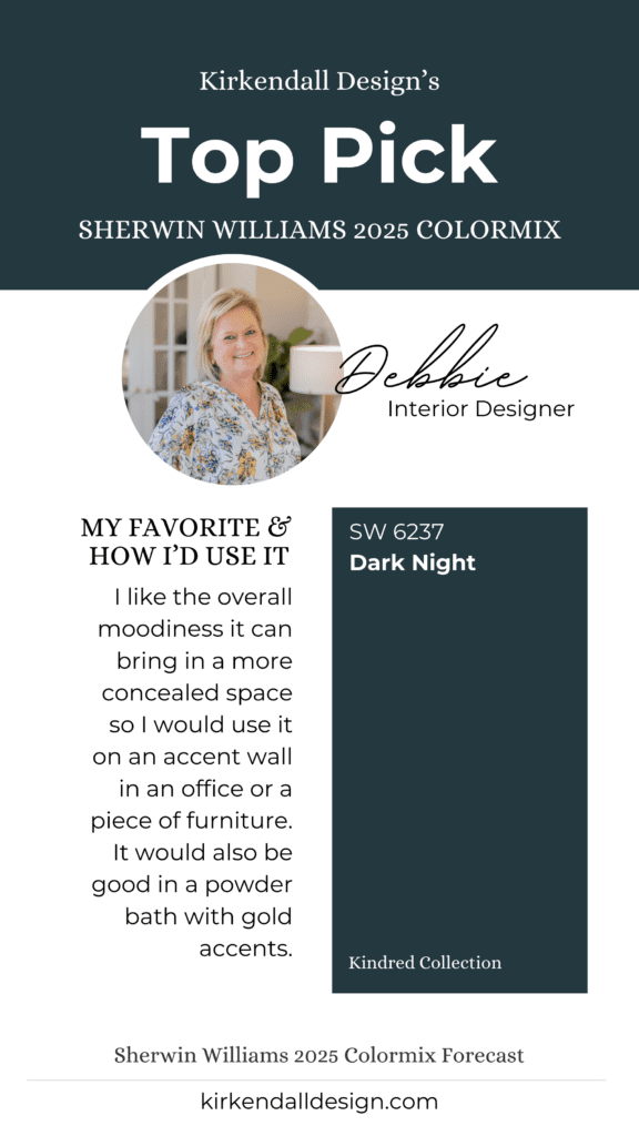
What is your favorite color in the Paradox collection? Dark Night!
How do you envision that color being used in a client’s home or commercial project?
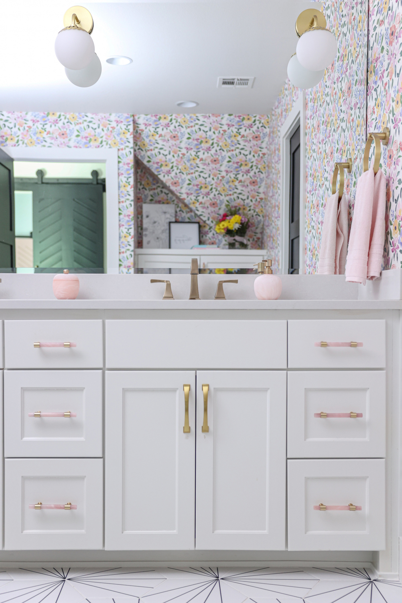
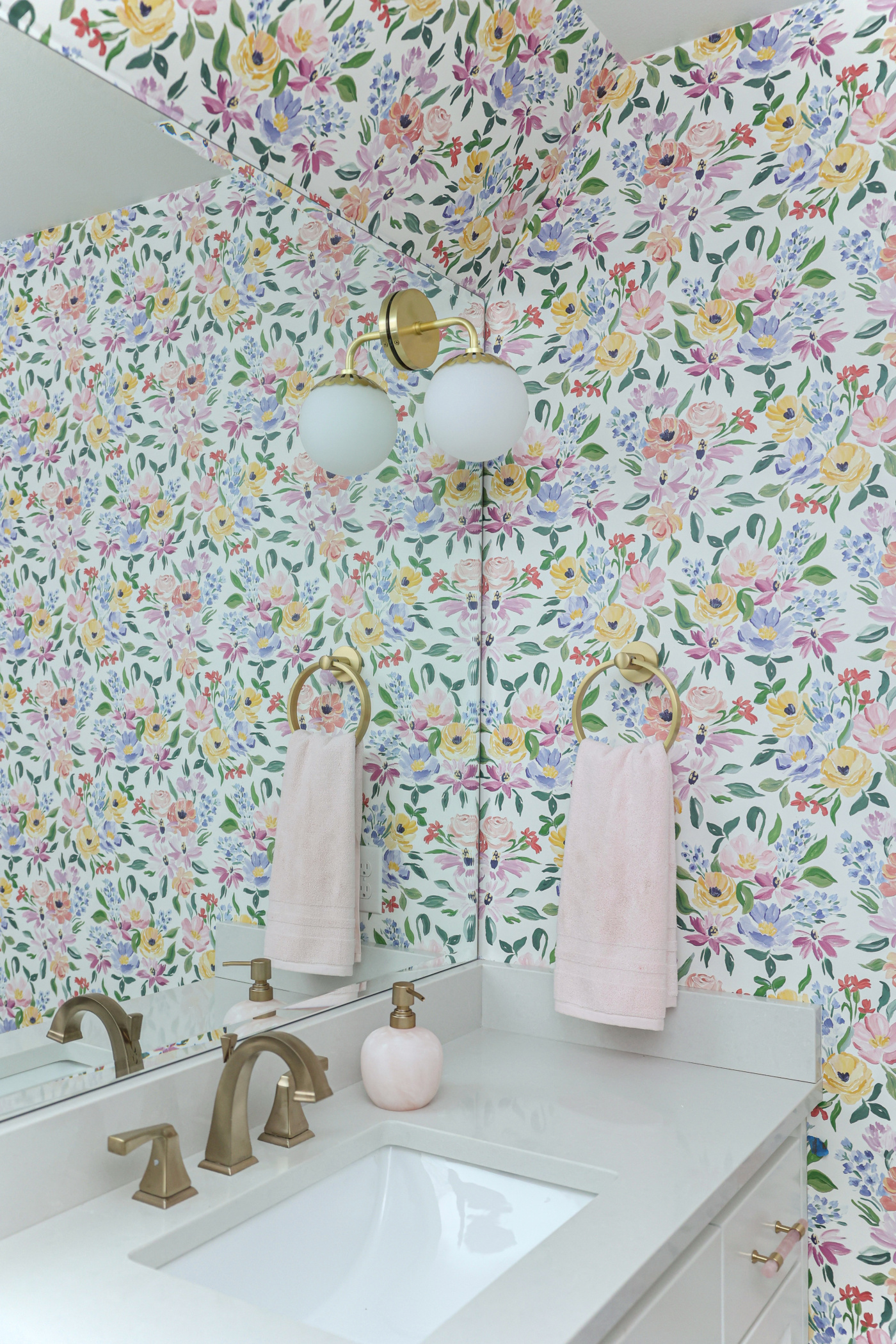
I like the overall moodiness it can bring in a more concealed space. I would use it on an accent wall in an office or a piece of furniture. It would also be good in a powder bath with gold accents.
Lindsay’s Favorite Colors
Which color trend palette is your favorite?
Chrysalis – I am a neutral girl through and through and I like the range of browns and tans here, plus there is a light toned mauve/lilac that is pretty as well. Thunderous can lean a little on the green side which I think goes well with all the other neutrals. Overall, it’s a color scheme that really brings the outdoors in, which I love. That, to me, is calming and authentic!
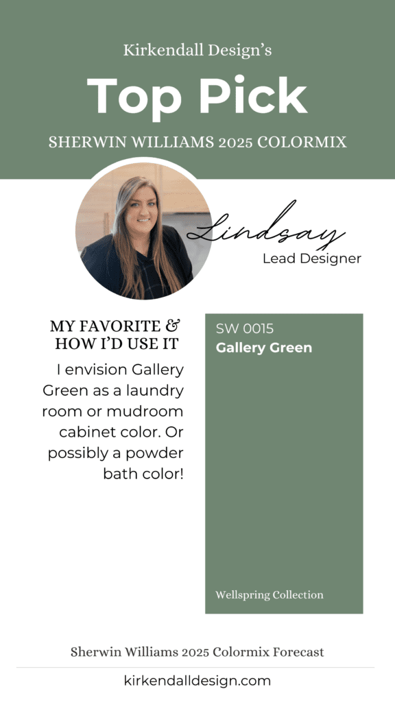
What is your favorite color in the Wellspring collection?
Gallery Green is my favorite in that collection!
How do you envision that color being used in a client’s home or commercial project?
I would envision Gallery Green as a laundry room or mudroom cabinet color. Or possibly a powder bath color!
Thank you for reading! This post was inspired by Postcards from the Ridge. We loved her deep dive into Sherwin Williams 2025 Colors – Find it on here.